Fig. 4
Download original image
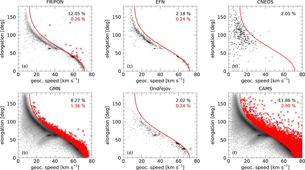
Density representation of the Kresáks’ diagram for databases of (a) FRIPON, (b) GMN, (c) EFN, (d) Ondřejov, (e) CNEOS, and (f) CAMS, given in logarithmic greyscale. The red curve plots the parabolic limit, and the red crosses represent hyperbolic events that overpass such limit with a p value lower than 0.14% (3σ). Each panel also displays the percentage of hyperbolic (black) and 3σ hyperbolic (red) events.
Current usage metrics show cumulative count of Article Views (full-text article views including HTML views, PDF and ePub downloads, according to the available data) and Abstracts Views on Vision4Press platform.
Data correspond to usage on the plateform after 2015. The current usage metrics is available 48-96 hours after online publication and is updated daily on week days.
Initial download of the metrics may take a while.