Fig. 6.
Download original image
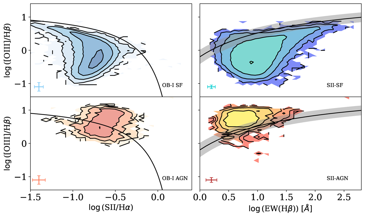
Comparison between the SII diagram (left) and the OB-I diagram (right). In the OB-I diagram, the black line and the shaded region represent Eq. (2). In the SII diagram, the solid black line represents the separation by Kewley et al. (2001). Each contour represents 20% more of the sample, and the error bars represent the median error for each axis, for each classification. On the left is the OB-I classifications on the SII diagram; on the right is the SII classifications on the OB-I diagram. The top panels represent SF galaxies and bottom panels represent AGNs.
Current usage metrics show cumulative count of Article Views (full-text article views including HTML views, PDF and ePub downloads, according to the available data) and Abstracts Views on Vision4Press platform.
Data correspond to usage on the plateform after 2015. The current usage metrics is available 48-96 hours after online publication and is updated daily on week days.
Initial download of the metrics may take a while.