Fig. 7.
Download original image
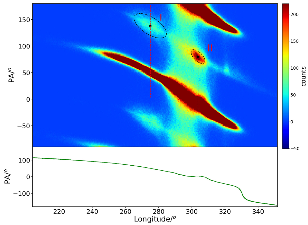
Top panel: 2D statistical distribution of PA and PA ± 180° for all single pulses, showing only PA values within the main pulse region. The dashed black ellipse corresponds to the two areas where PA jumps occur most frequently, with black dots indicating the centers of these ellipses. The two dashed red lines mark the longitude positions of the black dots, labeled longitude I and II, respectively. The PA range for these two dashed red lines spans from the value of the black dots minus 135° to the value plus 45°. Bottom panel: Curve of the PA for the total average pulse profile.
Current usage metrics show cumulative count of Article Views (full-text article views including HTML views, PDF and ePub downloads, according to the available data) and Abstracts Views on Vision4Press platform.
Data correspond to usage on the plateform after 2015. The current usage metrics is available 48-96 hours after online publication and is updated daily on week days.
Initial download of the metrics may take a while.