Fig. 5
Download original image
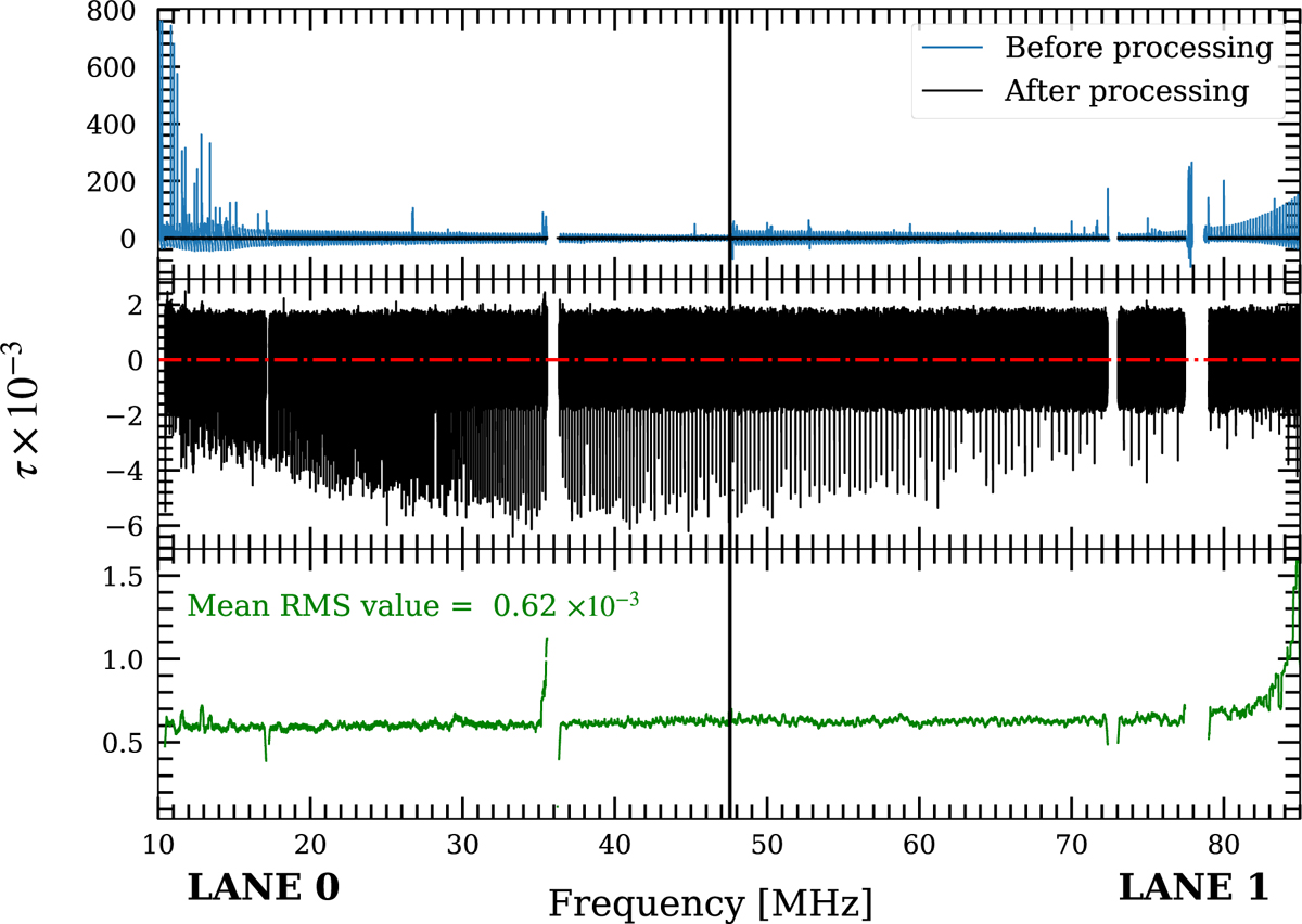
Description of the step 3 of data processing (see bottom panel of Fig. 2). The black vertical line shows the separation between lane 0 and lane 1. The top panel compares the flat spectrum before (blue) and after (black) the mitigation process. The middle panel is a zoom on the black spectrum. The red dashed-dotted line shows the zero baseline. The vertical spikes are detections of Cα RRLs. The bottom panel shows the value of the rms computed in a sliding window along the spectrum. The holes in the spectrum (at 35 MHz, 73 MHz and 79 MHz) are flagged regions contaminated by unmanageable RFI pollution during this observing block.
Current usage metrics show cumulative count of Article Views (full-text article views including HTML views, PDF and ePub downloads, according to the available data) and Abstracts Views on Vision4Press platform.
Data correspond to usage on the plateform after 2015. The current usage metrics is available 48-96 hours after online publication and is updated daily on week days.
Initial download of the metrics may take a while.