Open Access
Fig. 3.
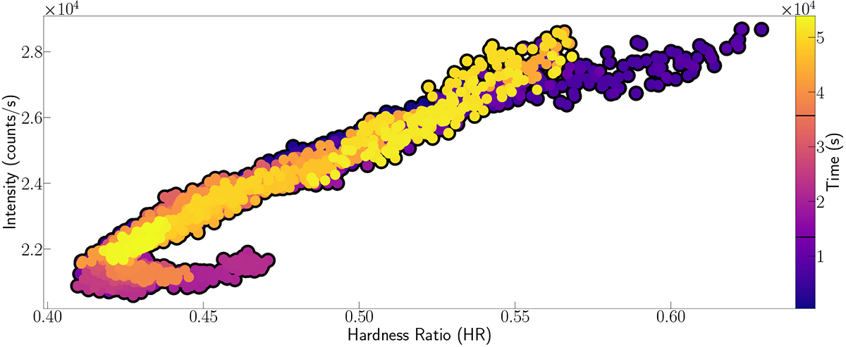
Download original image
Hardness-intensity diagram for the entire dataset. The colour scale represents the relative time in seconds after removing time gaps and instrumental drops (as shown in the x axis of Fig. 2). The two division marks in the colour bar show the limit of each NICER observation.
Current usage metrics show cumulative count of Article Views (full-text article views including HTML views, PDF and ePub downloads, according to the available data) and Abstracts Views on Vision4Press platform.
Data correspond to usage on the plateform after 2015. The current usage metrics is available 48-96 hours after online publication and is updated daily on week days.
Initial download of the metrics may take a while.