Fig. 2.
Download original image
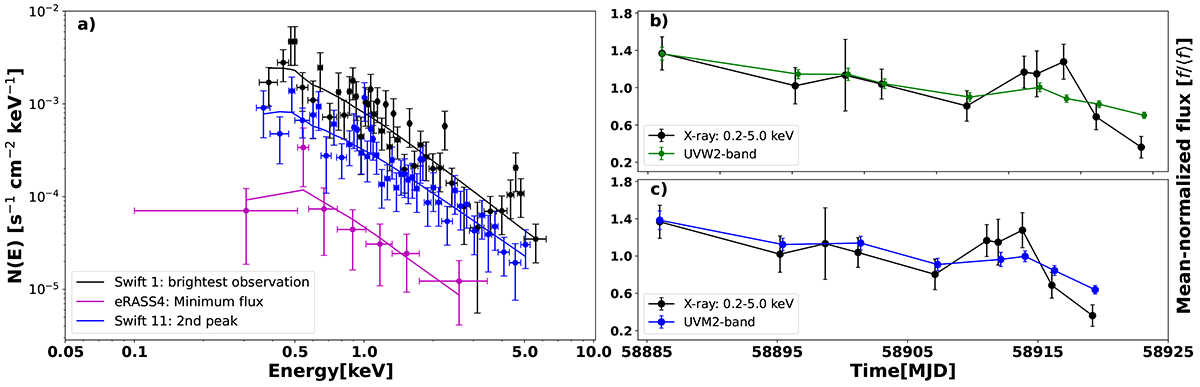
X-ray spectra and light curves. Panel (a) shows the variation in the three selected X-ray spectra taken during the brightest phase, the minimum flux, and during the second peak. The round markers represent unfolded data and the solid lines represent best-fit model. Black represents the brightest X-ray observation from Swift, magenta represents the minimum flux observation from eROSITA and blue represents the second peak from Swift. Panels (b) and (c) shows the mean-normalized light curves exhibiting short-term variability in the decaying part of the flare, between MJD 58880 to 58920 for 0.2–5.0 keV X-ray and the UVW2 and UVM2 band, respectively.
Current usage metrics show cumulative count of Article Views (full-text article views including HTML views, PDF and ePub downloads, according to the available data) and Abstracts Views on Vision4Press platform.
Data correspond to usage on the plateform after 2015. The current usage metrics is available 48-96 hours after online publication and is updated daily on week days.
Initial download of the metrics may take a while.