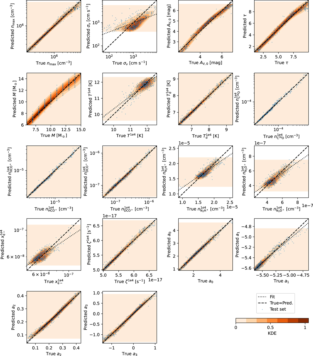
Fig. 6
Download original image
Comparison between the true (x-axis) and the predicted (y-axis) parameter values for the models in the test set (scatter plot points). Each panel is calculated for a specific model parameter (see axis labels). A perfect match between the true and predicted values corresponds to the dashed line. The dotted line represents the fit of the scatter points, while the colored contours are their kernel density estimation (KDE) normalized to the maximum value. The KDE color scale in the last panel is the same for all the panels. We note that (ζ) is in units of 10−17 s−1.
Current usage metrics show cumulative count of Article Views (full-text article views including HTML views, PDF and ePub downloads, according to the available data) and Abstracts Views on Vision4Press platform.
Data correspond to usage on the plateform after 2015. The current usage metrics is available 48-96 hours after online publication and is updated daily on week days.
Initial download of the metrics may take a while.