Fig. 5.
Download original image
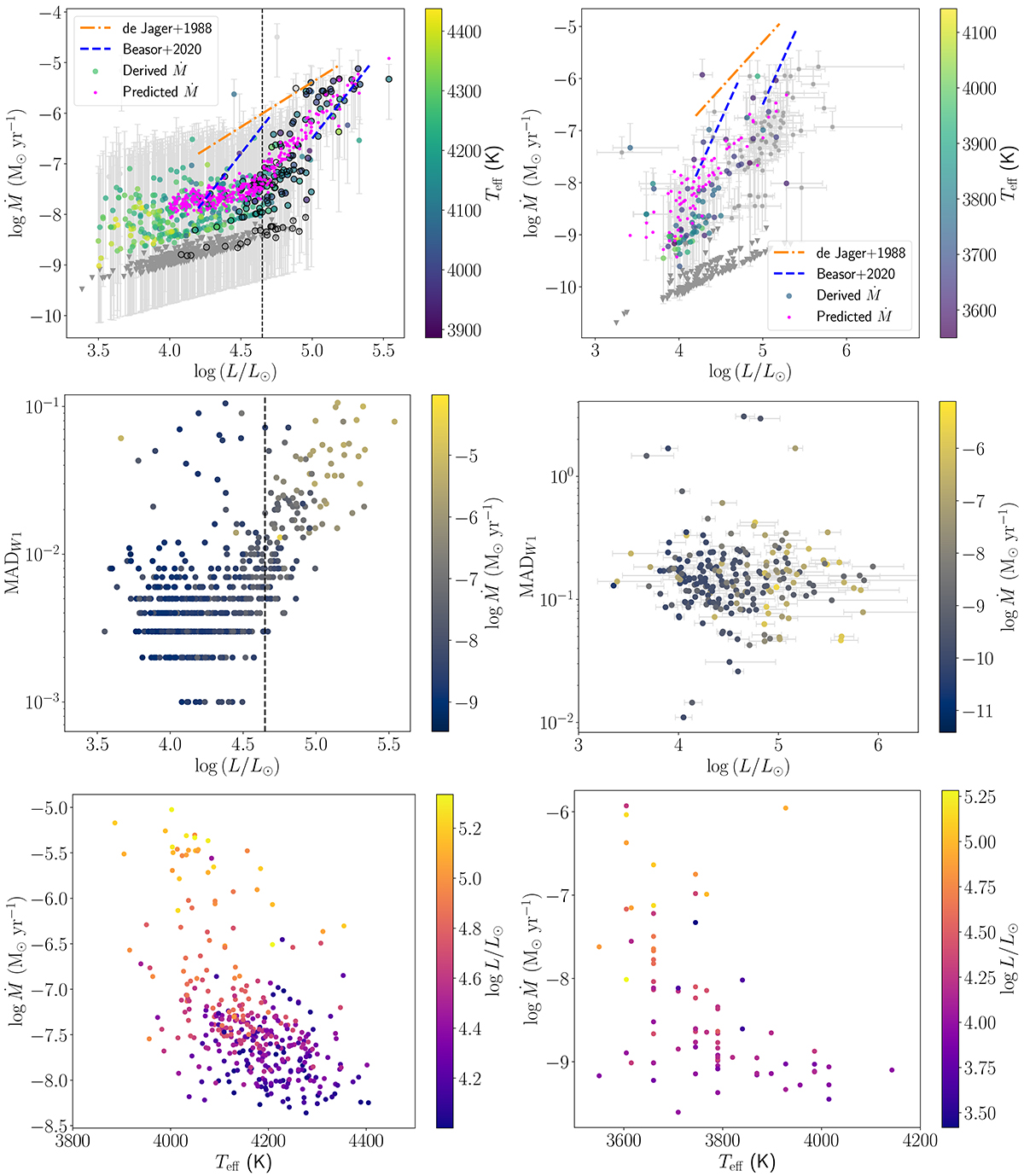
Top: mass-loss rates vs. luminosity for SMC (left) and MW (right). The colour bar shows the Teff. The grey triangles represent the upper limits, and the open circles indicate the RSGs with spectral classifications. The magenta points correspond to the prediction of the derived Ṁ(L,Teff) relation. The dashed blue lines show the prescription from Beasor et al. (2020) for initial masses of 10 and 20 M⊙ and the dash-dotted orange line is the one from de Jager et al. (1988). Middle: MAD of W1 band vs luminosity diagram for the SMC (left) and the MW (right). The colour bar shows the mass-loss rate. Bottom: mass-loss rates vs the effective temperature for the SMC (left) and the MW (right) indicating the luminosity with colour.
Current usage metrics show cumulative count of Article Views (full-text article views including HTML views, PDF and ePub downloads, according to the available data) and Abstracts Views on Vision4Press platform.
Data correspond to usage on the plateform after 2015. The current usage metrics is available 48-96 hours after online publication and is updated daily on week days.
Initial download of the metrics may take a while.