Fig. 3.
Download original image
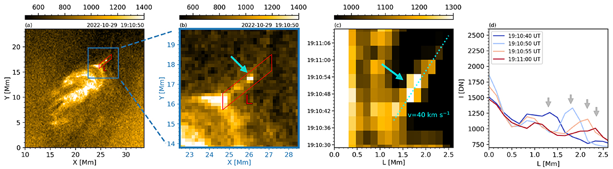
Plasmoid signatures in case 08. Panel a: Context view showing the CBP and the current sheet within a rectangle of length, L, and width, W. Panel b: Zoomed-in view of the blue rectangle shown in panel a, highlighting the illustrative plasmoid with a cyan arrow. Panel c: Space–time plot of the current sheet, obtained by taking the maximum intensity along the W direction. The cyan dashed line indicates the trajectory of the plasmoid. Panel d: Intensity profiles along the current sheet at different times, illustrating the evolution of the plasmoid indicated in panel c. An animation of this figure is available on zenodo and online, showing the evolution of the plasmoid between 19:10:35 UT and 19:11:10 UT.
Current usage metrics show cumulative count of Article Views (full-text article views including HTML views, PDF and ePub downloads, according to the available data) and Abstracts Views on Vision4Press platform.
Data correspond to usage on the plateform after 2015. The current usage metrics is available 48-96 hours after online publication and is updated daily on week days.
Initial download of the metrics may take a while.