Fig. 4.
Download original image
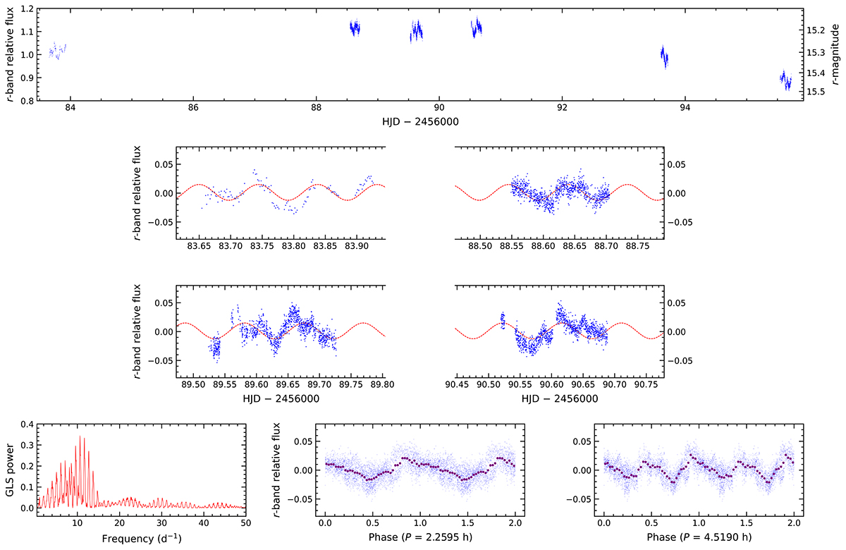
Top panel: r-band light curves from SMARTS 0.9-m and INT/WFC, expressed as flux ratios and magnitudes, relative to the comparison star. Middle panels: SMARTS light curve (top left) and INT/WFC light curves from the first three nights when J1910 maintained an almost constant flux level, after subtracting the nightly averages. The red dashed curve represents the best-fit sine wave with a period corresponding to the highest peak in the periodogram shown below. Bottom left panel: GLS periodogram of the four r-band light curves displayed in the middle panels (4, 9, 10, and 11 Jun. 2012). The highest peak corresponds to a period of 0.0941 d ( = 2.26 h). Bottom middle and right panels: The four light curves folded on this period and twice that value. The pale blue points represent the unbinned data, while the purple points are binned data across 40 phase intervals. The zero phase corresponds to the HJD of the first data point and a full cycle is repeated for continuity.
Current usage metrics show cumulative count of Article Views (full-text article views including HTML views, PDF and ePub downloads, according to the available data) and Abstracts Views on Vision4Press platform.
Data correspond to usage on the plateform after 2015. The current usage metrics is available 48-96 hours after online publication and is updated daily on week days.
Initial download of the metrics may take a while.