Fig. 2.
Download original image
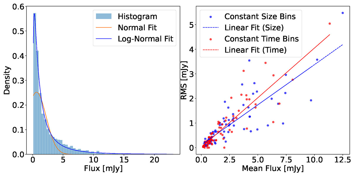
Left panel: Flux distribution from ∼12 years of R-band observations. The histogram (blue bars) shows the flux counts. The red curve is the best-fitting normal function, and the blue curve is the best-fitting log-normal function. Right panel: RMS (i.e., the square root of the excess variance) as a function of the mean flux, computed in (1) bins containing an equal number of data points (blue markers), and (2) bins of fixed time length (red markers). The solid blue and red lines indicate the best linear fits for each binning scheme.
Current usage metrics show cumulative count of Article Views (full-text article views including HTML views, PDF and ePub downloads, according to the available data) and Abstracts Views on Vision4Press platform.
Data correspond to usage on the plateform after 2015. The current usage metrics is available 48-96 hours after online publication and is updated daily on week days.
Initial download of the metrics may take a while.