Fig. 7
Download original image
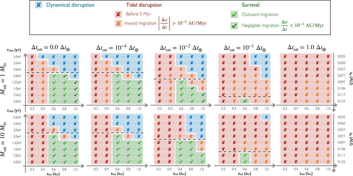
Survival chart of a 1.0 MIo (first row) and a 10.0 MIo (second row) satellite for different satellite dissipations and for equilibrium tides only, from no dissipation (left) to Δtsat = 1 Δt⊕ (right). The fate of the satellites is a function of the disk lifetime (left vertical axis) and the corresponding final semimajor axis of the planet (right vertical axis) and its initial position (horizontal axis). The blue crosses and region correspond to the dynamical disruption scenario. The red crosses correspond to satellites that underwent a tidal disruption within the simulation time (5 Myr), the orange crosses correspond to satellites that are migrating inward at a rate faster than 10−4 AU/Myr. This population (red and orange crosses) is outlined by the red region. The dark green check signs correspond to satellites whose fate is not clear (migration lower than 10−4 AU/Myr). The light green check signs correspond to an outward migration at a rate faster than 10−4 AU/Myr. The green region therefore corresponds to satellites that should survive. The black dashed line shows the final planet semimajor axis below which there is no survival of satellites.
Current usage metrics show cumulative count of Article Views (full-text article views including HTML views, PDF and ePub downloads, according to the available data) and Abstracts Views on Vision4Press platform.
Data correspond to usage on the plateform after 2015. The current usage metrics is available 48-96 hours after online publication and is updated daily on week days.
Initial download of the metrics may take a while.