Fig. 9.
Download original image
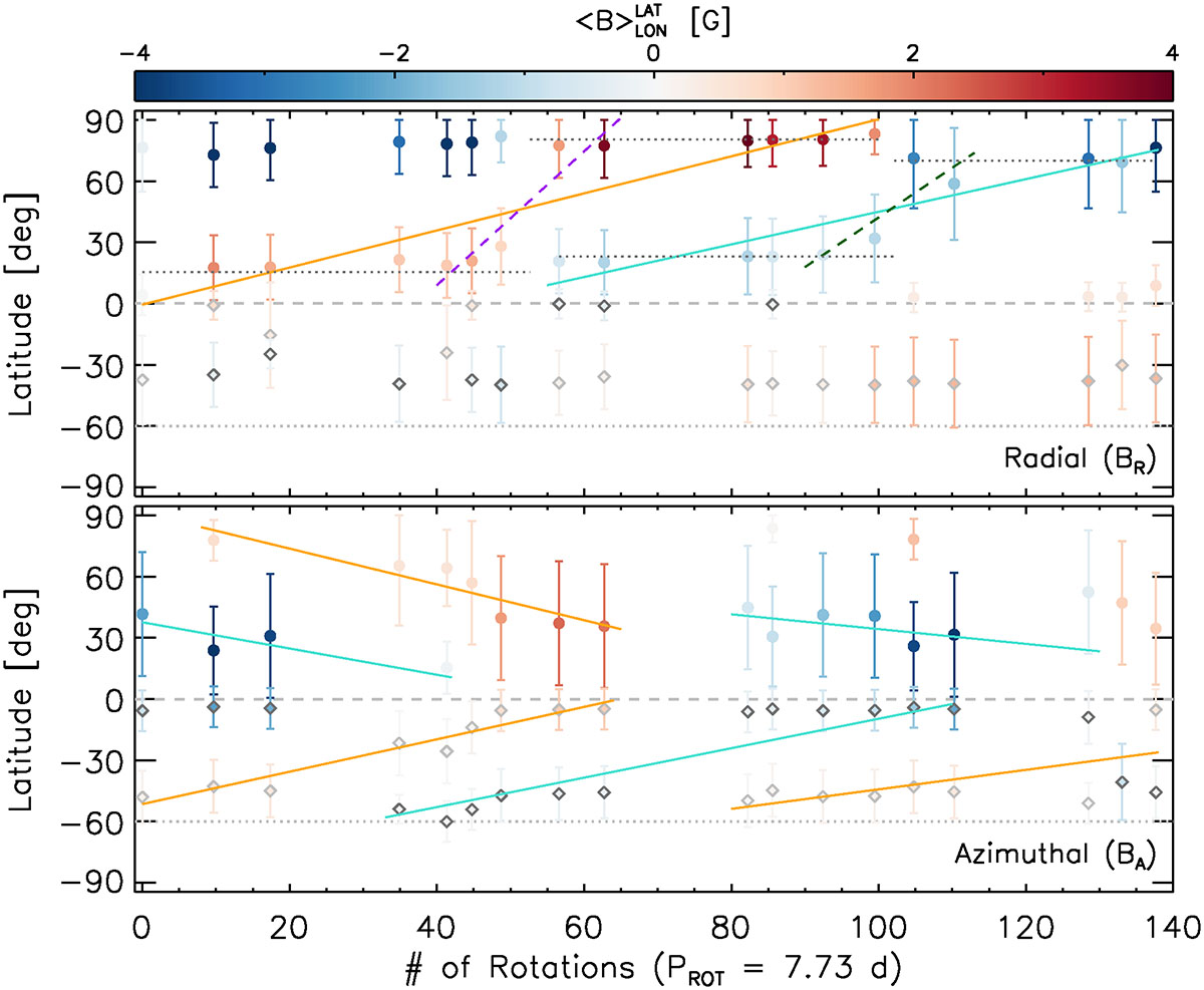
Analysis of the large-scale flows on ι Hor based on the magnetic butterfly diagrams (Fig. 7) for the radial (top) and azimuthal (bottom) components. Individual points indicate the field-weighted mean latitude hosting each polarity at a given epoch, with error bars denoting its standard deviation within the averaged latitudinal bin. Filled colored circles and gray open diamonds indicate locations within the northern and southern hemispheres, respectively. The latitudinally averaged magnetic field strength, ![]() , is denoted by the color bar. Lines (solid and dashed) correspond to different fits aimed at estimating the poleward and equatorward migration of the large-scale field. The line colors indicate which polarity of the magnetic field the fits are tracing: positive (orange and magenta) or negative (cyan and green). Dotted lines in the top panel show the best-fit two-latitude models (slope = 0.0) for each polarity used for statistical model comparison (see Sect. 3.3 for details).
, is denoted by the color bar. Lines (solid and dashed) correspond to different fits aimed at estimating the poleward and equatorward migration of the large-scale field. The line colors indicate which polarity of the magnetic field the fits are tracing: positive (orange and magenta) or negative (cyan and green). Dotted lines in the top panel show the best-fit two-latitude models (slope = 0.0) for each polarity used for statistical model comparison (see Sect. 3.3 for details).
Current usage metrics show cumulative count of Article Views (full-text article views including HTML views, PDF and ePub downloads, according to the available data) and Abstracts Views on Vision4Press platform.
Data correspond to usage on the plateform after 2015. The current usage metrics is available 48-96 hours after online publication and is updated daily on week days.
Initial download of the metrics may take a while.