Open Access
Fig. 7
Download original image
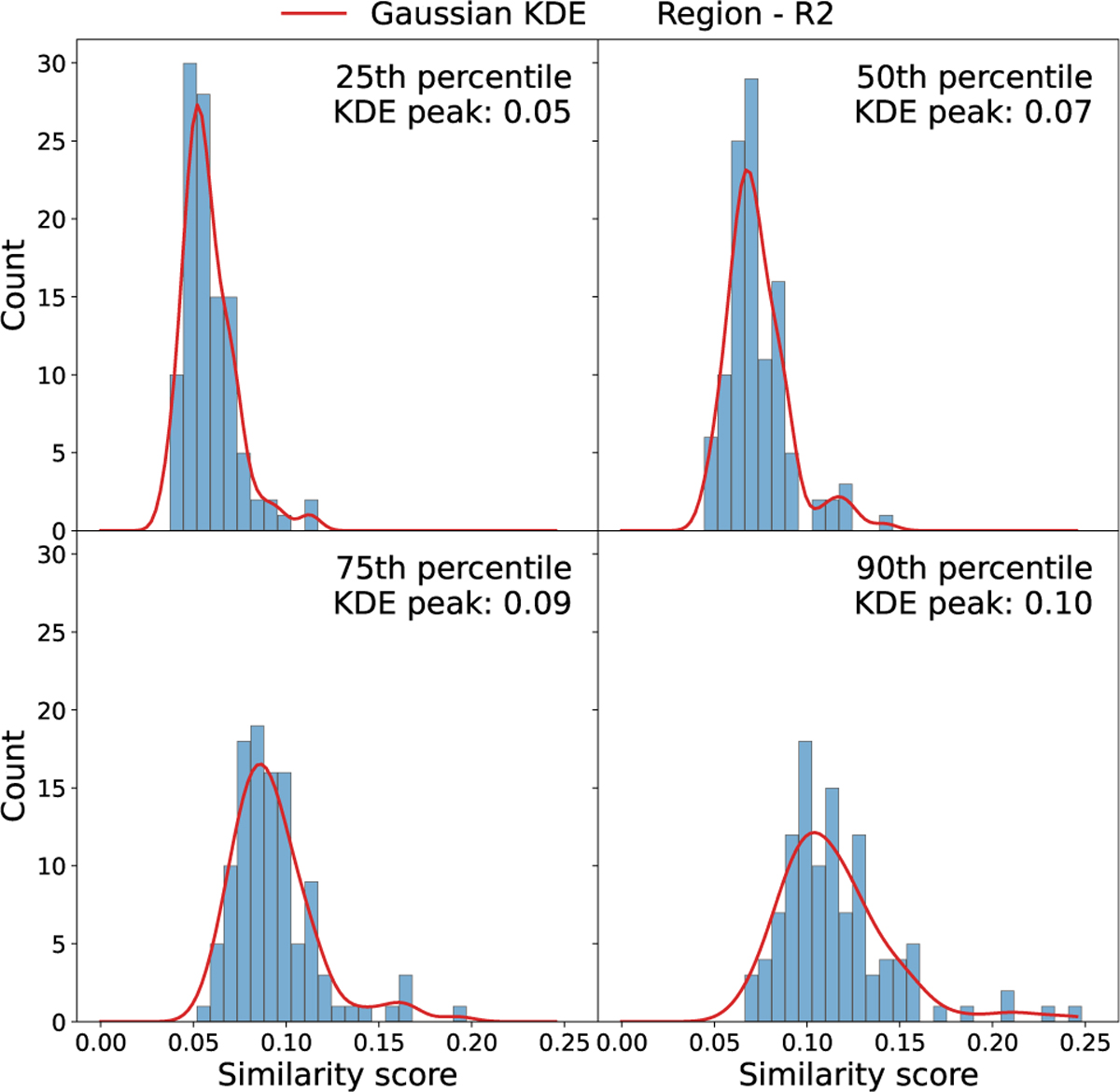
Each subplot shows a histogram of similarity scores thresholds obtained (as shown in Fig. 6) for the references in the region R2, but computed using different percentiles (25th, 50th, 75th, and 90th). The red curve represents a smoothed distribution obtained using a Gaussian kernel density estimation (KDE).
Current usage metrics show cumulative count of Article Views (full-text article views including HTML views, PDF and ePub downloads, according to the available data) and Abstracts Views on Vision4Press platform.
Data correspond to usage on the plateform after 2015. The current usage metrics is available 48-96 hours after online publication and is updated daily on week days.
Initial download of the metrics may take a while.