Fig. 9
Download original image
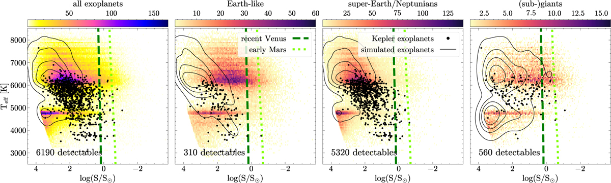
Effective temperature vs. instellation, analogous to Fig. 6, but for the simulated Kepler field. The distribution of the exoplanets observed by Kepler is shown as black dots, while the distribution of ‘detectable’ exoplanets in the Kepler simulation is shown in black density contours. The background distribution shows the distribution of planets after applying magnitude cuts described in Sect. 4.1. The number of detectable exoplanets in the simulated Kepler field is indicated on the lower left part of each panel.
Current usage metrics show cumulative count of Article Views (full-text article views including HTML views, PDF and ePub downloads, according to the available data) and Abstracts Views on Vision4Press platform.
Data correspond to usage on the plateform after 2015. The current usage metrics is available 48-96 hours after online publication and is updated daily on week days.
Initial download of the metrics may take a while.