Fig. 4.
Download original image
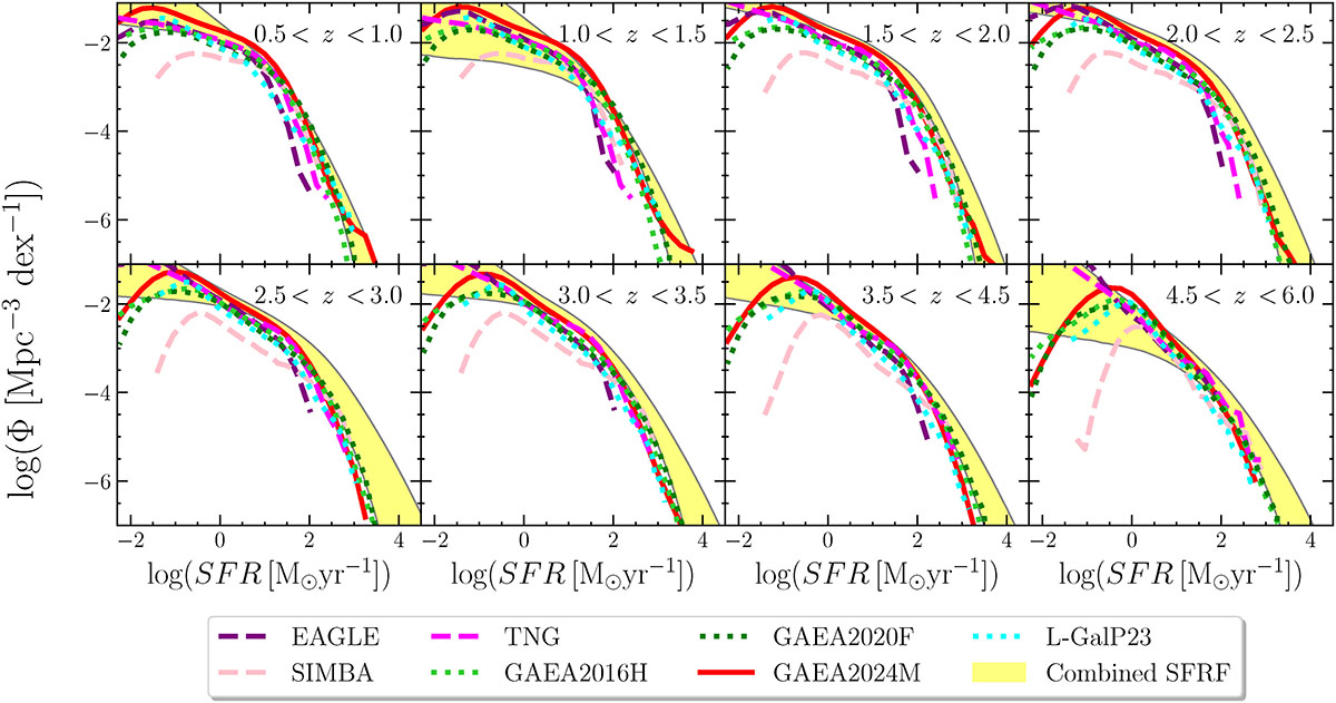
Observed SFRF compared with predictions from simulations and SAMs. The yellow region represents the observed data used for the fit. The black curve indicates the best fit. The dashed purple line represents the SFRF from the EAGLE simulation, the dashed pink curve shows the result from the SIMBA simulation, and the magenta line corresponds to IllustrisTNG (Katsianis et al. 2017a, 2021a). The lime-green and green dotted curves show the predictions from the GAEA SAM by Hirschmann et al. (2016) and Fontanot et al. (2020), respectively. Finally, the dotted cyan curves show the predictions by Parente et al. (2023).
Current usage metrics show cumulative count of Article Views (full-text article views including HTML views, PDF and ePub downloads, according to the available data) and Abstracts Views on Vision4Press platform.
Data correspond to usage on the plateform after 2015. The current usage metrics is available 48-96 hours after online publication and is updated daily on week days.
Initial download of the metrics may take a while.