Fig. 3.
Download original image
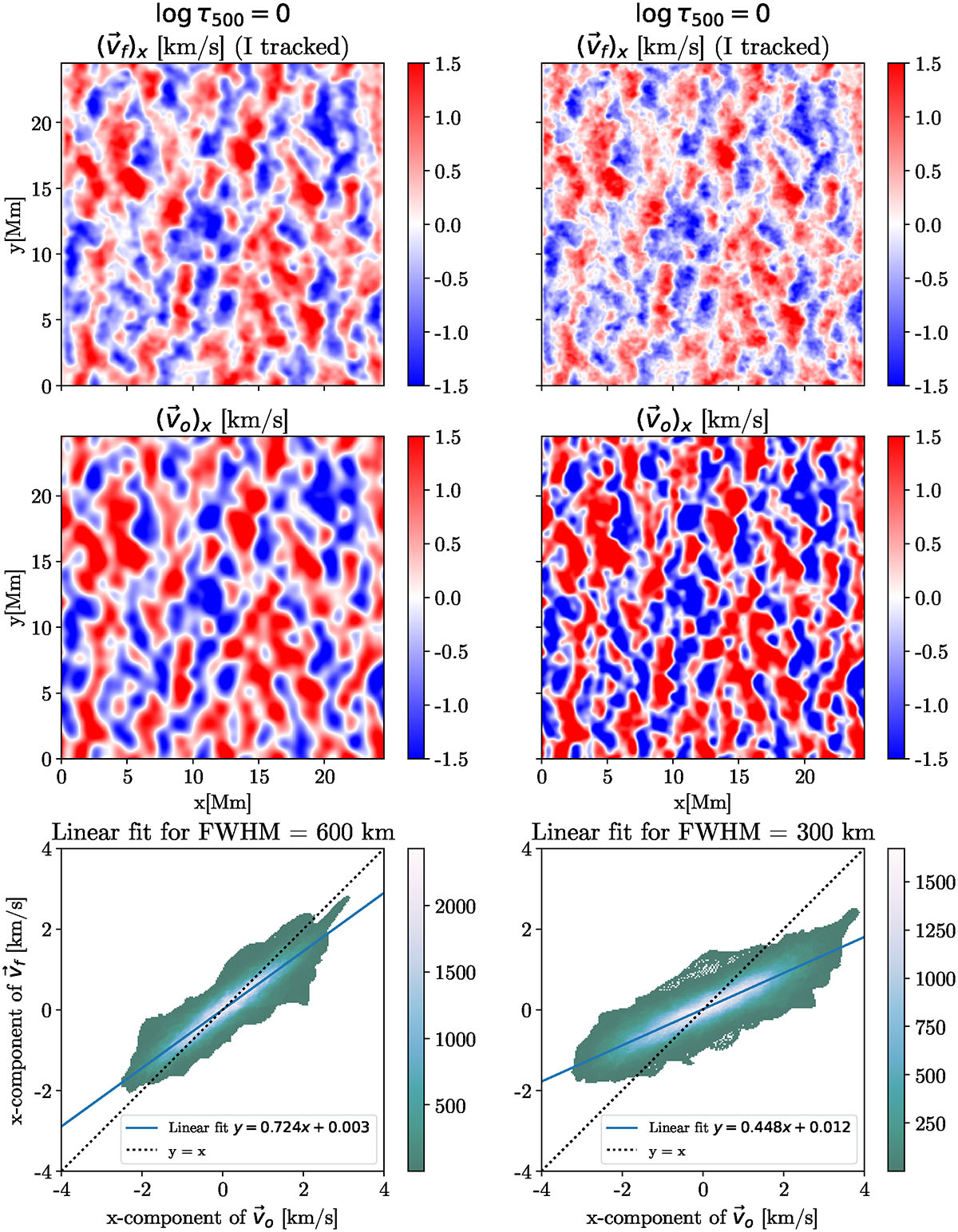
Comparison between the x component of the horizontal velocity retrieved by FLCT applied to intensity maps and the simulated velocity at log τ500 = 0. Color maps indicate the magnitude of velocity. Bottom row: Scatter plot showing the least-squares fit between vo and vf. Results are shown for two different sizes of apodizing windows: left, 600 km; right, 300 km.
Current usage metrics show cumulative count of Article Views (full-text article views including HTML views, PDF and ePub downloads, according to the available data) and Abstracts Views on Vision4Press platform.
Data correspond to usage on the plateform after 2015. The current usage metrics is available 48-96 hours after online publication and is updated daily on week days.
Initial download of the metrics may take a while.