Open Access
Fig. C.1
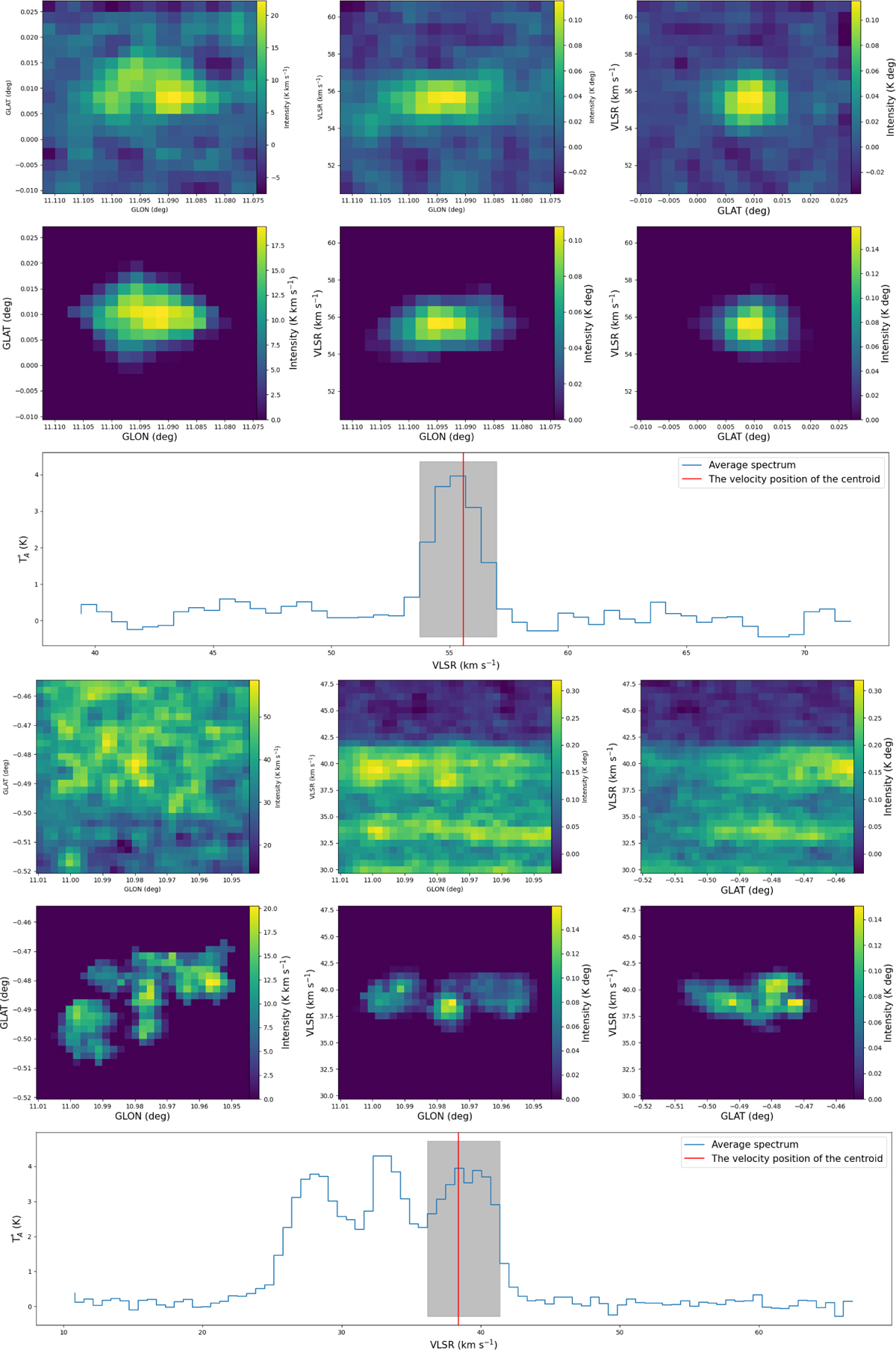
Download original image
Example of a true (top) and false (bottom) molecular clump. Each example includes integrated maps (first row), masked maps retaining the clump region (second row), and the clump’s average spectrum (third row), with red lines marking centroid velocity, and the shaded area indicating the velocity range.
Current usage metrics show cumulative count of Article Views (full-text article views including HTML views, PDF and ePub downloads, according to the available data) and Abstracts Views on Vision4Press platform.
Data correspond to usage on the plateform after 2015. The current usage metrics is available 48-96 hours after online publication and is updated daily on week days.
Initial download of the metrics may take a while.