Fig. A.2
Download original image
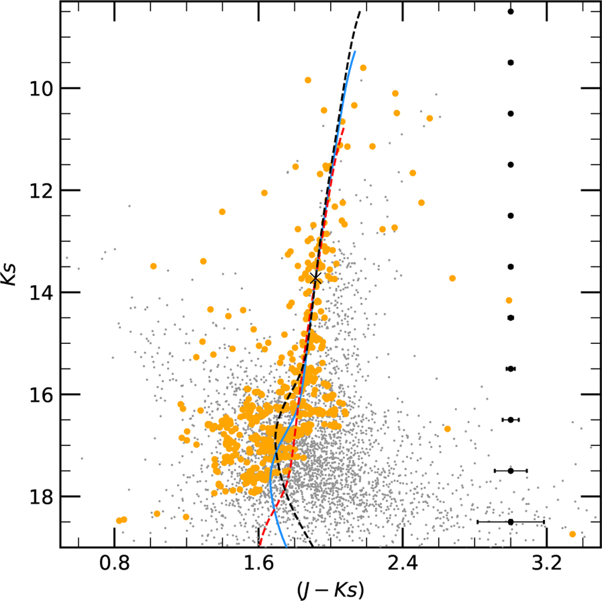
Same as Fig. 6 , but with overlaid isochrone curves to exemplify the fitting process. The solid blue curve represents the best-fitting isochrone resulting from the complete procedure. The dashed lines illustrate the same theoretical model shifted when choosing different comparison points; the red curve corresponds to a lower E(J − Ks)i value (1.36), while the black curve corresponds to a higher value (1.43) than that obtained for the optimal solution (blue curve).
Current usage metrics show cumulative count of Article Views (full-text article views including HTML views, PDF and ePub downloads, according to the available data) and Abstracts Views on Vision4Press platform.
Data correspond to usage on the plateform after 2015. The current usage metrics is available 48-96 hours after online publication and is updated daily on week days.
Initial download of the metrics may take a while.