Fig. 7
Download original image
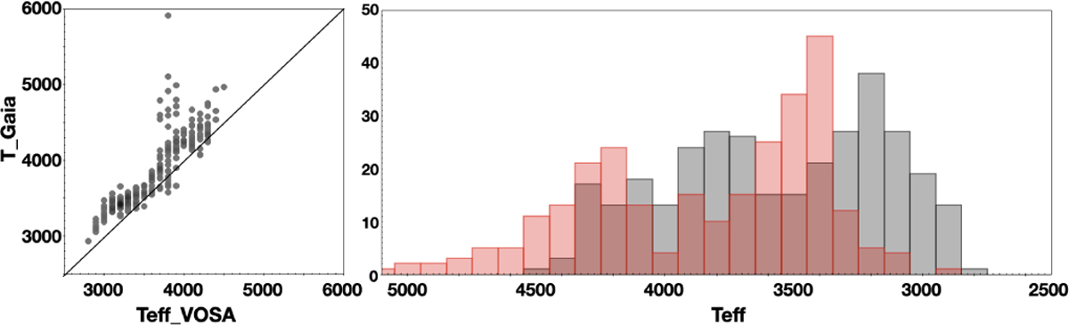
Left panel. Comparison of the individual temperatures from Gaia and VOSA, showing that the Gaia temperatures are significantly hotter than the VOSA temperatures in the mean. Right panel. Effective temperature distribution from Gaia and VOSA shown in red and gray, respectively, illustrating that the VOSA temperatures have less scatter and are cooler in the mean than the ones from Gaia.
Current usage metrics show cumulative count of Article Views (full-text article views including HTML views, PDF and ePub downloads, according to the available data) and Abstracts Views on Vision4Press platform.
Data correspond to usage on the plateform after 2015. The current usage metrics is available 48-96 hours after online publication and is updated daily on week days.
Initial download of the metrics may take a while.