Fig. 10.
Download original image
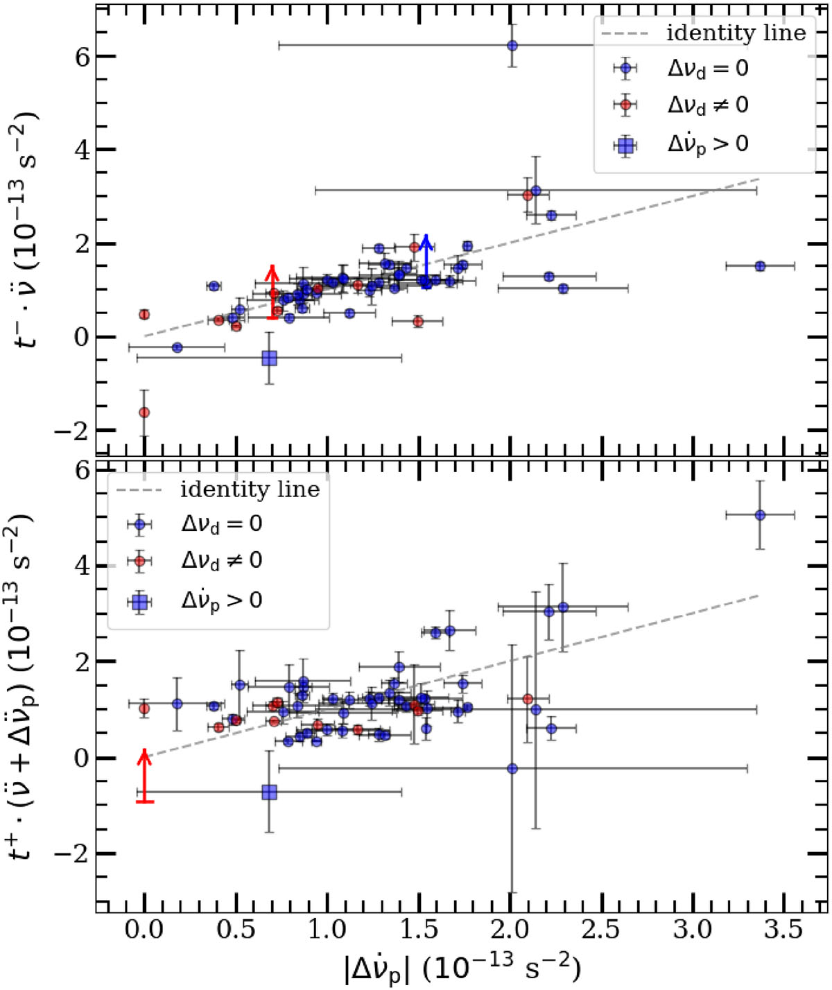
Comparison between ![]() and the waiting time (t±) multiplied by the value of the second derivative of the frequency (
and the waiting time (t±) multiplied by the value of the second derivative of the frequency (![]() before the glitch,
before the glitch, ![]() after the glitch). The red points represent the glitches for which recoveries were detected, and the blue points represent the glitches for which we did not detect a recovery. The blue square represents a glitch for which we measured a positive value of
after the glitch). The red points represent the glitches for which recoveries were detected, and the blue points represent the glitches for which we did not detect a recovery. The blue square represents a glitch for which we measured a positive value of ![]() . Top panel: Time (t−) since the previous glitch. The vertical arrows indicate the lower limits for glitches 1 (red arrow) and 46 (blue arrow). Bottom panel: Waiting time (t+) until the following glitch. The vertical arrow indicates the lower limit for glitch 45. As in Fig. 5, we included glitch 66 in this plot.
. Top panel: Time (t−) since the previous glitch. The vertical arrows indicate the lower limits for glitches 1 (red arrow) and 46 (blue arrow). Bottom panel: Waiting time (t+) until the following glitch. The vertical arrow indicates the lower limit for glitch 45. As in Fig. 5, we included glitch 66 in this plot.
Current usage metrics show cumulative count of Article Views (full-text article views including HTML views, PDF and ePub downloads, according to the available data) and Abstracts Views on Vision4Press platform.
Data correspond to usage on the plateform after 2015. The current usage metrics is available 48-96 hours after online publication and is updated daily on week days.
Initial download of the metrics may take a while.