Fig. 2.
Download original image
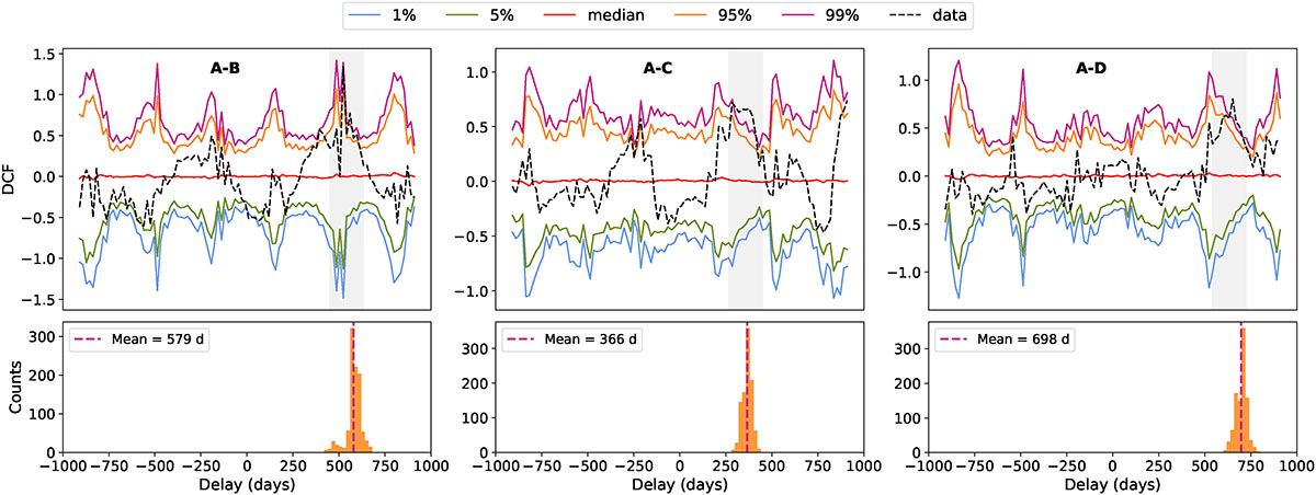
Upper panels: DCF between each pair of images, in the r band. The red line represents the mean correlation of unrelated quasars (from simulations). The solid curves represent the percentiles of that distribution: fuchsia (99), orange (95), green (5), and light blue (1). These curves define the range of correlations expected from random, unrelated light curves. The dashed line is the actual cross-correlation between a real pair of light curves; it approaches the upper percentile around a specific time delay, indicating a significant correlation that is unlikely to happen by chance. Lower panels: Distribution of centroid positions obtained from the bootstrap resampling, reflecting the uncertainty on the centroid determination.
Current usage metrics show cumulative count of Article Views (full-text article views including HTML views, PDF and ePub downloads, according to the available data) and Abstracts Views on Vision4Press platform.
Data correspond to usage on the plateform after 2015. The current usage metrics is available 48-96 hours after online publication and is updated daily on week days.
Initial download of the metrics may take a while.