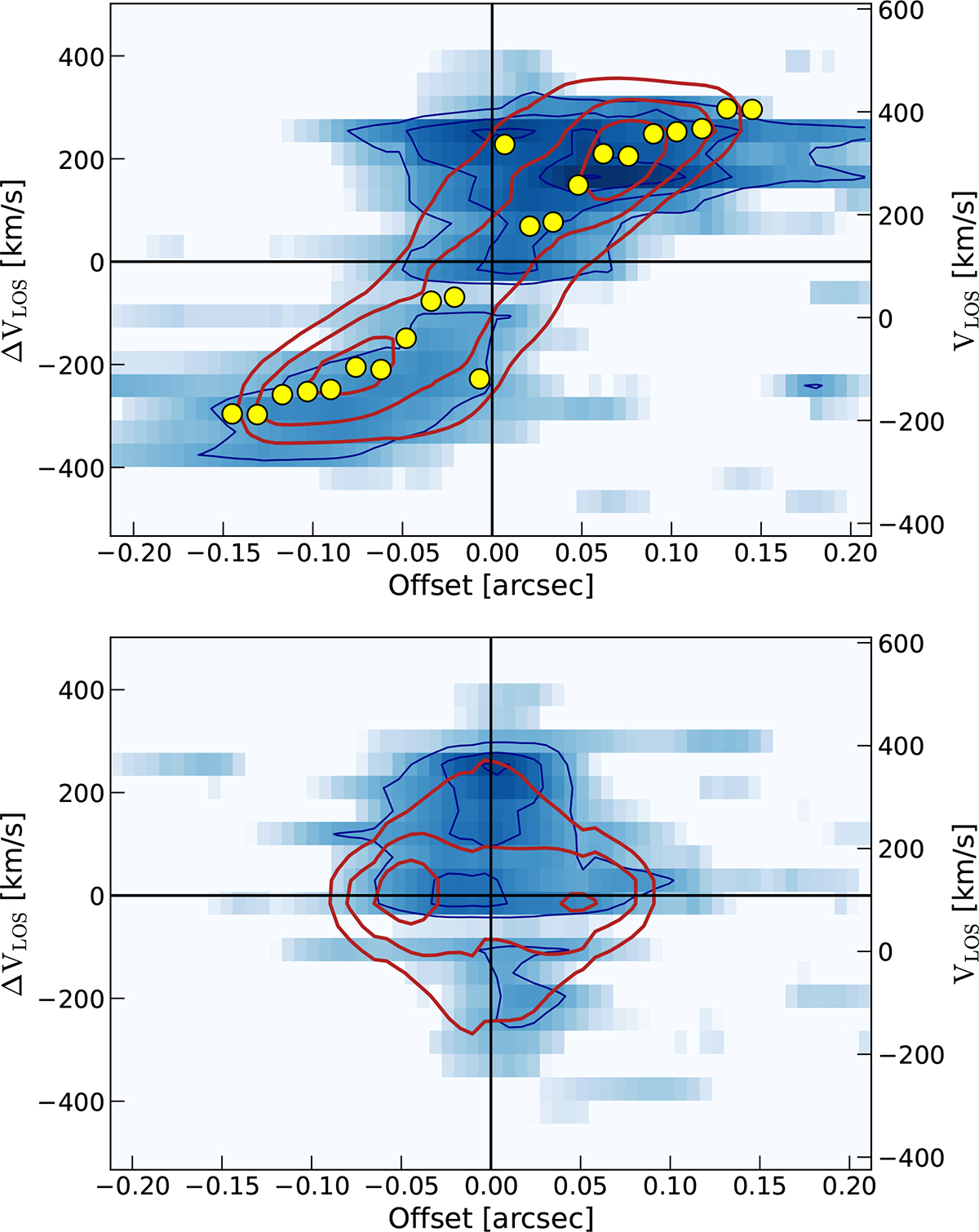
Fig. 8.
Download original image
PV diagrams from 3DBAROLO, upper: major axis, lower: minor axis. The blue contours show the contours of the data at 2, 3, 4, 5σ levels, and the red contours show the best-fit model to the data. In the major axis pv diagram, the yellow dots show the best fit rotational velocity in each of the rings. The right axis (VLOS) shows the velocities centered around the systemic velocity of the galaxy at the redshift of G09v1.97 (z = 3.63). The left axis (ΔVLOS) shows the velocities centered around the user-set systemic velocity, here 120 km/s (Table 5).
Current usage metrics show cumulative count of Article Views (full-text article views including HTML views, PDF and ePub downloads, according to the available data) and Abstracts Views on Vision4Press platform.
Data correspond to usage on the plateform after 2015. The current usage metrics is available 48-96 hours after online publication and is updated daily on week days.
Initial download of the metrics may take a while.