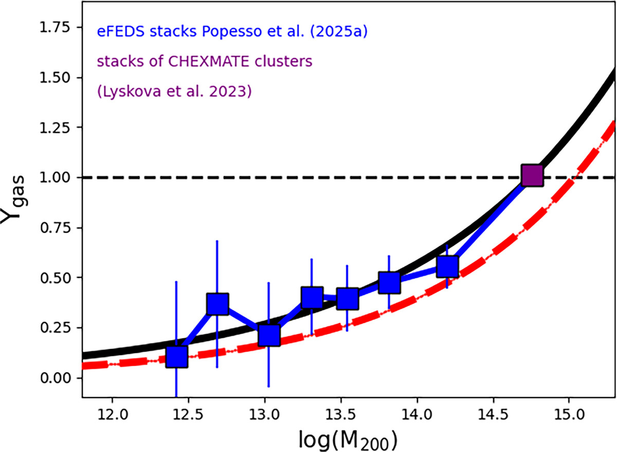
Fig. 5.
Download original image
Ygas–M200 relation. The blue squares indicate the Ygas derived from the stacked groups of Popesso et al. (2025a) The purple square indicates the value derived from the CHEXMATE clusters stacked in eROSITA data by Lyskova et al. (2023). The solid black curve represents our best fit to stacked points, including the CHEXMATE clusters. The dashed red line shows the best fit of the Ygas − M500 relation of Fig. 4.
Current usage metrics show cumulative count of Article Views (full-text article views including HTML views, PDF and ePub downloads, according to the available data) and Abstracts Views on Vision4Press platform.
Data correspond to usage on the plateform after 2015. The current usage metrics is available 48-96 hours after online publication and is updated daily on week days.
Initial download of the metrics may take a while.