Fig. D.1.
Download original image
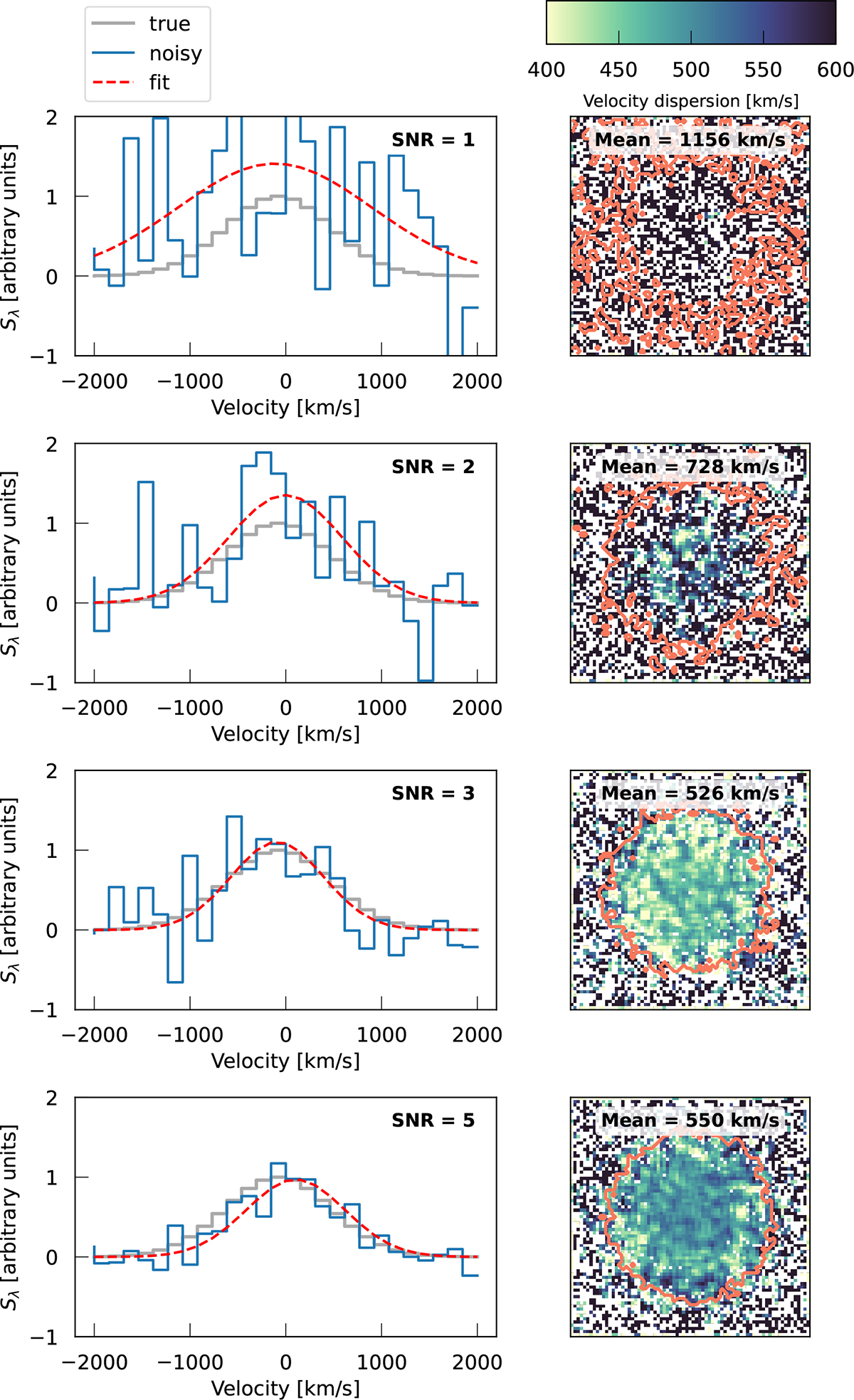
Effect of varying S/N on the spectral fits and velocity dispersion maps. The left column shows how the input Gaussian spectrum (gray) is degraded with noise (blue) at different S/N levels (shown at top right corner). In each panel, the resulting Gaussian fit is shown with a dashed red line. The right column shows the resulting velocity dispersion map from degrading the synthetic data cube, with an orange contour picturing the 2σ isophote of the emission.
Current usage metrics show cumulative count of Article Views (full-text article views including HTML views, PDF and ePub downloads, according to the available data) and Abstracts Views on Vision4Press platform.
Data correspond to usage on the plateform after 2015. The current usage metrics is available 48-96 hours after online publication and is updated daily on week days.
Initial download of the metrics may take a while.