Fig. 4
Download original image
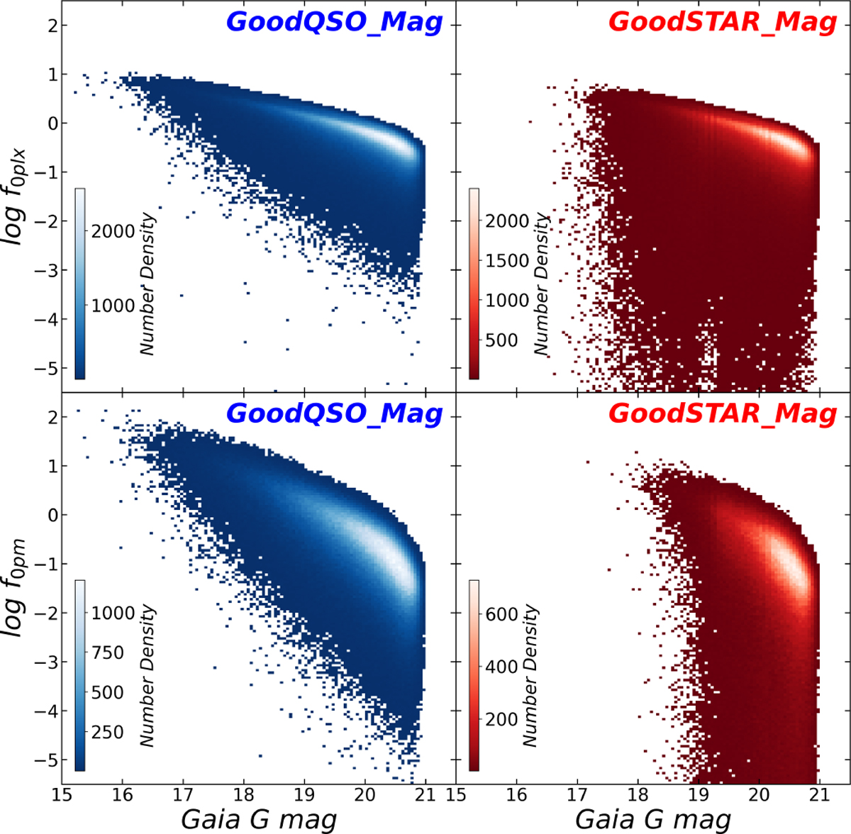
log f0plx vs. Gaia G-band magnitude (top row) and log f0pm vs. Gaia G-band magnitude (bottom row) distributions of the GoodQSO_Mag (blue) and GoodSTAR_Mag (red). The color bar in each subplot represents the number density of the distribution. Note: the color map in each subplot follows its own color bar, and thus, identical colors across different subplots do not represent equivalent number densities. All the subplots display only small parts of the whole distributions to exhibit the critical data region.
Current usage metrics show cumulative count of Article Views (full-text article views including HTML views, PDF and ePub downloads, according to the available data) and Abstracts Views on Vision4Press platform.
Data correspond to usage on the plateform after 2015. The current usage metrics is available 48-96 hours after online publication and is updated daily on week days.
Initial download of the metrics may take a while.