Fig. A.1
Download original image
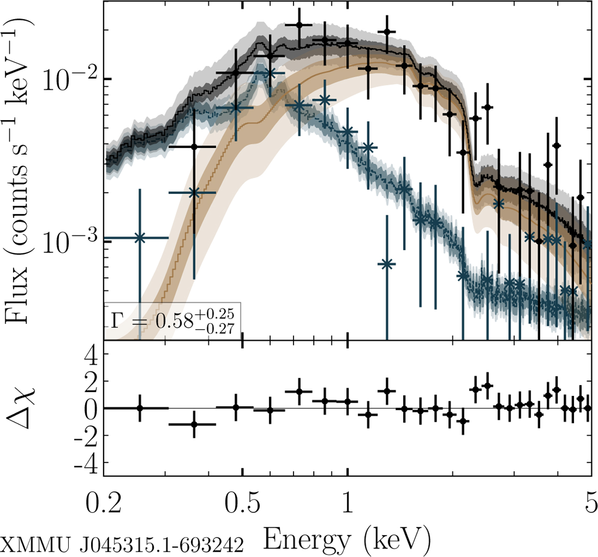
Example for Fig. A.1 in Kaltenbrunner (2025). Merged eROSITA spectrum with best fit models for #1. Black and blue data points are fluxes in the on- and off-region, respectively. Blue and yellow lines show the best-fit models for the background and source, the black line shows the sum of both. Shaded areas display the 1σ (dark) and 3σ (light) confidence for the models.
Current usage metrics show cumulative count of Article Views (full-text article views including HTML views, PDF and ePub downloads, according to the available data) and Abstracts Views on Vision4Press platform.
Data correspond to usage on the plateform after 2015. The current usage metrics is available 48-96 hours after online publication and is updated daily on week days.
Initial download of the metrics may take a while.