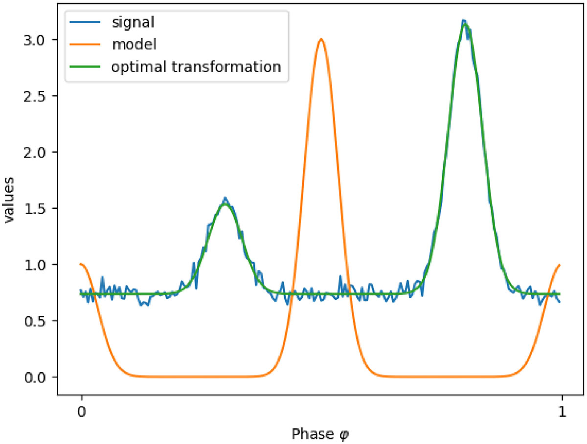
Fig. B.1.
Download original image
Graphical evaluation of the proposed algorithm. The orange curve represents a periodic signal modeling a reference signal from our atlas. The blue curve denotes a noisy signal corresponding to an observed measurement. The green curve illustrates the optimal transformation of the orange signal, obtained through temporal shifts, spatial shift and amplitude scaling, which best matches the blue signal.
Current usage metrics show cumulative count of Article Views (full-text article views including HTML views, PDF and ePub downloads, according to the available data) and Abstracts Views on Vision4Press platform.
Data correspond to usage on the plateform after 2015. The current usage metrics is available 48-96 hours after online publication and is updated daily on week days.
Initial download of the metrics may take a while.