Fig. 6
Download original image
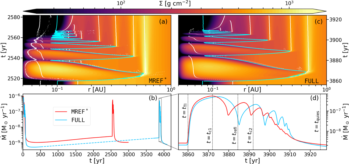
Evolution of the surface densities and accretion rates. Panels a and c: space-time diagrams of MREF* and FULL, respectively. The displayed time spans have the same length. The white contours mark the positions of local pressure maxima, while the cyan line indicates the DZIE at the midplane. Panel b: accretion rates for both models over their entire simulation times. The dashed section of the blue line represents the interpolation between the two bursts. Panel d: magnification of the burst occurring in FULL. The vertical dashed lines mark the time of the ignition of the outburst (tTI), the first and second reflections of the heating front (tc1, tc2), the launching of the first reflare (trefl) and the beginning of the quiescent phase (tquies) for FULL. For comparison, the accretion rate resulting from the burst in MREF* is overplotted, shifted in time so that the respective tTI for both models align.
Current usage metrics show cumulative count of Article Views (full-text article views including HTML views, PDF and ePub downloads, according to the available data) and Abstracts Views on Vision4Press platform.
Data correspond to usage on the plateform after 2015. The current usage metrics is available 48-96 hours after online publication and is updated daily on week days.
Initial download of the metrics may take a while.