Fig. 3.
Download original image
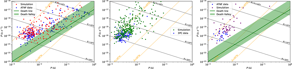
Diagram of P−Ṗ for observed and simulated pulsars in different wavelengths. Left panel: P−Ṗ diagram for the detected pulsars in radio surveys only in the simulations in red along with the observations in radio for the FAST GPPS or PMPS survey in blue. Middle panel: P−Ṗ diagram for the detected pulsars in γ-ray surveys only in the simulations in green, along with the observed pulsars in γ-ray from Fermi surveys only in blue. Right panel: P−Ṗ diagram for the simulated pulsars detected both in radio and γ-ray surveys in purple, along with observations for the FAST GPPS or PMPS survey simultaneously with the γ-ray observations from Fermi in blue. For all the panels, the death line is represented as a green solid line, and the death valley is the shaded green area.
Current usage metrics show cumulative count of Article Views (full-text article views including HTML views, PDF and ePub downloads, according to the available data) and Abstracts Views on Vision4Press platform.
Data correspond to usage on the plateform after 2015. The current usage metrics is available 48-96 hours after online publication and is updated daily on week days.
Initial download of the metrics may take a while.