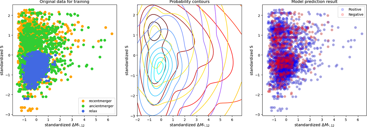
Fig. 6.
Download original image
Example figures of the classification process and result from the 6-indicator Bayesian classifier. Figures are 2D, but the actual classifier was made in a 6D indicator space. Left: Standardized original simulation data distribution on 2D indicator space. Merger stages are shown with different colors, and check it in the legend. Middle: Probability contours. Red, yellow, and blue lines represent probability contours of recent merger, ancient merger, and relaxed samples. Based on these probability contours, the model classifies the dynamical state as shown in the middle panel. Right: Prediction result of the overall sample distribution. Blue dots show the matched classification, and red dots show the mismatched classification. The center of the blue contour region shows good classification, but the center of the red contour region shows conflict of classifications between the recent merger and the ancient merger classification results. It represents an uncertain region of classification.
Current usage metrics show cumulative count of Article Views (full-text article views including HTML views, PDF and ePub downloads, according to the available data) and Abstracts Views on Vision4Press platform.
Data correspond to usage on the plateform after 2015. The current usage metrics is available 48-96 hours after online publication and is updated daily on week days.
Initial download of the metrics may take a while.