Fig. 3.
Download original image
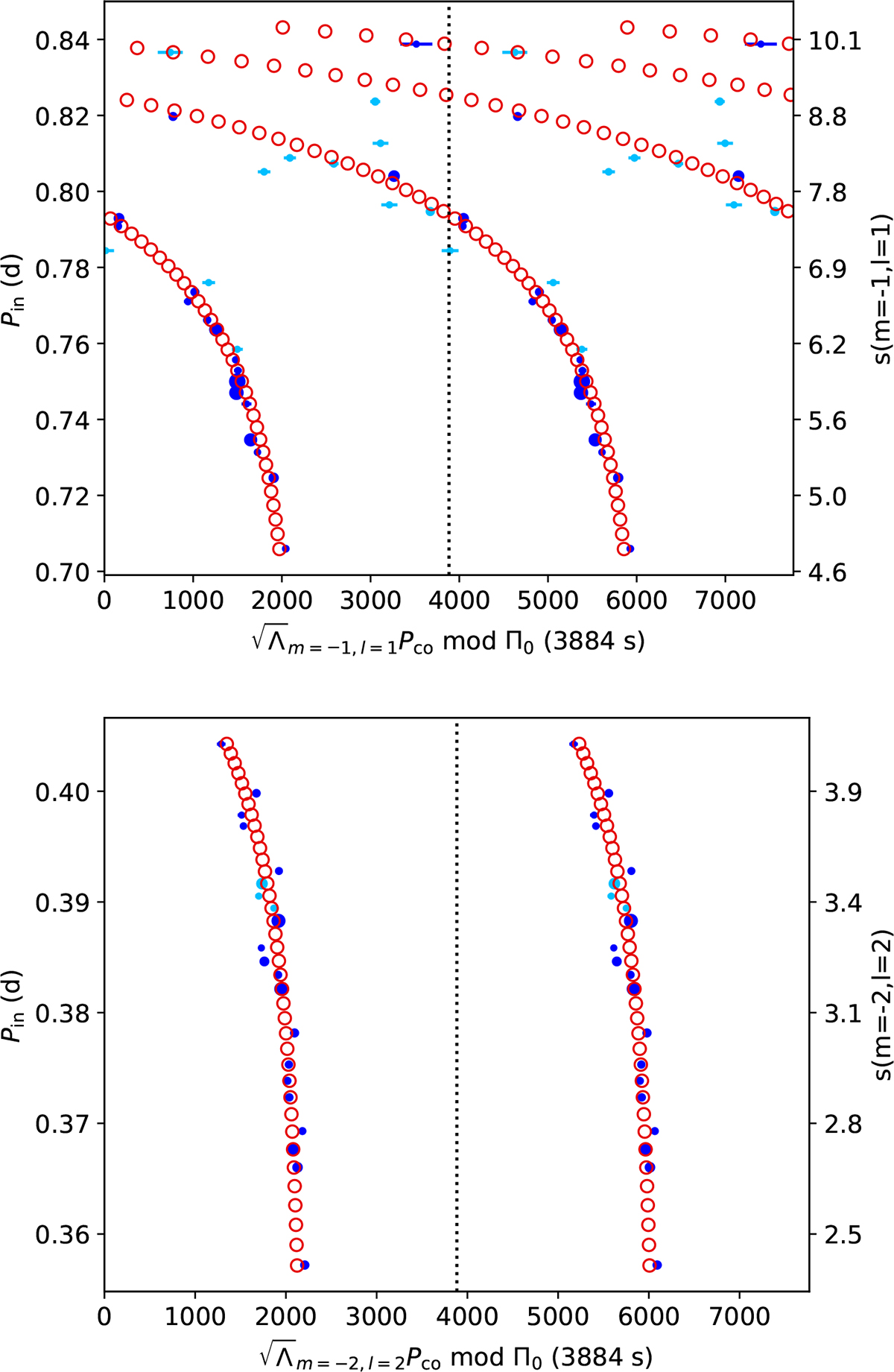
Stretched period échelle diagram of ℓ = 1 (top) and ℓ = 2 (bottom) Kelvin mode frequencies. Navy blue dots indicate observed frequencies used for the analysis. Light blue dots represent observed frequencies that are possible frequency combinations and discarded for the analysis. Red circles are frequencies of the best model including a magnetic field. The size of the dots is proportional to the mode amplitude.
Current usage metrics show cumulative count of Article Views (full-text article views including HTML views, PDF and ePub downloads, according to the available data) and Abstracts Views on Vision4Press platform.
Data correspond to usage on the plateform after 2015. The current usage metrics is available 48-96 hours after online publication and is updated daily on week days.
Initial download of the metrics may take a while.