Fig. 4.
Download original image
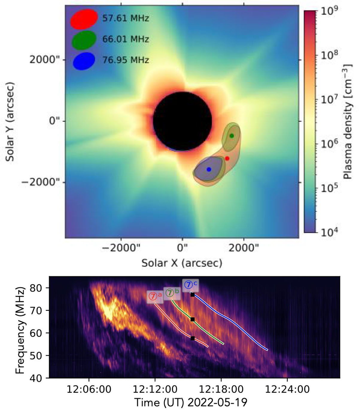
Top: LOFAR radio imaging of the multilane structure in the type II radio burst. The background color map shows the electron density in the corona, as derived from the Predictive Science MHD model (Riley et al. 2011). Higher densities are in red, intermediate densities in green, and lower densities in blue. Bottom: Dynamic spectrum. The three observed lanes (blue, green, and red) are highlighted. The time of the radio imaging is indicated by the black squares (12:16 UT). LOFAR radio contours (80% level) for each lane are displayed in their respective colors, and the source centroid for each is marked with a colored point at the center of the corresponding contour. This figure highlights the correspondence between the radio multilane emission and the underlying coronal density structure.
Current usage metrics show cumulative count of Article Views (full-text article views including HTML views, PDF and ePub downloads, according to the available data) and Abstracts Views on Vision4Press platform.
Data correspond to usage on the plateform after 2015. The current usage metrics is available 48-96 hours after online publication and is updated daily on week days.
Initial download of the metrics may take a while.