Fig. 5
Download original image
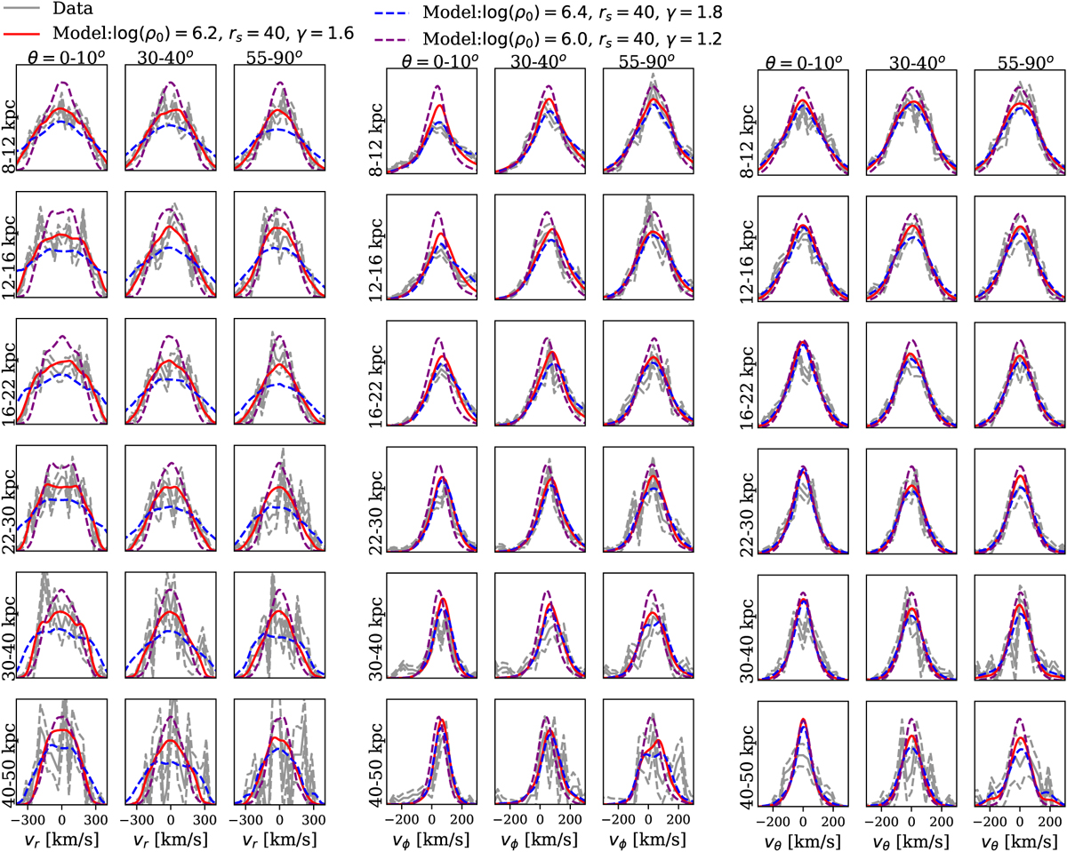
Comparison of velocity distributions from data and model for Auriga 23. The velocity distributions, υr, υϕ, and υθ are calculated in 7 × 6 bins in r versus θ, but we only show three columns here as labelled. In each panel, the grey solid and dashed curves are the velocity distribution and uncertainty of observational data. The red solid curves are from the best-fitting model. Blue and magenta dashed curves show models with different radial distribution of the underlying DM mass. The velocity distributions, especially υr, strongly constrain the underlying DM radial density distribution. The best-fitting model (red solid) reproduces the velocity distributions in all three components well: υr, υϕ, and υθ.
Current usage metrics show cumulative count of Article Views (full-text article views including HTML views, PDF and ePub downloads, according to the available data) and Abstracts Views on Vision4Press platform.
Data correspond to usage on the plateform after 2015. The current usage metrics is available 48-96 hours after online publication and is updated daily on week days.
Initial download of the metrics may take a while.