Fig. 6
Download original image
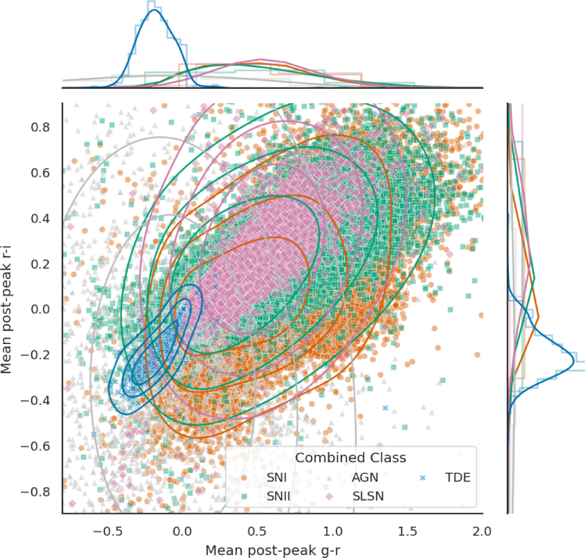
Scatter plot of mean post-peak g-r (horizontal) vs. mean post-peak r-i (vertical), with 1D distributions (histograms) shown along the top and right axes. TDEs (blue crosses) appear bluer than SNe (orange circles and green squares) and SLSNe (pink diamonds), while AGNs (gray triangles) span a broader range of colors. Contours denote the 50%, 80%, and 95% highest-density regions of the per-class 2D kernel density estimate.
Current usage metrics show cumulative count of Article Views (full-text article views including HTML views, PDF and ePub downloads, according to the available data) and Abstracts Views on Vision4Press platform.
Data correspond to usage on the plateform after 2015. The current usage metrics is available 48-96 hours after online publication and is updated daily on week days.
Initial download of the metrics may take a while.