Fig. 5
Download original image
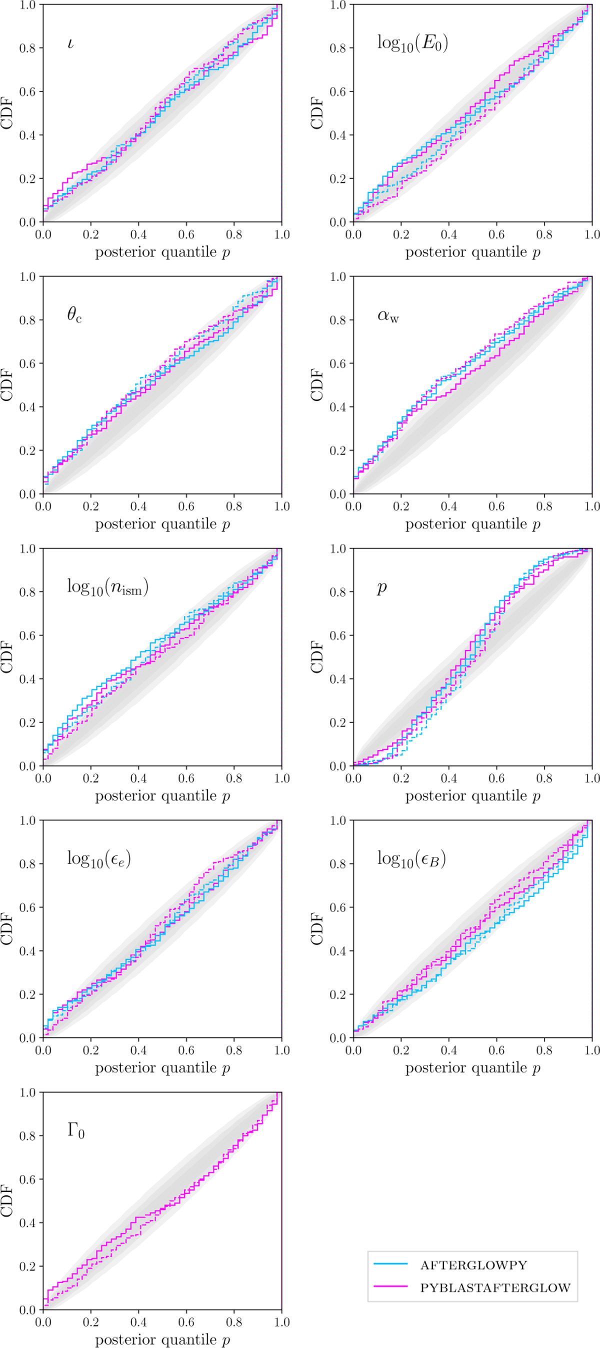
P-P plots for GRB afterglow injections. Each panel shows a P-P plot for the recovery of the parameter displayed in its top left corner. The P-P plots show the cumulative distribution of the injected values’ posterior quantiles for 200 injections. The lightblue curves indicate injection recoveries with AFTERGLOWPY, the magenta ones for PYBLASTAFTER-GLOW. The solid lines signify that the injections stem from physical base model, the dashed lines indicate an injection with the surrogate itself. The gray areas mark the 68-95-99.7% confidence range in which the quantile distribution should fall if it was uniformly distributed.
Current usage metrics show cumulative count of Article Views (full-text article views including HTML views, PDF and ePub downloads, according to the available data) and Abstracts Views on Vision4Press platform.
Data correspond to usage on the plateform after 2015. The current usage metrics is available 48-96 hours after online publication and is updated daily on week days.
Initial download of the metrics may take a while.