Fig. B.1.
Download original image
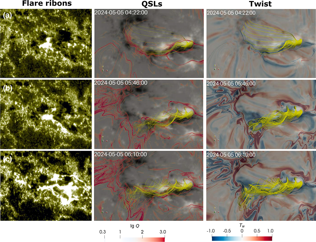
Comparison of flare ribbons in 1600 Å and the distributions of QSLs and twist on the bottom plane of the simulation. The red contours in the middle column denote the regions with lg Q > 2. The blue/red regions in the right column denote negative/positive twists, respectively. The yellow lines represent the traced eruptive magnetic structures.
Current usage metrics show cumulative count of Article Views (full-text article views including HTML views, PDF and ePub downloads, according to the available data) and Abstracts Views on Vision4Press platform.
Data correspond to usage on the plateform after 2015. The current usage metrics is available 48-96 hours after online publication and is updated daily on week days.
Initial download of the metrics may take a while.