| Issue |
A&A
Volume 701, September 2025
|
|
|---|---|---|
| Article Number | A163 | |
| Number of page(s) | 14 | |
| Section | The Sun and the Heliosphere | |
| DOI | https://doi.org/10.1051/0004-6361/202555036 | |
| Published online | 09 September 2025 | |
The solar corona butterfly diagram
1
INAF – Osservatorio Astrofisico di Torino, Pino Torinese, Torino, Italy
2
University of Turin, Physics Department, Torino, Italy
⋆ Corresponding authors: This email address is being protected from spambots. You need JavaScript enabled to view it.
, This email address is being protected from spambots. You need JavaScript enabled to view it.
Received:
4
April
2025
Accepted:
15
July
2025
Abstract
Context. Since the discovery of solar magnetism, the study of magnetic fields on the Sun has long been a central focus. The effects of the solar cycle on the photospheric magnetic fields have been extensively inspected, whereas those on the corona remain relatively obscure.
Aims. In this work, we applied the innovative approach demonstrated in a previous study to measure coronal magnetic fields from coronal densities, in order to study, for the first time, the evolution of these parameters over a full solar cycle.
Methods. We analysed 2595 polarised brightness (pB) images acquired by the Mauna Loa Solar Observatory from October 28, 1998 to December 31, 2008, covering almost the entire 23rd solar cycle. From these images, we derived the daily coronal electron densities and magnetic field maps. The combination of these maps allowed us to reconstruct Carrington rotation maps at 2.5 R⊙ of coronal densities and magnetic fields, which we combined into butterfly diagrams to study their evolution over one full solar cycle.
Results. Our results show good agreement around solar minimum between the inferred location of the magnetic neutral line in the corona and potential field extrapolations. The butterfly diagrams show the formation of an asymmetric solar corona approaching the minimum in 2008, which is not matched by a similar asymmetry in the evolution of photospheric magnetic fields. The evolution of the coronal magnetic energy shows similarities, but also notable differences, compared to the photospheric magnetic energy, suggesting a connection between coronal structures and the innermost regions of the solar convective zone. Additionally, the coronal magnetic fields over the polar regions appear to be markedly different and nearly anti-correlated around solar maximum, but become comparable during the descending phases of the cycle.
Conclusions. These results offer a new framework for understanding the modulation of the solar corona by the activity cycle, as well as new perspectives in view of future observations of the solar poles, which will be acquired for the first time by the ESA Solar Orbiter mission in the coming years.
Key words: methods: data analysis / Sun: corona / Sun: evolution / Sun: magnetic fields
© The Authors 2025
 Open Access article, published by EDP Sciences, under the terms of the Creative Commons Attribution License (https://creativecommons.org/licenses/by/4.0), which permits unrestricted use, distribution, and reproduction in any medium, provided the original work is properly cited.
This article is published in open access under the Subscribe to Open model. This email address is being protected from spambots. You need JavaScript enabled to view it. to support open access publication.
1. Introduction
The solar activity cycle is one of the most fundamental processes in heliophysics, shaping the solar magnetic fields, radiation output, and interaction with the heliosphere. At the heart of our understanding of this cycle lies the so-called butterfly diagram, a graphical representation of the evolution of photospheric magnetic fields over time (see, e.g. review by Hathaway 2010, Fig. 8). This diagram provides invaluable insights into the spatial and temporal dynamics of the solar dynamo, the mechanism responsible for generating and sustaining the solar magnetic field. By tracing the poleward and equatorward migration of magnetic flux, the butterfly diagram encapsulates the interplay between differential rotation, meridional flow, and convective processes, offering a window into the deep-seated processes driving solar activity (see the recent review by Norton et al. 2023, and references therein).
The solar corona, the outermost layer of the solar atmosphere, is profoundly influenced by the solar activity cycle. During solar minimum, the magnetic configuration of the Sun closely resembles that of a dipole, characterised by prominent polar coronal holes and a few narrow equatorial coronal streamers. In contrast, at solar maximum, the magnetic complexity of the Sun peaks and streamers extend across all latitudes, while polar holes vanish amid a much more complex magnetic topology (see e.g. Golub & Pasachoff 2009). This modulation of the coronal structure reflects the evolving global magnetic field, revealing the intricate connection between the photosphere and the extended solar atmosphere. Despite the dominance of magnetic fields in shaping the coronal plasma, direct measurements of these fields remain surprisingly limited. This shortage of measurements stems from both the challenging nature of coronal observations and the inherent difficulties in measuring magnetic fields in a low-density, high-temperature plasma. Nevertheless, understanding coronal magnetic fields is crucial not only for decoding the solar cycle but also for addressing broader astrophysical questions, ranging from the initiation of solar eruptions to the acceleration of the solar wind.
Given the scarcity of coronal magnetic field measurements, many authors previously studied the large-scale evolution of coronal magnetic energy using magnetohydrodynamic (MHD) numerical reconstructions starting from photospheric field observations over a full solar activity cycle (e.g. Yeates et al. 2010; Chifu et al. 2022; Yeates 2024). However, model-based reconstructions have many limitations, as recently discussed by Yeates (2024). Even advanced reconstructions of global coronal fields using the non-linear force-free field (NLFFF) method are limited, as they do not accurately reproduce currents in regions external to the active regions, such as filament channels, thus limiting the reliability of such results. Reconstructions also depend on the input data. The use of different measurements of the photospheric fields, for example those from the Wilcox solar observatory (WSO), the Global Oscillation Network Group (GONG), or the Synoptic Optical Long-term Investigations of the Sun (SOLIS), can provide different results regarding the extrapolations of the coronal magnetic fields (see Petrie 2024). Very recently, Yang et al. (2024) demonstrated the capability of U-Comp observations to monitor the magnetic fields in the inner corona over a period of about 8 months; however, no similar study has yet been carried out over one full solar cycle.
The connection between coronal structures and solar magnetic fields – not only on the photospheric surface but also deeper within the Sun – remains poorly understood, as illustrated by our limited understanding of the rotation of the solar corona. Although the rotation rates of the solar surface and of different layers inside the Sun are well known, the rotation rate of the solar corona at different latitudes, altitudes, and phases of the solar activity cycle remain uncertain. Analysis of extreme ultraviolet (EUV) and radio data has led previous authors to conclude that differential rotation in the inner corona is less pronounced than in the photosphere. Near-rigid rotation occurs in the corona during minimum activity (see Mouradian et al. 2002, and references therein), with significantly less differential motion than in the photosphere. These results were also confirmed in the intermediate corona through analysis of coronagraphic images (Lewis et al. 1999).
This discrepancy is challenging to interpret, as the coronal plasma is largely controlled by the magnetic field, which is believed to be anchored in the photosphere, yet a proposed explanation suggests that coronal structures are only influenced by large-scale magnetic field variations and low multipole moments in the underlying photosphere (Wang et al. 1988). Other authors have found evidence of differential rotation in the solar corona (Morgan & Habbal 2010; Morgan 2011), including differences between the northern and southern hemispheres (Giordano & Mancuso 2008). Latitude regions where the angular velocities of the photosphere and the overlying atmosphere are very different imply the existence of shear regions, where magnetic restructuring is occurring, likely associated with interchange reconnection depositing energy in the solar corona and reducing the open magnetic flux (Owens et al. 2011). These phenomena are thus connected to solar cycle modulation of solar wind acceleration and coronal heating.
This study aimed to address these and other questions by measuring, for the first time, the coronal magnetic fields over one full solar activity cycle. Leveraging the innovative technique for measuring coronal magnetic fields described in Bemporad (2023), we applied this method to the unique dataset acquired by the Mauna Loa Solar Observatory (MLSO) coronagraph. In doing so, we present the first ‘butterfly diagram’ for the solar corona magnetic field, offering a comprehensive view of its evolution over a complete solar cycle. From this we also derived similar evolutionary maps for two additional fundamental plasma parameters, specifically the Alfvén speed and the plasma-β, providing fundamental new information on the solar-wind acceleration regions.
2. Description of the selected data
The data analysed here were provided by MLSO, which currently has two operating instruments: the Upgraded Coronal Multichannel Polarimeter (UCoMP Landi et al. 2016), a coronagraph that provides information about the polarisation, line width, and Doppler shift of coronal emission lines in visible light and near-IR, and the COSMO K-Coronagraph (K-Cor de Wijn et al. 2012), whose purpose is to study the dynamics of coronal mass ejections and the evolution of structures in the low corona. Owing to larger uncertainties in the K-Cor absolute radiometric calibration (J. Burkepile, private communication), we used data acquired by the previous Mark-IV K-coronameter (Mk4).
The Mk4 instrument Elmore et al. (2003) was the fourth in a series of white-light K-coronameters, and it operated from October 1998 to 2013 with the aim of measuring the Stokes parameters using a high-speed polarising beam splitter. The images of the corona produced by Mk4 are polarisation brightness maps in white light (700 nm to 900 nm). The instrument observations ranged from 1.12 R⊙ to 2.8 R⊙, and the white-light images of the polarisation brightness were recorded at a three-minute cadence over a five-hour observing day from approximately 17:00 UT to 22:00 UT. Observations were typically possible on about 300 days per year, with a data accuracy of 15% and a noise level of approximately  on a plate scale of 5.25 arcsec per pixel. MLSO provided data in .fits format, with images of 960 × 960 pixels, containing polarised brightness values expressed in units of 1/B⊙.
The analysed data period spans from October 28, 1998 to December 31, 2008, amounting to a total of 3717 days and almost entirely covering the 23rd solar cycle along 137 Carrington rotations (CR), from CR 1942 to CR 2078. For each day, we used only the average daily image provided in the archive, in order to minimise uncertainties and given that this study focusses solely on long-term coronal evolution. Although an average image per day is generally available, data gaps are present, resulting in 259 images during this period. In addition to the data gaps, we found that some other images could not be used in our analysis due to acquisition issues. After excluding these, the total number of available daily images was 2595.
3. Derivation of coronal plasma parameters
3.1. Electron density measurement
The method for deriving coronal electron densities is described in detail in Appendix A. As the images are provided in Cartesian coordinates, the first step involved transforming them into polar coordinates. Two representative images are shown here and in Appendix A as examples: one from solar minimum acquired on August 30, 2008 (Figure 1), and one from solar maximum, acquired on July 27, 2001 (Figure A.1). Each figure contains four panels: the leftmost shows the original pB data in polar coordinates; the second shows the result of the pB fitting process; the third displays the relative difference between the two, and the rightmost presents the resulting electron density map.
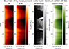 |
Fig. 1. Example of a daily pB image acquired by Mauna Loa on August 30, 2008. Left panel: Original pB data in polar coordinates (heliocentric distance on the x axis, polar angle measured counter-clockwise from the polar north on the y axis). Left-middle panel: Polar coordinates of the pB fit. Right-middle panel: Relative difference between the original data and fitted data. Right panel: Resulting electron density in polar coordinates. |
In Figure 1, the similarity between the first and second panels demonstrates the correctness of the fitting method. In the third panel, the darker regions represent a better agreement between the original pB data and the fit, while brighter regions show worse agreement. Two broad regions with larger errors correspond to the polar coronal holes. The edges of the south coronal hole (centred on a polar angle θ = 180°) show the largest absolute errors. This likely reflects decreased accuracy of the spherical symmetry assumption in these regions. Some coronal features deviate more significantly from the radial distribution, particularly within polar coronal holes, owing to the super-radial expansion of the solar wind (see DeForest et al. 2001, and discussion therein). Nevertheless, the contrast between the plume and inter-plume regions in the polar coronal holes is also well reproduced by the fitting, indicating that our procedure is sensitive to even faint coronal features. Notably, the fitting procedure also mitigates certain instrumental artefacts in the data, such as the discontinuity located around 1.45 − 1.50 R⊙.
In Fig. A.1, unlike in the minimum phase, the fit works well at all angles closer to the Sun, typically below 1.5 R⊙. This is likely due to the inner corona being more uniformly bright across all latitudes during solar maximum compared to solar minimum. Moreover, the multiple coronal features show a lower degree of deviation from the radial direction than at solar minimum, thus reducing the average error in the fitting procedure. The solar maximum image does not display the same instrumental artefact noted in Figure 1. A comparison between the right panels in Figures 1 and A.1 shows that the solar maximum corona is both more structured and generally denser in both the streamer and coronal hole regions, consistent with previous results (e.g. Bemporad et al. 2003; Morgan & Cook 2020; Lamy et al. 2020).
3.2. Magnetic field measurement
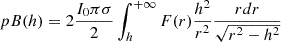
The measurement of the coronal magnetic field was carried out following Bemporad (2023), who, after a preliminary study of the energy budget in the solar corona, identified the magnetic energy and the potential gravitational energy as the two main contributors. Based on this, the equipartition principle is reformulated such that the total magnetic energy is equally distributed between the potential energy and all other energy forms:
 (1)
(1)
Here, (r, θ) are the polar coordinates in the solar corona relative to the Sun’s centre, and ρ is the mass density. From Equation (1), the equipartition magnetic field is defined as
 (2)
(2)
where θ denoted different latitudes in the observed corona. From Equation (2), the equipotential magnetic field is defined as
 (3)
(3)
where the term in the angular brackets denotes the average value of the equipartition magnetic field obtained at a constant altitude r over the latitudinal interval of 2π. This is the formulation used in the present work to measure the value of the coronal magnetic field (see Bemporad 2023, for more details). Its application first requires derivation of the 2D distribution of coronal electron densities, as previously described.
All images within the selected time interval were analysed individually to first derive the 2D distribution of coronal densities, followed by that of the magnetic fields. The resulting daily density and magnetic field maps were then analysed to construct Carrington maps and finally the ‘butterfly diagram’, as described below.
3.3. Other coronal plasma parameters
Given the distributions of coronal densities ne (Equation (A.7)) and equipotential magnetic field Bpot (Equation (3)) at the same heliocentric distance, and following the analysis of Bemporad (2023), it is possible to combine these quantities and derive the distributions of at least two other fundamental plasma parameters.
The first parameter is plasma-β, defined as the ratio of gas pressure to magnetic pressure, and expressed as
 (4)
(4)
The plasma-β distribution identifies regions where plasma dynamics are dominated by thermal pressure (β > 1) and those dominated by magnetic pressure (β < 1). The β = 1 heliospheric radius marks a major transition in the aspect ratio of large-scale turbulent plasma features, shifting from magnetic field-aligned rays or striations below this point to more isotropic, cloud-like ‘flocculations’ above it, where plasma is no longer constrained by the magnetic field (DeForest et al. 2016).
To derive this parameter, it is necessary to assume a value for the unknown coronal temperature Te. Here, we adopted a value of Te = 0.8 × 10⁶ K at 2.5 R⊙ (Vásquez et al. 2003), assuming a constant temperature both in latitude and time throughout the solar cycle. This assumption is more reliable during solar minimum (see especially Vásquez et al. 2011, who found a relatively uniform temperature distribution from tomographic reconstruction during the 2008 solar minimum), as well as for the evolution going from solar minimum to solar maximum in quiet Sun (Schonfeld et al. 2017) and coronal streamer (Bemporad et al. 2003; Landi & Testa 2014) regions. In contrast, coronal regions located above magnetic field concentrations in the photosphere are likely the locations of a much larger temperature variability approaching solar maximum (Guhathakurta & Fisher 1994; Schonfeld et al. 2017), and the assumption of constant temperature made here will lead to an underestimate of plasma-β in these regions.
Another important plasma parameter derived by combining density and magnetic-field CR maps is the Alfvén speed VA, given by
 (5)
(5)
which represents the most fundamental velocity for the propagation of waves and disturbances in a plasma. Determining the Alfvén speed in the solar corona is essential to understand solar wind formation, energy transport, and magnetic reconnection processes (Marsch 2006). It plays a key role in characterising wave propagation, turbulence, and plasma instabilities, which affect space weather and the interaction between the solar wind and Earth’s magnetosphere (Tu & Marsch 1995; Bruno & Carbone 2013).
The Alfvén radius, rA, denotes the distance at which the solar wind speed becomes, at different latitudes and longitudes, larger than VA. The Alfvén speed provides insights into coronal heating mechanisms and the influence of magnetic fields on solar plasma behaviour (Cranmer 2002; De Moortel & Nakariakov 2012). The rA is also the distance at which the Sun heats the corona more efficiently through Alfvén wave dissipation and the maximum distance at which disturbances created in interplanetary space can travel backwards toward the Sun. This distance also determines how the Sun loses angular momentum with the solar wind, since beyond rA the wind effectively carries angular momentum away, influencing the Sun’s long-term rotation. Furthermore, the 3D distribution of the Alfvén speed determines the most probable locations for the excitation of shock waves during solar eruptions (Mancuso et al. 2019), and consequently for the acceleration of particles and the emission of type-II radio bursts (Mann et al. 2003; Gopalswamy et al. 2009). The significance of this parameter in the study of the solar corona was recently summarised by Cranmer et al. (2023), among others.
4. Carrington maps and butterfly diagrams
A Carrington map is a common way to visualise structural changes occurring on the Sun over one full solar rotation, using only observations from the Earth’s viewing direction. Carrington maps of the photosphere (e.g. Sheeley & Warren 2006) or chromosphere (e.g. Chatzistergos et al. 2023) are created by acquiring full-disc images for ∼27 days. For each image, the central meridian is taken and, when placed next to each other, all the extracted vertical stripes are used to create the map. The same method can also be applied to build Carrington maps (or synoptic maps) of the inner solar corona observed on-disc in the UV-EUV ranges, as demonstrated by previous studies (Benevolenskaya et al. 2001, 2014; Hamada et al. 2020; Li et al. 2024).
The construction of Carrington maps for the off-limb intermediate or extended solar corona with coronagraphic images requires additional considerations, since the Sun’s central meridian is not visible in the acquired images, because the solar disc being obscured by the instrument’s occulter. This limitation has long been discussed by several authors, who addressed it by producing synoptic maps with data acquired by the Large Angle Spectroscopic Coronagraph (LASCO; Brueckner et al. 1995) by separating the east and west limbs (Subramanian et al. 1999; Ko et al. 2008), by extracting the whole 2π corona from each image at different times (Lamy et al. 2002, 2020), or by combining images acquired by different spacecraft (Sasso et al. 2019). The method used here for the construction of the off-limb coronal Carrington maps is described in detail in Appendix B and has been applied to the entire dataset to create Carrington maps of coronal densities and magnetic fields for every solar rotation from late 1998 to December 2008, for a total of 137 CRs.
To compare the equipotential magnetic fields derived here and those provided by potential field source surface (PFSS) extrapolation at 2.5 R⊙ provided by WSO, all density profiles were extrapolated from 2.0 to 2.5 R⊙ using step-by-step application at each latitude θi of the expression given in Appendix A (Eq. (A.7)) with the corresponding coefficients [ai, bi]. The extrapolated densities at 2.5 R⊙ were then used to measure equipotential magnetic fields at the same heliocentric distance. There is also a second important reason why this study focusses exclusively on the results obtained at the heliocentric distance of 2.5 R⊙. The equipotential magnetic field technique (as also shown in Figure 11 in Bemporad 2023) provides less reliable results in the inner coronal regions, where the magnetic field configuration is expected to be closed (such as at the base of coronal streamers), rather than open (such as in coronal holes). In these regions, stronger magnetic fields are located in active regions, where the densities are also higher. Therefore, a correlation (rather than anti-correlation) is expected between the densities and the magnetic fields, as provided by the equipartition field (Eq. (2)). Conversely, above the Source Surface, in the coronal region where the magnetic fields are open, such as in coronal streamers (above the streamer cusp) around the streamer current sheet, densities are higher while magnetic fields are lower. This results in an expected anti-correlation between the densities and the magnetic fields, as described by the equipotential field (Eq. (3)). Therefore, our analysis focused only on the corona at 2.5 R⊙, since this is the heliocentric distance at which the equipotential field provides more reliable results.
Given a temporal sequence of Carrington maps, it is possible to assemble all available data into a single map spanning the entire observation period; that is, to create a so-called butterfly diagram of coronal densities and magnetic fields. This type of map is common for photospheric magnetic fields, since they allow us to follow the sunspot movements through the solar cycle and monitor the photospheric magnetic fields. To date, however, similar diagrams have not been produced for the coronal magnetic fields. The only existing similar maps have been limited to coronal brightness and electron densities (e.g. Lamy et al. 2002, 2014). In this study, butterfly diagrams were constructed by averaging the data contained in each Carrington map over the length of the CR (27 days). This yielded a single vertical stripe for each CR, and by arranging these stripes in chronological order, the resulting diagram illustrates the evolution of the quantities of interest across various years.
5. Resulting Carrington maps
The first results presented here are two examples of Carrington maps during the minimum and maximum phases of solar cycle 23 for both the electron densities and the equipotential magnetic fields at a fixed distance of 2.5 R⊙. Specifically, we report results for CR 2074 (30 August to 25 September, 2008) and CR 1979 (27 July to 22 August, 2001). These two CRs were selected because of their limited number of data gaps. In both cases, we followed the steps described in Appendix A.
5.1. Electron densities
We begin by discussing the electron density maps for the minimum and maximum phases (Figure 2, left panels). The top-left panel, showing the electron density map during the minimum phase, clearly reveals the presence of the large-scale equatorial streamer belt corresponding to the horizontal band of larger densities in the latitude interval between latitudes ±30°. Additionally, two regions of much lower density correspond to polar coronal holes at latitudes larger than ∼50° in both hemispheres. The existence of more localized coronal streamers at intermediate latitudes is also visible, due to the previously mentioned asymmetries in the 2008 – 2009 minimum.
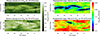 |
Fig. 2. Carrington maps of coronal electron densities (left panels) and equipotential magnetic fields (right panels) at 2.5 R⊙ for CR 2074 (top, solar minimum), and for CR 1979 (bottom, solar maximum). |
The bottom-left panel in Figure 2 shows the electron density map during the maximum phase, where it is evident that the overall electron density is generally higher compared to the solar minimum. Moreover, the distribution of densities is more typical of the solar maximum conditions, with high-density, smaller-scale features located at all latitudes and longitudes, and without larger-scale equatorial streamer belts and polar coronal hole regions. In general, these results are in agreement with previous authors (Lamy et al. 2002, 2014); however, this is the first time such an analysis has been performed with ground-based MLSO coronagraphic images.
5.2. Magnetic fields
Once the properties of the electron density distribution are determined, it is possible to derive the corresponding equipotential magnetic field by using Equation (3); results are shown in the right panels of Figure 2. The Carrington maps for CR 2074 and CR 1979 are presented here as representatives of the minimum and maximum solar cycle phases, respectively. During the minimum phase (top right panel in Figure 2), the neutral line passing at equatorial latitudes is clearly visible. The previously mentioned asymmetrical streamers are well outlined, indicating that in limited longitudinal intervals, the neutral CS was located at intermediate latitudes up to 50° in both hemispheres. In contrast, during the maximum phase (bottom right panel in Figure 2), the magnetic field appears to be generally higher with a more complicated configuration compared to the solar minimum, and the neutral line is no longer clearly visible. It should be noted that an accurate derivation of the true location of the neutral CS in the solar corona is challenging, even when combining observations from multiple spacecraft and different extrapolation methods (see e.g. Sasso et al. 2019).
To validate our results, we compared our maps with photosphere magnetic field maps and PFSS extrapolations for the solar corona provided by WSO. Comparison of the magnetic field maps derived here with PFSS extrapolations is important because PFSS is the most commonly used reconstruction method for the global corona and, therefore, is an interesting reference. Differences between PFSS extrapolations at the minimum and maximum phases of the cycle are expected, mainly because at the maximum, there is less open flux than at the minimum (see discussion in Owens et al. 2011), so one might expect less intense coronal fields at maximum. Nevertheless, the PFSS-type extrapolation is an approximation that can be considered valid only at the minimum of the cycle, when the coronal fields are almost potential. Whereas at the maximum of the cycle, the non-potential configurations make the approximation less reliable.
The WSO maps use sine latitude coordinates (Figure C.1), so we transformed our maps to allow comparison by applying a coordinate transformation as described in Appendix C. Applying this transformation, we created the corresponding Carrington maps for the equipotential magnetic fields and compared them with the WSO PFSS magnetic field maps. The reference CRs for the minimum and maximum solar phases were again CR 2074 and CR 1979, respectively. Figure 3 consists of two columns: the left shows the magnetic field maps for CR 2074, and the right for CR 1979. The top panels show the photospheric field maps from WSO, the central panels show the results for the equipotential magnetic fields at the heliocentric distance of 2.5 R⊙, and the bottom panels show the absolute value of the coronal magnetic field as extrapolated from WSO with the PFSS approximation at the same distance. Hereafter, to facilitate comparison, coronal maps are displayed only within the latitude range covered by WSO data, and thus excluding regions at the highest latitudes (> 75°).
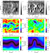 |
Fig. 3. Carrington maps of photospheric magnetic fields (top), coronal equipotential magnetic fields at 2.5 R⊙ (middle), and PFSS extrapolations (bottom) for CR 2074 (left column, solar minimum) and CR 1979 (right column, solar maximum). An animation of this figure available online shows the equipotential and PFSS magnetic fields in chronological order for all the CRs analysed in this work. |
Figure 3 reveals both differences and similarities between the equipotential magnetic field and the PFSS magnetic field for CR 2074. Specifically, the orientation of the magnetic neutral line (darker regions in the two panels) around the equator is very well reproduced, along with the overall values for the magnetic field strengths at higher latitudes. Conversely, the comparison for CR 1979 is more complex due to the higher complexity of the magnetic fields during the maximum phase of solar activity, which are not well described by the PFSS extrapolations. Nonetheless, agreement exists on the location of a northward section of the neutral line between 40° −60° north, with isolated islands of locally lower values also approximately following the orientation of the PFSS neutral line. In summary, the good agreement obtained with the neutral line from PFSS clearly indicates that the technique described above is a reliable method for studying coronal magnetic fields.
The coronal magnetic field maps in Figure 3 also provide absolute values that can be compared with other measurements given in the literature at the same height. For example, from the compilation of measurements shown in the top panel of Fig. 1 in Bemporad (2023) and provided by different authors (references therein), at 2.5 R⊙, one should expect coronal magnetic field values in the range between 0.2 − 0.6 G. Of the four panels with coronal magnetic fields in Figure 3, only the PFSS extrapolations for CR 1979 during solar maximum (bottom right panel) display values significantly lower than this interval. Hence, the CR maps of equipotential magnetic fields agree with previous measurements and provide a location of the neutral line that is in agreement with PFSS extrapolations. This neutral line also represents a mapping of the base of the interplanetary current sheet at 2.5 R⊙.
5.3. Other coronal plasma parameters
The plasma-β CR maps for CR 2074 (relative to the solar minimum conditions) and CR 1979 (relative to the solar maximum conditions) are provided in the top panels of Figure 4. The resulting map for the solar minimum condition (top left panel in Figure 4) clearly reveals a narrow region where β > 1, coinciding with the nearly equatorial coronal streamer belt (Figure 2, top left) and with the base of the heliospheric current sheet (Figure 2, top right). As expected, this region aligns with the PFSS neutral line (Figure 3, bottom left panel). These results can be compared with similar CR maps of the solar wind speed during a solar minimum at the same heliocentric distance by Dolei et al. (2018) (starting from measurements previously obtained by Bemporad 2017), which showed that at 2.5 R⊙, the slow solar wind speed is expected to be very small around the ecliptic plane. Thus, in agreement with recent measurements (Huang et al. 2023) acquired by the Parker Solar Probe mission (Fox et al. 2016), the solar wind in the streamer belt is characterised by high plasma β. Moreover, regions at latitudes typically above ∼30° −40°, corresponding to polar coronal holes, are characterised by β < 0.1. This latitudinal distribution of plasma-β at 2.5 R⊙ also implies that, around the equator, the corona does not co-rotate with the inner layers, while at higher latitudes the opposite should occur.
 |
Fig. 4. Top panels: Plasma-β Carrington maps for CR 2074 (left), and CR 1979 (right). Contour lines show the value of plasma-β corresponding to β = 1 (solid white lines) and β = 0.1 (dashed white lines). Bottom panels: Alfvén speed maps for CR 2074 (left), and CR 1979 (right). Contour lines show the value of VA corresponding to VA = 200 km s−1 (solid white lines) and VA = 1000 km s−1 (dashed white lines). |
The resulting map for plasma-β at solar maximum (top right panel in Figure 4) instead shows more limited regions with β > 1 and a wider area where 0.1 < β < 1, characterising a much larger fraction of the whole corona at 2.5 R⊙, up to latitudes of ∼60° −70°. Interestingly, despite the increased complexity of the solar corona around the activity maximum, the sparse regions with β > 1 are mostly distributed near the PFSS neutral line (Figure 3, bottom right panel). These findings have further implications for the rotation of the solar corona at solar maximum, implying that, at 2.5 R⊙, a much larger fraction of the whole corona is expected to corotate with the inner layers, with only a few sparse regions where corotation can fail.
The Alfvén speed CR maps resulting from the above densities and equipotential magnetic fields are provided in the bottom panels of Figure 4 for CR 2074 (bottom left, solar minimum conditions) and CR 1979 (bottom right, solar maximum conditions). The resulting map for the solar minimum condition clearly shows that near the equator, the regions with higher β > 1 are also those with lower VA < 200 km s−1, and vice versa for the polar regions. Considering typical solar wind speed values at 2.5 R⊙ (see Bemporad 2017, and references therein), the resulting map confirms that, as expected, both the fast and slow solar wind are still sub-Alfvénic at all latitudes. The distribution of the Alfvén speed for CR 2074 also clearly shows that the bimodality of fast and slow solar wind typical of solar minimum conditions is associated with a bimodality in the distribution of the Alfvén radius rA. As expected, the map of the Alfvén speed VA is very similar to the map of plasma-β. In fact, by assuming a constant electron temperature Te and using ρ = nemH, from the above formula, it follows that
 (6)
(6)
Hence, the two quantities VA and  are inversely proportional and connected by the constant quantity
  km s−1 (with Te = 8 ⋅ 105 K). In the real corona, plasma-β variations will be larger than those observed in VA, particularly during solar maximum and above active regions, where higher temperatures result in higher β.
Around solar maximum (bottom right panel in Figure 4 relative to CR 1979), the Alfvén speed distribution is much more fragmented and inhomogeneous, with larger values of VA all around the Sun at the same distance of 2.5 R⊙. These results can be compared with recent measurements obtained with the Parker Solar Probe (the first spacecraft crossing rA and entering the sub-Alfvénic region Kasper et al. 2021), demonstrating that during its expansion, the solar wind encounters multiple distances at which its speed becomes higher and lower than VA. This observation implies that the Alfvén radius is highly turbulent and multiple crossings may exist in a frothy ‘Alfvén zone’ (see review by Cranmer et al. 2023). Figure 4 also implies that at solar maximum (bottom right), this higher complexity is also expected in the latitudinal and longitudinal distribution of rA measured at a constant distance from the Sun, in contrast to the clearer bimodality shown at solar minimum (bottom left).
6. Resulting butterfly diagrams
6.1. Electron densities
The butterfly diagram obtained for the evolution of electron density is provided in the top left panel of Figure 5 as a latitude-year 2D map, starting from late 1998 and continuing to the end of 2008. As expected, the electron density appears to be higher during the solar maximum phase at all latitudes (approximately from 2000 to 2002) and tends to concentrate at equatorial latitudes when approaching the minimum phase. This is consistent with the fact that during solar minimum, the magnetic field lines are open at the poles, allowing an outflow of the plasma which results in a lower electron density in polar coronal holes. At equatorial latitudes, the presence of coronal streamers and the closed magnetic field configuration holds the plasma, leading to higher electron density. The density butterfly diagram also shows the progressive narrowing around the equator of the higher-density region, with a corresponding broadening of the lower-density regions at the north and south poles. Interestingly, at the minimum phase of the solar cycle around 2008, the diagram also shows that a perfectly equatorial streamer belt is not recovered. This agrees with previous authors who reported that the minimum between solar cycles 23 and 24 exhibited peculiarities, in particular weaker-than-expected polar magnetic fields resulting in low- and mid-latitude coronal holes and pseudo-streamers that persisted throughout the minimum (see discussion by Gibson et al. 2011).
 |
Fig. 5. Left panels: Butterfly diagrams of the photospheric magnetic field (top) and coronal electron densities (bottom). Right panels: Butterfly diagrams of the PFSS coronal magnetic field (top) and equipotential coronal magnetic field (bottom). |
It is also interesting to compare the positions of the streamers and polar coronal holes in the bottom left panel of Figure 5 with the respective positions of photospheric structures in the top left panel of the same figure. The comparison shows that where and when the photospheric magnetic fields are stronger (due to the presence of strong magnetic flux concentration, mostly associated with sunspots), denser coronal streamers are present in the overlying corona. When approaching the minimum phase of solar activity, the streamers move towards the equator, while the newly emerging magnetic flux decays in strength and moves towards the equator, as expected. Moreover, as the solar minimum approaches, the opposite polarities of magnetic fields at the poles become evident, with clear signatures of poleward magnetic flux transport connected with the meridional circulation. At the same time, the latitudinal extension of polar coronal holes increases accordingly.
It should be noted that, as shown in the left panels of Figure 5, the existence of the asymmetric configuration in the 2008–2009 solar minimum is apparently not connected on large scales and over long time intervals with a corresponding asymmetry in the distribution of the photospheric magnetic field. In fact, except for a short period around the end of 2007 when a classical single and broader equatorial streamer belt appears to be formed, in the previous and subsequent years the corona shows two streamers located around the latitudes between 20° −40° and 40° −60°, in the north and south hemispheres, respectively. Meanwhile, the photospheric fields show no signatures of any feature at similar latitudes in the north hemisphere and weak fields closer to the equator in the south hemisphere. Hence, the asymmetry in the photospheric fields (reported by Petrie 2024) does not appear to be directly related to the asymmetries of the overlying corona. This result may indicate that some coronal structures at larger spatial scales are influenced not so much by the magnetic configuration emerging in the photosphere but rather by the magnetic fields present in more internal layers of the convective region. This conclusion is also supported by the unexpected behaviour obtained for solar cycle 23 by Mancuso & Giordano (2012) in the rotation of the solar corona, who found agreement between the variations in the residual rotation rates of the coronal and subphotospheric equatorial plasma throughout solar cycle 23.
To better describe the temporal distribution of coronal densities, Figure 6 presents the derived values averaged over an interval of 15° in latitude, both at the two poles (75° −90°) and at intermediate latitudes (around 45°), in the north and south hemispheres. The resulting temporal evolutions at the two poles (top panel in Figure 6) show higher densities during the maximum phase and display different trends in the two poles, sometimes opposite to each other. In particular, this occurred during 2002 and 2003, and during 1999 and 2000. When moving towards the minimum phase, after 2004, the trends at the two poles become quite similar, with a general decrease in electron density. The bottom panel of Figure 6 shows the temporal distribution of electron densities at intermediate latitudes in the north and south hemispheres. Unlike at the poles, the two trends seem quite similar during the maximum phase, with a first peak between 1999 and 2000, a second peak between 2003 and 2004, followed by a general decrease when moving towards the minimum phase. Our results are in good agreement with those found by Lamy et al. (2021, Figure 18), which shows the temporal variation of the electron density at 10 R⊙.
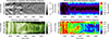 |
Fig. 6. Temporal evolution of coronal densities at the north pole (top image, blue line) and south pole (top image, red line), and at intermediate latitudes in northern (bottom image, blue line) and southern (bottom image, red line) hemispheres. |
6.2. Magnetic fields
The butterfly diagram obtained for the evolution of equipotential magnetic fields at 2.5 R⊙ is provided in the bottom right panel of Figure 5, again as a latitude-year 2D map starting from late 1998 and continuing to the end of 2008. This map can be compared with the evolution of magnetic fields from the PFSS extrapolation (Figure 5, top right panel) at the same height of 2.5 R⊙ in the corona. The two panels show quite different distributions: first, around the solar activity maximum of cycle 23 (2000–2001) the PFSS fields minimise, while the equipotential fields maximise. Moreover, in the descending phase of the solar cycle, the PFSS fields (top right panel in Figure 5) show a well-defined equatorial neutral line, with an apparent sinusoidal oscillation. In particular, by performing a sinusoidal fit of the curve obtained for the position of the neutral line from July 2002 (beginning of the descending phase of cycle 23) until the end of 2008 (minimum of activity), we obtained a period of (363 ± 3) days and an oscillation amplitude of (7.1 ± 0.7) degrees. Both results agree with what is expected for the annual variation along the Earth’s orbit, considering the 7.25 degree obliquity of the Sun’s rotational axis with respect to the ecliptic plane.
As mentioned above, the PFSS magnetic field extrapolations do not accurately describe the complexity of the magnetic fields during the solar maximum, so it is expected that the magnetic field is not well represented by this approximation. In fact, contrary to the PFSS extrapolations (top right panel in Figure 5), the 2008–2009 solar minimum exhibited significant asymmetry in the solar corona (as mentioned above), which is well reproduced by a pair of neutral lines located around ∼30° latitude in both hemispheres on the equipotential magnetic field map (bottom right panel in Figure 5). The PFSS extrapolation is an oversimplified representation of the coronal magnetic fields, characterised by a large fraction of closed magnetic field lines connecting the photospheric multipolar regions. This can result in a significant amount of missing open solar magnetic flux at the considered heliocentric distance of 2.5 R⊙ (see Owens et al. 2011), thus reducing the field strength. This likely explains why, at the solar maximum, the coronal magnetic field strength from PFSS appears to be much lower than expected, while the map of equipotential magnetic fields correctly reproduces the expected trend: coronal magnetic fields that are, on average, more intense at solar maximum and then decay towards solar minimum.
It is also important to note that in the PFSS extrapolation, the magnetic field is forced to be radially directed at the outer boundary located over the source surface at 2.5 R⊙, artificially reducing the field strength near the neutral lines. When these neutral lines become more complex and widespread, the weakening of the outer boundary field is more pronounced compared to cases with more localised neutral lines (as illustrated by the comparison between the bottom right and bottom left panels in Figure 3). This can lead to a greater reduction in the mean field at the source surface during solar maximum, when neutral lines extend across most latitudes, than during solar minimum, when they remain near the equator (as shown in the right panels of Figure 5), resulting in very little contribution from active regions during solar maximum. Moreover, Figure 5 compares the full-field strength rather than just the radial component, highlighting the artificiality of the purely radial source-surface field.
It is also useful to examine the latitudinal distribution and temporal evolution of the coronal magnetic field butterfly diagram (bottom right panel in Figure 5) in relation to the strength of the source photospheric fields (top left panel in Figure 5). To begin with, by averaging over the last 13 CRs of the butterfly diagram (corresponding to 2008, the final year of analysed data), we find that at the minimum of the cycle, the distributions of the photospheric and coronal magnetic fields are quite similar, with a flat distribution around the equator and increasing towards both poles (Figure 7, top panels). In contrast, when averaging over 13 CRs spanning the previous maximum (year 2001), we observe that the distribution of the photospheric fields is markedly different in the equatorial regions, showing very intense fields due to the sunspots. However, the intensity increase towards the poles is similar to that observed during solar minimum (Figure 7, bottom images). Furthermore, the average coronal fields do not exhibit the same level of relative intensification in the equatorial regions as observed in the photospheric fields. This provides important information on how the magnetic field energy emerging in the photosphere is stored in the corona, apparently with different behaviour between the maximum and minimum of the cycle. This is also likely connected to the variation between maximum and minimum in the fraction of open magnetic flux from the photosphere to the corona, since at the maximum of the cycle, a large part of the equatorial magnetic flux closes in the inner corona, not intensifying the overlying coronal magnetic fields (see Owens et al. 2011, Fig. 1). For example, Chifu et al. (2022) recently found a poor correlation between the solar sunspot number and the magnetic free energy (reconstructed with a non-linear force-free field approximation) for the descending phases of solar cycle 24, consistent with the results shown here for solar cycle 23.
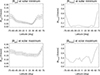 |
Fig. 7. Latitudinal distribution of the photospheric magnetic field (right column) and the coronal equipotential magnetic field (left column) during solar minimum (top images) and solar maximum (bottom images). |
The comparison between the temporal trend of the average coronal field at high latitudes (75° −90°) at the north and south poles also reveals some interesting properties. During the maximum phases of the cycle (year 2001), imbalances of up to a factor of two are observed between the two poles, with predominance alternating between them in different periods and exhibiting an anticorrelated trend (one pole increases while the other decreases). Towards the minimum (year 2008) the fields at the two poles become equivalent (Figure 8, top panel). The trend suggests two distinct phases of the cycle: one near the maximum, during which the poloidal field oscillates between hemispheres, followed by a second phase starting around 2004, closer to the minimum, in which a simple attenuation of the magnetic fields in both poles occurs. These phases can also be described as a more chaotic phase, characterised by significant fluctuations in the poloidal magnetic field modulus during the cycle maximum, followed by a more gradual phase of descent of the poloidal field modulus towards the cycle minimum. It is also notable that, contrary to WSO data showing the polar-field reversal around 2000 followed by an intensity increase, the coronal polar fields oscillate between 1999 and 2003 and then decrease steadily in strength from 2003 to 2009.
 |
Fig. 8. Temporal evolution of coronal magnetic field at the north pole (top image, blue line), south pole (top image, red line), and intermediate latitudes in north (bottom image, blue line) and south (bottom image, red line) hemispheres. |
In contrast, at intermediate latitudes (around 45°, again averaging over an angular extension of 15°) and near the equator, there is a much smaller difference between the magnetic field trends in the two hemispheres (Figure 8, bottom panel). The amplitude of fluctuations over time is comparable to the overall decay between the maximum and minimum of the cycle.
6.3. Combined plasma parameters
The plasma-β butterfly diagram, resulting from the constant temperature assumption discussed above, is shown in the top panel of Figure 9, together with two contour lines outlining the regions with β ≥ 1 (solid lines) and β ≥ 0.1 (dashed lines). From this map, it is evident that at 2.5 R⊙, the plasma-β is equal to or greater than 1 only towards the minimum of the activity cycle and at the core of the coronal streamers. This result is in agreement with the idea that an already turbulent solar wind originates from these regions, as shown by DeForest et al. (2016), and also with the results derived for the inner corona by Nuevo et al. (2013), using tomographic reconstructions. Conversely, coronal holes are found to have β ≪ 1, so fast solar wind sources will experience a transition to turbulent flow farther from the Sun as the solar wind accelerates. Furthermore, progressing from the minimum to the maximum of the cycle, the regions with β > 1 disappear. This indicates that towards the maximum of the cycle, the turbulent-flow transition region is located even at a lower heliocentric distance in the inner corona. This trend is preserved even if we consider that, at 2.5 R⊙, the coronal temperatures at the maximum of the cycle will be slightly higher than those at the minimum(see Foley et al. 2002). The boundaries of the two coronal holes are clearly identified as regions of transition between β < 0.1 (inside the coronal hole) and 0.1 < β < 1 (regions between the coronal hole and the streamer).
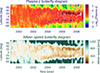 |
Fig. 9. Top panel: Butterfly diagram of plasma-β. Contour lines show the value of plasma-β corresponding to β = 1 (solid white lines) and β = 0.1 (dashed white lines). Bottom panel: Butterfly diagram of the Alfvén speed VA. Contour lines show the value of VA corresponding to VA = 200 km s−1 (solid white lines) and VA = 1000 km s−1 (dashed white lines). |
These results also relate to the evolution of coronal rotation rates at different latitudes during the solar cycle. Considering the heliocentric distance of 2.5 R⊙ analysed here, the plasma-β evolution shown in the top panel of Figure 9 suggests that during the solar maximum (years 2000–2001), the whole corona is expected to be in quasi-corotation with the inner corona and/or with the photosphere, whereas at the solar minimum (2008–2009), the equatorial regions near the cores of streamers are not expected to corotate. More recent results obtained from the analysis of more than ten years of coronagraphic observations (Edwards et al. 2022) and EUV full-disc images (Routh et al. 2024) suggest that the solar corona rotates faster and with less differential rotation compared to the photosphere, implying a possible connection with sub-photospheric rotation rates.
Combining the density and magnetic field butterfly diagrams, the resulting Alfvén speed map is shown in the bottom panel of Figure 9. This figure also shows evolution over the solar cycle, with coronal holes characterised by regions where VA > 1000 km s−1 at 2.5 R⊙, whose extension increases in latitude towards solar minimum. Conversely, still at solar minimum, the equatorial regions previously identified as having β > 1 correspond to areas with VA < 200 km s−1. Therefore, at solar minimum and 2.5 R⊙, the fast solar wind is certainly sub-Alfvénic, while the slow solar wind should still have a speed lower than 200 km s−1 and therefore also be sub-Alfvénic. There is an interesting correspondence between the regions with β > 1 and those with VA < 200 km s−1, where solar wind turbulence is therefore more likely to be triggered.
7. Discussion and conclusions
This study aimed to better understand how the solar activity cycle influences the solar corona, particularly considering the prolonged minimum of 2008–2009 at the end of cycle 23. During this period, the magnetic fields at the Sun’s poles remained particularly weak, leading to the absence of a single equatorial streamer belt (typical of previous cycle minima) and the presence of streamers even at intermediate latitudes (Gibson et al. 2011; Petrie 2024). Studying coronal magnetic fields is fundamental to understanding how magnetic energy is stored in the corona and where it may be released as solar eruptions. This work achieves this for the first time by applying the new technique proposed by Bemporad (2023) to measure the coronal magnetic fields using ground-based coronagraphic images acquired from late October 1998 to December 2008.
The evolution of total magnetic energy in the solar corona was investigated during solar cycle 23 by Yeates et al. (2010), who found that total magnetic energy increased by a factor of eight between solar minimum and solar maximum. More recently, Chifu et al. (2022) found that during solar cycle 24, the evolution of the total magnetic free energy (a proxy for the strength and probability of dynamic processes such as flares, prominence eruption, and coronal mass ejections) does not exactly match the evolution of the sunspot number, showing poorer correlation in the second half of the cycle. These findings suggest that the transfer of magnetic energy from the photosphere to the corona is complex and does not occur homogeneously.
From the measurements reported here, it is possible to compare the magnetic energy density in the solar corona with that in the photosphere. We derived the cumulative magnetic energy density in the solar corona at 2.5 R⊙, calculated over all the radial values for every CR from late 1998 to 2008; the results are shown in Figure 10. The coronal magnetic energy (solid blue line in Figure 10) shows two predominant peaks: the first between 1999 and 2001 and the second between 2001 and 2004. It is interesting to compare this evolution with the total magnetic energy density in the photosphere (red line in Figure 10): again, two main peaks occur around 2000 and 2002 but, unlike in the corona, the first peak is less pronounced than the second. This contrasts with sunspot number, which shows a higher peak followed by a lower one. The first key conclusion is that the magnetic energy stored in the corona is not directly proportional to the magnetic energy emerging from the photosphere. This may indicate that the deposition of coronal magnetic energy is influenced not only by photospheric regions, but also by sub-photospheric magnetic field concentrations, which can act on larger scales and create non-potential magnetic configurations. The two curves in Figure 10 also show, from 2004 onwards, a general decrease in both the coronal and photospheric magnetic energy densities, as expected when moving from solar maximum to minimum. These two curves are very similar, particularly after 2005, which is surprising given the very different datasets used to derive them; however, they also exhibit interesting differences. Notably, the energy in the photospheric fields (red curve) decreases more rapidly than that in the coronal fields (blue curve), suggesting that some magnetic energy may remain ‘stored’ in the corona during the solar cycle. This result agrees with previous findings for earlier solar cycles, where soft X-ray (SXR) flare occurrence and SXR background flux were significantly delayed relative to sunspot numbers (see e.g. Wagner 1988; Aschwanden 1994; Temmer 2010). Moreover, the coronal magnetic energy exhibits a pronounced peak around 2008, during which the magnetic energy in the photospheric fields had already decreased to minimum levels. These results suggest a role for sub-photospheric fields, possibly relic magnetic fields acting in the descending phases of the solar activity cycle, leading to delayed accumulation of magnetic free energy in the corona, which is progressively released through solar activity such as flares, erupting prominences and coronal mass ejections.
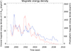 |
Fig. 10. Total magnetic energy density in the photosphere (red line) and the solar corona at 2.5 R⊙ (blue line). |
The significance of this study lies not only in providing the first systematic observational reconstruction of coronal magnetic fields across a solar cycle, but also in offering critical insights into how the corona evolves in response to the solar cycle. The results also inform our understanding of coronal rotation during different phases of the solar activity cycle. These insights are essential for investigating how stationary processes such as the solar wind, which is intimately tied to the coronal structure, are modulated over the cycle. Moreover, this study provides fundamental ingredients to better understand how, over longer timescales, the magnetic energy emerging from the interior of the Sun to the photosphere is finally deposited in the solar corona above the current-free configuration and subsequently released during solar impulsive events. By linking coronal magnetic field dynamics to the sub-photospheric magnetic fields and to the broader heliospheric environment, this work provides a new framework for exploring the interplay between solar magnetism in different solar layers, the solar wind, and space weather phenomena.
Data availability
Movie associated to Fig. 3 is available at https://www.aanda.org
Acknowledgments
The authors acknowledge J. Burkepile and G. de Toma – HAO for making available the entire set of calibrated daily Mauna Loa images that were used in this work. The authors acknowledge the anonymous Referee for constructive comments and suggestions.
References
- Aschwanden, M. J. 1994, Sol. Phys., 152, 53 [Google Scholar]
- Bemporad, A. 2017, ApJ, 846, 86 [Google Scholar]
- Bemporad, A. 2023, ApJ, 946, 14 [Google Scholar]
- Bemporad, A., Poletto, G., Suess, S. T., et al. 2003, ApJ, 593, 1146 [Google Scholar]
- Bemporad, A., Giordano, S., Zangrilli, L., & Frassati, F. 2021, A&A, 654, A58 [NASA ADS] [CrossRef] [EDP Sciences] [Google Scholar]
- Benevolenskaya, E. E., Kosovichev, A. G., & Scherrer, P. H. 2001, ApJ, 554, L107 [Google Scholar]
- Benevolenskaya, E., Slater, G., & Lemen, J. 2014, Sol. Phys., 289, 3371 [Google Scholar]
- Biesecker, D. A., Thompson, B. J., Gibson, S. E., et al. 1999, J. Geophys. Res., 104, 9679 [Google Scholar]
- Billings, D. E. 1966, A Guide to the Solar Corona (New York: Academic Press) [Google Scholar]
- Brueckner, G. E., Howard, R. A., Koomen, M. J., et al. 1995, Sol. Phys., 162, 357 [NASA ADS] [CrossRef] [Google Scholar]
- Bruno, R., & Carbone, V. 2013, Liv. Rev. Sol. Phys., 10, 2 [Google Scholar]
- Capobianco, G., Fineschi, S., Massone, G., et al. 2012, in Modern Technologies in Space- and Ground-based Telescopes and Instrumentation II, eds. R. Navarro, C. R. Cunningham, & E. Prieto, SPIE Conf. Ser., 8450, 845040 [Google Scholar]
- Casti, M., Arge, C. N., Bemporad, A., Pinto, R. F., & Henney, C. J. 2023, ApJ, 949, 42 [NASA ADS] [CrossRef] [Google Scholar]
- Chatzistergos, T., Ermolli, I., Banerjee, D., et al. 2023, A&A, 680, A15 [NASA ADS] [CrossRef] [EDP Sciences] [Google Scholar]
- Chifu, I., Inhester, B., & Wiegelmann, T. 2022, A&A, 659, A174 [NASA ADS] [CrossRef] [EDP Sciences] [Google Scholar]
- Cranmer, S. R. 2002, Space Sci. Rev., 101, 229 [Google Scholar]
- Cranmer, S. R., Chhiber, R., Gilly, C. R., et al. 2023, Sol. Phys., 298, 126 [CrossRef] [Google Scholar]
- De Moortel, I., & Nakariakov, V. M. 2012, Philos. Trans. R. Soc. London Ser. A, 370, 3193 [Google Scholar]
- de Wijn, A. G., Burkepile, J. T., Tomczyk, S., et al. 2012, in Ground-based and Airborne Telescopes IV, eds. L. M. Stepp, R. Gilmozzi, & H. J. Hall, SPIE Conf. Ser., 8444, 84443N [NASA ADS] [CrossRef] [Google Scholar]
- DeForest, C. E., Lamy, P. L., & Llebaria, A. 2001, ApJ, 560, 490 [Google Scholar]
- DeForest, C. E., Matthaeus, W. H., Viall, N. M., & Cranmer, S. R. 2016, ApJ, 828, 66 [Google Scholar]
- Dolei, S., Susino, R., Sasso, C., et al. 2018, A&A, 612, A84 [NASA ADS] [CrossRef] [EDP Sciences] [Google Scholar]
- Edwards, L., Kuridze, D., Williams, T., & Morgan, H. 2022, ApJ, 928, 42 [NASA ADS] [CrossRef] [Google Scholar]
- Elmore, D. F., Burkepile, J. T., Darnell, J. A., Lecinski, A. R., & Stanger, A. L. 2003, in Polarimetry in Astronomy, ed. S. Fineschi, SPIE Conf. Ser., 4843, 66 [Google Scholar]
- Foley, C. R., Patsourakos, S., Culhane, J. L., & MacKay, D. 2002, A&A, 381, 1049 [NASA ADS] [CrossRef] [EDP Sciences] [Google Scholar]
- Fox, N. J., Velli, M. C., Bale, S. D., et al. 2016, Space Sci. Rev., 204, 7 [Google Scholar]
- Gibson, S. E., de Toma, G., Emery, B., et al. 2011, Sol. Phys., 274, 5 [Google Scholar]
- Giordano, S., & Mancuso, S. 2008, ApJ, 688, 656 [NASA ADS] [CrossRef] [Google Scholar]
- Golub, L., & Pasachoff, J. M. 2009, The Solar Corona (The Edinburgh Building, Cambridge CB2 8RU, UK: Cambridge University Press) [Google Scholar]
- Gopalswamy, N., Thompson, W. T., Davila, J. M., et al. 2009, Sol. Phys., 259, 227 [NASA ADS] [CrossRef] [Google Scholar]
- Guhathakurta, M., & Fisher, R. R. 1994, Sol. Phys., 152, 181 [Google Scholar]
- Hamada, A., Asikainen, T., & Mursula, K. 2020, Sol. Phys., 295, 2 [NASA ADS] [CrossRef] [Google Scholar]
- Hathaway, D. H. 2010, Liv. Rev. Sol. Phys., 7, 1 [Google Scholar]
- Huang, J., Kasper, J. C., Larson, D. E., et al. 2023, ApJS, 265, 47 [Google Scholar]
- Kasper, J. C., Klein, K. G., Lichko, E., et al. 2021, Phys. Rev. Lett., 127, 255101 [NASA ADS] [CrossRef] [Google Scholar]
- Ko, Y.-K., Li, J., Riley, P., & Raymond, J. C. 2008, ApJ, 683, 1168 [Google Scholar]
- Lamy, P., Llebaria, A., & Quemerais, E. 2002, Adv. Space Res., 29, 373 [Google Scholar]
- Lamy, P., Barlyaeva, T., Llebaria, A., & Floyd, O. 2014, J. Geophys. Res. (Space Phys.), 119, 47 [Google Scholar]
- Lamy, P., Llebaria, A., Boclet, B., et al. 2020, Sol. Phys., 295, 89 [CrossRef] [Google Scholar]
- Lamy, P., Gilardy, H., Llebaria, A., Quémerais, E., & Ernandez, F. 2021, Sol. Phys., 296, 76 [NASA ADS] [CrossRef] [Google Scholar]
- Landi, E., & Testa, P. 2014, ApJ, 787, 33 [Google Scholar]
- Landi, E., Habbal, S. R., & Tomczyk, S. 2016, J. Geophys. Res. (Space Phys.), 121, 8237 [Google Scholar]
- Lewis, D. J., Simnett, G. M., Brueckner, G. E., et al. 1999, Sol. Phys., 184, 297 [Google Scholar]
- Li, S., Feng, L., Ying, B., et al. 2024, ApJ, 969, L16 [Google Scholar]
- Mancuso, S., & Giordano, S. 2012, A&A, 539, A26 [NASA ADS] [CrossRef] [EDP Sciences] [Google Scholar]
- Mancuso, S., Frassati, F., Bemporad, A., & Barghini, D. 2019, A&A, 624, L2 [NASA ADS] [CrossRef] [EDP Sciences] [Google Scholar]
- Mann, G., Klassen, A., Aurass, H., & Classen, H. T. 2003, A&A, 400, 329 [NASA ADS] [CrossRef] [EDP Sciences] [Google Scholar]
- Marsch, E. 2006, Liv. Rev. Sol. Phys., 3, 1 [Google Scholar]
- Morgan, H. 2011, ApJ, 738, 189 [NASA ADS] [CrossRef] [Google Scholar]
- Morgan, H., & Cook, A. C. 2020, ApJ, 893, 57 [CrossRef] [Google Scholar]
- Morgan, H., & Habbal, S. R. 2010, ApJ, 710, 1 [Google Scholar]
- Mouradian, Z., Bocchia, R., & Botton, C. 2002, A&A, 394, 1103 [NASA ADS] [CrossRef] [EDP Sciences] [Google Scholar]
- Norton, A., Howe, R., Upton, L., & Usoskin, I. 2023, Space Sci. Rev., 219, 64 [CrossRef] [Google Scholar]
- Nuevo, F. A., Huang, Z., Frazin, R., et al. 2013, ApJ, 773, 9 [Google Scholar]
- Owens, M. J., Crooker, N. U., & Lockwood, M. 2011, J. Geophys. Res. (Space Phys.), 116, A04111 [Google Scholar]
- Petrie, G. J. D. 2024, J. Space Weather Space Clim., 14, 5 [Google Scholar]
- Quémerais, E., & Lamy, P. 2002, A&A, 393, 295 [NASA ADS] [CrossRef] [EDP Sciences] [Google Scholar]
- Routh, S., Jha, B. K., Mishra, D. K., et al. 2024, ApJ, 975, 158 [Google Scholar]
- Saito, K., Poland, A. I., & Munro, R. H. 1977, Sol. Phys., 55, 121 [NASA ADS] [CrossRef] [Google Scholar]
- Sasso, C., Pinto, R. F., Andretta, V., et al. 2019, A&A, 627, A9 [NASA ADS] [CrossRef] [EDP Sciences] [Google Scholar]
- Schonfeld, S. J., White, S. M., Hock-Mysliwiec, R. A., & McAteer, R. T. J. 2017, ApJ, 844, 163 [Google Scholar]
- Sheeley, N. R., Jr, & Warren, H. P. 2006, ApJ, 641, 611 [Google Scholar]
- Subramanian, P., Dere, K. P., Rich, N. B., & Howard, R. A. 1999, J. Geophys. Res., 104, 22321 [Google Scholar]
- Temmer, M. 2010, in SOHO-23: Understanding a Peculiar Solar Minimum, eds. S. R. Cranmer, J. T. Hoeksema, & J. L. Kohl, ASP Conf. Ser., 428, 161 [Google Scholar]
- Tu, C. Y., & Marsch, E. 1995, Space Sci. Rev., 73, 1 [Google Scholar]
- van de Hulst, H. C. 1950, Bulletin of the Astronomical Institutes of the Netherlands, 11, 135 [Google Scholar]
- Vásquez, A. M., van Ballegooijen, A. A., & Raymond, J. C. 2003, ApJ, 598, 1361 [Google Scholar]
- Vásquez, A. M., Huang, Z., Manchester, W. B., & Frazin, R. A. 2011, Sol. Phys., 274, 259 [CrossRef] [Google Scholar]
- Wagner, W. J. 1988, Adv. Space Res., 8, 67 [Google Scholar]
- Wang, T., & Davila, J. M. 2014, Sol. Phys., 289, 3723 [NASA ADS] [CrossRef] [Google Scholar]
- Wang, Y. M., Sheeley, N. R., Jr, Nash, A. G., & Shampine, L. R. 1988, ApJ, 327, 427 [Google Scholar]
- Yang, Z., Tian, H., Tomczyk, S., et al. 2024, Science, 386, 76 [Google Scholar]
- Yeates, A. R. 2024, Sol. Phys., 299, 83 [Google Scholar]
- Yeates, A. R., Constable, J. A., & Martens, P. C. H. 2010, Sol. Phys., 263, 121 [Google Scholar]
Appendix A: Determination of coronal electron densities
The measurement of the electron density in the solar corona is obtained through the inversion method first presented by van de Hulst (1950), and then modified by Billings (1966). More specifically, we started from the formula providing the difference between the radially and tangentially polarised intensities:
![Mathematical equation: $$ \begin{aligned} I_t-I_r = I_0\frac{n_e\pi \sigma }{2}\sin ^2{\chi }[(1-u)A+uB] \end{aligned} $$](/articles/aa/full_html/2025/09/aa55036-25/aa55036-25-eq10.gif) (A.1)
(A.1)
where I0 represents the central intensity, ne is the electron density, σ is the classical electron radius squared, u is the limb darkening coefficient, and χ, A, B are geometrical factors. The integral of Equation A.1 along the line-of-sight (LOS) coordinate y provides the actual intensity as seen by the observer, i.e. the polarised brightness (pB):
![Mathematical equation: $$ \begin{aligned} pB = \int _{-\infty }^{+\infty }\Big (I_0\frac{n_e\pi \sigma }{2}\sin ^2{\chi }[(1-u)A+uB]\Big ) dy. \end{aligned} $$](/articles/aa/full_html/2025/09/aa55036-25/aa55036-25-eq11.gif) (A.2)
(A.2)
Since Equation A.2 is in general difficult to evaluate, it is common to work under a spherical-symmetry hypothesis, allowing to rewrite the equation in terms of the distance from the Sun centre r as:
 (A.3)
(A.3)
where h represents a generic point along the x axis, and F(r) is defined as:
![Mathematical equation: $$ \begin{aligned} F(r) = n_e(r)[(1-u)A + uB]. \end{aligned} $$](/articles/aa/full_html/2025/09/aa55036-25/aa55036-25-eq13.gif) (A.4)
(A.4)
From the above expression, it is evident that, under a spherical-symmetry hypothesis, the electron density depends solely on the heliocentric distance r.
The assumption of spherical symmetry has been typically made by many other authors over the last decades (e.g. Saito et al. 1977; Quémerais & Lamy 2002), and has also been validated with tomography (Wang & Davila 2014) and numerical models (Bemporad et al. 2021), but it requires some considerations. During the minimum phase of the solar activity cycle, there are some coronal regions where this assumption is more valid, like coronal streamers (see e.g. Biesecker et al. 1999), while it is less reliable, for example, at the solar poles. However, during the solar maximum, the concentration of electron density varies significantly along the LOS, in particular over active regions, so that spherical symmetry is less adequate. Our work aims to study the large-scale structure and long-term evolution of the solar corona over one full solar cycle, and not to resolve small-scale coronal features and short-term temporal variations. Hence, we assume the validity of the spherical-symmetry hypothesis of the solar corona over the whole period under study.
The idea behind the inversion method proposed by van de Hulst (1950) is that the pB (Eq. A.2) can be expressed as a power series with negative exponents. From this assumption, the pB data are fitted with such a curve, and the electron density can be determined. Under the hypothesis of spherical symmetry, the power series can be written as:
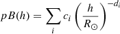 (A.5)
(A.5)
where the coefficients ci and di are experimentally found by fitting the pB data with the hypothesized curve. From Eq. A.5 it can be assumed the same trend for F(r), defined in Eq. A.4:
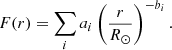 (A.6)
(A.6)
The form of ai, bi, and the resulting electron density is given for instance in Capobianco et al. (2012). The final expression for ne is given by:
![Mathematical equation: $$ \begin{aligned} n_e(r) = \frac{\sum _i a_i \left(\frac{r}{R_{\odot }}\right)^{-b_i}}{[(1-u)A + uB]}. \end{aligned} $$](/articles/aa/full_html/2025/09/aa55036-25/aa55036-25-eq16.gif) (A.7)
(A.7)
The above technique has been applied to every radial pB profile of every available image with a resolution of 0.5°, for a total of 720 fitted profiles for every image in an altitude range between 1.17 and 2.00 R⊙. This choice is justified by the fact that below 1.17 R⊙ the radial pB profiles show a significant deviation from the expected radial increase, while above 2.0 R⊙ the profiles flatten with a clear indication that the noise overcomes the signal. An example of a data analysis process is provided in Figure 1 and Figure A.1, both discussed in the main paper.
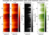 |
Fig. A.1. Example of a daily pB image acquired by Mauna Loa on July 27, 2001. Left panel: original pB data in polar coordinates (heliocentric distance on the x axis, polar angle measured counter-clockwise from the polar north on the y axis). Left-middle panel: pB fit in polar coordinates. Right-middle panel: the relative difference between the original data and fitted data. Right panel: resulting electron density in polar coordinates. |
Appendix B: Construction of the coronal Carrington maps
To create maps comparable with the photospheric ones, we followed the steps below, also summarized in Figure B.1:
-
Choose a CR and - starting from the results of the calculation of the electron densities ne and the equipartition magnetic field Bpot (Paragraph 3) - separate the east and west limbs. Notice that, under the assumption of a stationary solar corona, the features observed over one solar limb should be approximately the same as those observed over the opposite solar limb about two weeks later, thanks to a half rotation of the Sun.
-
Cut the last 7 days of the current CR and add the last 7 days of the previous CR to the east limb, and cut the first 7 days of the current CR and add the first 7 days of the next CR to the west limb. This is justified by the fact that the coronal structures observed on the east limb at a time t0 − 1 week and the ones observed on the west limb at a time t0 + 1 week are both associated with the photospheric structures at a time t0.
-
Create a single map by merging the east and west limbs: the new map is obtained by averaging the two maps obtained from the solar corona observed over the two opposite limbs. To do so, every corresponding day of the two maps is compared, and the following conditions are set:
-
if both maps contain data on a certain day, the resulting stripe is the average of the two
-
if one of the two maps contains a data gap on a certain day, the information is taken on the same day from the other map
-
if both maps contain a data gap on a certain day, the resulting map will have a black stripe in that position
This process is applied to minimize the effects due to the evolution of the coronal structures in the time elapsed between t0 − 1 week and t0 + 1 week.
-
The final Carrington map is obtained by putting every daily vertical stripe (extracted over a period of 27 days) next to each other in chronological order by going from right to left. A similar approach has been applied, for instance, very recently by (Casti et al. 2023) to build CR maps of the coronal solar wind speed as measured above the east and west limb, taking into account the solar rotation.
 |
Fig. B.1. Scheme of the creation of a coronal Carrington map. Here tcarr represents the Carrington time for one full solar rotation. |
Appendix C: Projection in sine latitude of Carrington maps
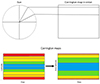 |
Fig. C.1. Top image: Schematic representation of the creation of a Carrington map in sine latitude. Bottom image: Scheme of a comparison between a deprojected Carrington map in solar latitude and a projected Carrington map in sine latitude. |
The sine latitude coordinates system is useful for acquiring Carrington maps of the photospheric fields, because of the projection effects related to the spherical shape of the solar surface. In particular, every image of the Sun is characterized by the fact that the pixels corresponding to regions around the equator cover a much smaller latitude interval compared to pixels corresponding to regions near one of the two poles. Hence, in each image of the Sun, the central slice going from south to north pole has a north-south extension of each pixel projected by a factor sin θi if θi is the latitude of the i−th pixel, leading to an angular resolution variable with the latitude. The conversion has been made by exploiting the following formula:
![Mathematical equation: $$ \begin{aligned} \theta _i = \arcsin \left[\left(\frac{2\,i}{n_{lat}}-1\right)\sin {\theta _{max}}\right], i=0,1,...,n_{lat} \end{aligned} $$](/articles/aa/full_html/2025/09/aa55036-25/aa55036-25-eq17.gif) (C.1)
(C.1)
where for the WSO data is nlat = 29 and θmax = 75°.
All Figures
|
Fig. 1. Example of a daily pB image acquired by Mauna Loa on August 30, 2008. Left panel: Original pB data in polar coordinates (heliocentric distance on the x axis, polar angle measured counter-clockwise from the polar north on the y axis). Left-middle panel: Polar coordinates of the pB fit. Right-middle panel: Relative difference between the original data and fitted data. Right panel: Resulting electron density in polar coordinates. |
| In the text | |
|
Fig. 2. Carrington maps of coronal electron densities (left panels) and equipotential magnetic fields (right panels) at 2.5 R⊙ for CR 2074 (top, solar minimum), and for CR 1979 (bottom, solar maximum). |
| In the text | |
|
Fig. 3. Carrington maps of photospheric magnetic fields (top), coronal equipotential magnetic fields at 2.5 R⊙ (middle), and PFSS extrapolations (bottom) for CR 2074 (left column, solar minimum) and CR 1979 (right column, solar maximum). An animation of this figure available online shows the equipotential and PFSS magnetic fields in chronological order for all the CRs analysed in this work. |
| In the text | |
|
Fig. 4. Top panels: Plasma-β Carrington maps for CR 2074 (left), and CR 1979 (right). Contour lines show the value of plasma-β corresponding to β = 1 (solid white lines) and β = 0.1 (dashed white lines). Bottom panels: Alfvén speed maps for CR 2074 (left), and CR 1979 (right). Contour lines show the value of VA corresponding to VA = 200 km s−1 (solid white lines) and VA = 1000 km s−1 (dashed white lines). |
| In the text | |
|
Fig. 5. Left panels: Butterfly diagrams of the photospheric magnetic field (top) and coronal electron densities (bottom). Right panels: Butterfly diagrams of the PFSS coronal magnetic field (top) and equipotential coronal magnetic field (bottom). |
| In the text | |
|
Fig. 6. Temporal evolution of coronal densities at the north pole (top image, blue line) and south pole (top image, red line), and at intermediate latitudes in northern (bottom image, blue line) and southern (bottom image, red line) hemispheres. |
| In the text | |
|
Fig. 7. Latitudinal distribution of the photospheric magnetic field (right column) and the coronal equipotential magnetic field (left column) during solar minimum (top images) and solar maximum (bottom images). |
| In the text | |
|
Fig. 8. Temporal evolution of coronal magnetic field at the north pole (top image, blue line), south pole (top image, red line), and intermediate latitudes in north (bottom image, blue line) and south (bottom image, red line) hemispheres. |
| In the text | |
|
Fig. 9. Top panel: Butterfly diagram of plasma-β. Contour lines show the value of plasma-β corresponding to β = 1 (solid white lines) and β = 0.1 (dashed white lines). Bottom panel: Butterfly diagram of the Alfvén speed VA. Contour lines show the value of VA corresponding to VA = 200 km s−1 (solid white lines) and VA = 1000 km s−1 (dashed white lines). |
| In the text | |
|
Fig. 10. Total magnetic energy density in the photosphere (red line) and the solar corona at 2.5 R⊙ (blue line). |
| In the text | |
|
Fig. A.1. Example of a daily pB image acquired by Mauna Loa on July 27, 2001. Left panel: original pB data in polar coordinates (heliocentric distance on the x axis, polar angle measured counter-clockwise from the polar north on the y axis). Left-middle panel: pB fit in polar coordinates. Right-middle panel: the relative difference between the original data and fitted data. Right panel: resulting electron density in polar coordinates. |
| In the text | |
|
Fig. B.1. Scheme of the creation of a coronal Carrington map. Here tcarr represents the Carrington time for one full solar rotation. |
| In the text | |
|
Fig. C.1. Top image: Schematic representation of the creation of a Carrington map in sine latitude. Bottom image: Scheme of a comparison between a deprojected Carrington map in solar latitude and a projected Carrington map in sine latitude. |
| In the text | |
Current usage metrics show cumulative count of Article Views (full-text article views including HTML views, PDF and ePub downloads, according to the available data) and Abstracts Views on Vision4Press platform.
Data correspond to usage on the plateform after 2015. The current usage metrics is available 48-96 hours after online publication and is updated daily on week days.
Initial download of the metrics may take a while.