| Issue |
A&A
Volume 700, August 2025
|
|
|---|---|---|
| Article Number | A247 | |
| Number of page(s) | 13 | |
| Section | The Sun and the Heliosphere | |
| DOI | https://doi.org/10.1051/0004-6361/202452955 | |
| Published online | 28 August 2025 | |
Thermal structuring of the quiet solar corona
1
Max Planck Institute for Solar System Research, 37077, Göttingen, Germany
2
Institut für Sonnenphysik (KIS), 79110, Freiburg, Germany
3
NASA Goddard Space Flight Center, Solar Physics Laboratory, Heliophysics Science Division, Greenbelt, MD, 20771, USA
4
Northumbria University, Physics and Electrical Engineering, Newcastle upon Tyne, NE1 8ST, UK
⋆ Corresponding author: This email address is being protected from spambots. You need JavaScript enabled to view it.
Received:
11
November
2024
Accepted:
8
June
2025
Abstract
Context. The quiet solar atmosphere is populated with plasma loops that are typically observed in the ultraviolet (UV) and extreme-ultraviolet (EUV) wavelengths. The coronal counterparts of these loops are traditionally referred to as coronal bright points. Although they are very compact, bright points reveal a high degree of multithermal complexity through different layers in the solar atmosphere.
Aims. We investigate the thermal structuring of these loop systems to gain further insights into the physical mechanisms that heat the plasma. To this end, we report on the multithermal characteristics of bright points in the quiet solar atmosphere through the transition region and the corona.
Methods. We combined spectral data from the EUV spectrometer SPICE on board Solar Orbiter and imaging data from AIA on board SDO to cover a broad temperature range (log T [K] ≈ 4.6–6.5). The bright points were observed simultaneously in all available spectral and imaging channels. We analyzed 14 features in total, computed their differential emission measure (DEM) distribution, and compared them with the emission measure from the (average) quiet Sun.
Results. We found common characteristics of the DEM in the bright points. In the upper transition region, above temperatures of log T [K] ≈ 5.2, the slope of the DEM toward higher temperatures (i.e., towards the corona) is significantly shallower than in the quiet Sun. The situation is different in the lower transition region, below log T [K] ≈ 5.2: The negative slope of the DEM is similar to that of the quiet Sun there, which implies that in response to the additional heating, the density in the bright point increases by the same factor at all temperatures.
Conclusions. Our finding of the very shallow gradient of the DEM toward higher temperatures is relevant for coronal heating models. Based on earlier studies, a shallower DEM slope would imply fewer heating events in the bright points than in the quiet Sun. The apparent dichotomy between the plasma at the lower and at the higher temperatures might also imply distinct heating mechanisms or thermally disconnected loops in the two temperature ranges. To confirm these, however, a more detailed analysis is required. In particular, UV and EUV spectroscopic time series combined with co-temporal imaging data are required to better capture the thermal evolution of bright points, which in turn will shed further light on the nature of thermal structuring and plasma heating in the corona.
Key words: Sun: corona / Sun: transition region / Sun: UV radiation
© The Authors 2025
 Open Access article, published by EDP Sciences, under the terms of the Creative Commons Attribution License (https://creativecommons.org/licenses/by/4.0), which permits unrestricted use, distribution, and reproduction in any medium, provided the original work is properly cited.
This article is published in open access under the Subscribe to Open model.
Open Access funding provided by Max Planck Society.
1. Introduction
The solar corona and transition region are populated with bright plasma loops. The plasma in loops is confined to the magnetic field lines, which are anchored in photospheric magnetic fields. Depending on the underlying magnetic environment, from the quiet Sun to active regions, the loops exhibit a wide range of lengths, temperatures, and densities. This was revealed by observations in different spectral bands, from the ultraviolet (UV) to X-rays (e.g., Reale 2014).
Quiet-Sun coronal loops are associated with magnetic bipoles in the junctions of the photospheric magnetic network. They are traditionally called coronal bright points, essentially because the earliest observations in X-rays were unable to resolve their substructures (Golub et al. 1974). We also use this term in our study. While X-ray bright points reach temperatures of ≈2–3 MK (Madjarska 2019), a spectrum of somewhat cooler bright points exists as well. These are prominent in the UV and extreme-ultraviolet (EUV) emission lines, which originate from plasma at transition region and coronal temperatures up to 1–2 MK. These loops are coupled to their chromospheric footpoints, which emit in the UV over the magnetic network. Studying the dynamics of bright points therefore requires spectroscopic observations that span the solar atmosphere. This simultaneous spectral coverage of a broad range of plasma temperatures, however, is not regularly available.
Tian et al. (2008) analyzed plasma flows and electron densities in a bright point covering chromospheric and coronal emission. They found that the bright point consisted of cooler and hotter plasma components, which further indicates that the loops associated with these two components might be heated through different physical mechanisms. They used spectroscopic data from two instruments, namely SUMER1 and EIS2. This combination of instruments offered a broad temperature coverage, with SUMER covering the transition region and EIS the coronal plasma. The disadvantage of the SUMER dataset was, however, that different emission lines were acquired 1–2 hours apart from each other because the instrument was unable to access all the lines at the same time. This is not ideal for studying loops, which generally evolve on timescales much shorter than this.
Doschek et al. (2010) investigated coronal bright points by using spectral data from EIS that mostly covered coronal emission lines. They showed that the bright points exhibit a high level of complexity when observed at different temperatures, but their study lacked strong emission lines that covered the low transition region. The bright point they studied in most detail stood out above the surrounding areas, but only when it was observed in emission lines that formed above about log T [K] = 5.8 (see their Table 3). On the other hand, this feature did not appear to be prominent at the transition region temperatures.
The thermal structuring of loops is best investigated through the differential emission measure (DEM; Mariska 1992; Del Zanna & Mason 2018), which gives the distribution over the temperature for the plasma along the line of sight. Different regimes of the upper solar atmosphere can be distinguished through the properties of the DEM. Above the chromosphere, in the temperature range covering the lower transition region, the DEM of the quiet Sun drops steeply and reaches a minimum value at log T [K]≈5.2 (e.g., Mariska 1992). From this minimum toward higher coronal temperatures, the DEM rises in the upper transition region. It peaks at coronal temperatures of log T [K]≈6.0, after which it drops sharply. In these distinct temperature ranges, namely the lower and the upper transition region, and in the corona, the DEM nearly follows three different power-law-like distributions that intersect at the minimum and maximum values. This is evident from the well-known shape of the DEM distribution in the quiet Sun (e.g., Raymond & Doyle 1981, their Fig. 3.).
The question of whether the shape of the DEM depends on the region of interest and if this can be used to infer the properties of plasma heating is widely investigated. The observed DEM was often compared with models for active region loops. The models show a coronal DEM peak at log T [K]≈6.5 (e.g., Warren et al. 2012), and many studies investigated the slope of the DEM in the upper transition region (up to the coronal peak) in the scope of impulsive (nanoflare) heating models (e.g., Cargill 1994; Cargill & Klimchuk 1997, 2004). In the quiet Sun, Chitta et al. (2013) studied emerging loops, using the EUV channels of the Atmospheric Imaging Assembly (AIA; Lemen et al. 2012) on board the Solar Dynamics Observatory (SDO; Pesnell et al. 2012). They compared the temperature and the DEM of the observed loops to the modeled values from impulsive heating models. By testing different frequencies of the heating events, they found that a combination of low and high heating frequencies produces results that are closest to the observations. The data they used, however, covered only the coronal emission.
Despite the studies mentioned so far, the question of how bright points are thermally coupled throughout the solar atmosphere remains an outstanding issue, mainly because we lack simultaneous spectral observations spanning the solar atmosphere. We study the thermal structuring of the short loops in bright points in the quiet Sun based on data that cover a broad range of plasma temperatures, from the low transition region to the corona. We combine spectral data from the Spectral Imaging of the Coronal Environment (SPICE; SPICE Consortium 2020) instrument on board the Solar Orbiter mission (Müller et al. 2020) and imaging data from AIA. The transition region emission lines observed with SPICE are acquired simultaneously, unlike with SUMER. By performing the DEM analysis, we find a common behavior in all analyzed bright points. This can provide insights into the heating of these short loops.
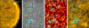 |
Fig. 1. Overview of our observations. Panel a shows a context image from AIA 171 Å, where the red box outlines the SPICE field of view, which is displayed in panel c (C III 977 Å intensity map). The corresponding SDO field of view is outlined with the yellow box and is shown in panels b (HMI line-of-sight magnetogram) and d (AIA 171 Å). The boxes in panels b–d (side length of ≈24 Mm) highlight the 14 bright points we analyzed, which exhibited predominantly flux emergence (blue), flux cancellation (violet), or random motion of the footpoints (green; Sect. 3.2.3). The images in panels a, c, and d are in logarithmic scaling. Those in panels b and d are averaged during the SPICE raster, and their evolution is available in an online movie that spans eight hours centered around the SPICE raster (Sect. 2). |
2. Observations and data processing
We identified bright points in the UV spectroscopic data from the transition region (log T [K] = 4.6–6.0), in a quiet-Sun dataset from SPICE. To investigate their characteristics at higher temperatures (log T [K] = 5.9–6.5), we used coronal imagery data from AIA. For the magnetic field context, we used photospheric magnetograms from HMI in the same region.
2.1. Observational data
We used a large, dense raster3 acquired on 28 May 2020 between 16:09 and 16:54 UT by SPICE on board the Solar Orbiter mission. At the time of these observations, Solar Orbiter was about 28° away from the Sun-Earth line, at a distance of about 0.565 astronomical units from the Sun. At this distance, 1′′ corresponds to ≈410 km on the Sun. The field of view was located in the quiet Sun, and from the point of view of Solar Orbiter, it was close to the disk center (Fig. 1c). This is in the western hemisphere from the vantage point of the Earth (Fig. 1a). SPICE rastered an extent of about 210 Mm, with a step size of 4′′ from west to east. The plate scale along the slit was 1.098′′ per pixel, and the slit length corresponded to about 270 Mm. The spatial resolution along the slit is estimated to be 6.7′′ (Fludra et al. 2021), which here corresponds to about 2.8 Mm. This dataset contains spectra of six transition region emission lines that we list in Table 1 (for an example of a typical spectrum from SPICE, see, e.g., Fludra et al. 2021; Huang et al. 2023). We show the C III (977 Å) line intensity map (obtained by averaging the observed line profile over the wavelength) in Fig. 1c.
Spectral lines and bands.
During the period of the SPICE raster, we used a time series of data from AIA4. We used the full-disk coronal images acquired by AIA in the EUV channels (see Table 1). The images were taken with a cadence of 12 s and have a plate scale of about 0.6′′ per pixel. We also used the full-disk line-of-sight magnetograms acquired by the Helioseismic and Magnetic Imager (HMI; Scherrer et al. 2012; Schou et al. 2012). These data have a cadence of 45 s and a plate scale of about 0.5′′ per pixel.
Additionally, we used a longer time series of the SDO data that started four hours before and ended about three hours after the SPICE raster. We used the HMI magnetograms and the AIA images at 171 Å, 193 Å, and 304 Å to follow the long-term evolution of the bright points. For this long time series that covers about 8 hours, we used a reduced cadence of about 1.5 minutes (90 s for HMI and 96 s or 84 s for AIA).
2.2. Preparation of the data
We processed all the AIA data using the aiapy Python package (Barnes et al. 2020). The processing included updating the image pointing information, rescaling the data to the plate scale of exactly 0.6′′ per pixel, and removing the instrument roll angle. To simplify the handling of different datasets and the selection of features to analyze, we projected the HMI data onto the AIA coordinates. We did this by using the information given in the data headers and the routines available in the Python package SunPy (The SunPy Community 2020). This ensured that HMI and AIA data were coaligned and all have a plate scale of 0.6′′ per pixel.
When comparing the data from SPICE to the ones from SDO, there are noticeable projection effects as a consequence of the instruments being at different heliographic longitudes. Here we aimed to measure the average intensity of small features, namely the loops that are roughly up to 20 Mm long, so that they do not reach sufficiently high to be severely affected by projection effects. Therefore, we used each dataset in its original view plane (and plate scale) to perform the measurements and avoided unnecessary interpolation of the data in a small field of view. We still ensured for each analyzed feature that the area we selected for the analysis overlaps in all different passbands, as we discuss in Sect. 2.3.2. In Figs. 1b and 1d, we show cutouts from an HMI magnetogram and an AIA 171 Å image in a field of view that nearly matches the one from SPICE. For illustration purposes, both images were produced by averaging individual frames during the SPICE raster period.
2.3. Selection of bright points
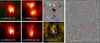 |
Fig. 2. Bright point 01 throughout the solar atmosphere. We show bright point 01 as recorded with different instruments and in different spectral ranges, as annotated. The green dots in panel a mark the pixels we used to estimate the average background spectrum. The dark blue contour in panels b and d outlines the bright-point pixels selected in the SPICE data. The orange contour in panel c outlines the brightening in Lyβ, which we used to align the SPICE data to HMI. In panels e and f, we overplot the contours from panels c and d, respectively, after reprojecting them onto the AIA coordinate grid. The dotted white square represents the field of view of panels a–d (roughly 24 × 24 Mm) after the reprojection. The light blue box in panel f outlines the bright-point pixels selected in the AIA data. In panel g we show the overlap between the various analyzed brightenings in Lyβ and the magnetic field concentrations across the whole field of view (see Sect. 2.3). All panels from SPICE and AIA are scaled linearly between minimum and maximum values. |
We identified several bright points in the C III intensity image (overplotted boxes in Fig. 1c). All of them have underlying small bipolar magnetic field regions in the photosphere (separation distance of 5–10 Mm; Fig. 1b). Likewise, they all have counterparts in the coronal images (Fig. 1d). In the following, we first explain how we selected the bright points in the SPICE data and then the corresponding ones in the AIA data.
2.3.1. Bright points in the SPICE data
Thresholds for the selection of the bright points.
For our analysis, we selected features that appeared prominent in the transition region emission, located over the magnetic network. We selected 14 bright points in total, the selection of which was based on the brightness in the C III image (Fig. 1c) from SPICE5. Bright points traditionally show emission in a broad range of plasma temperatures through the transition region and corona. Therefore, with the spatial resolution available from SPICE, we do not expect that a choice of a particular line as a starting point for the selection affects the results of our study. This could be important in some future studies, which might resolve the substructure of bright points and how this changes between different plasma temperatures in a greater detail.
We applied certain steps when extracting the emission of the bright points in the respective spectral lines in order to reduce contamination of the line profile by the surrounding and background quiet-Sun emission. We started by placing a small box around the feature (e.g., box 01 in Fig. 1c, enlarged in Fig. 2a). Within it, we first selected pixels that have C III intensity lower than 30% of the brightest pixel value (pixels marked with green dots in Fig. 2a; columns 2 and 3 in Table 2). We then obtained the background emission spectral profile by computing the average line profile from these pixels. We subtracted this background profile from all the pixels within the box to obtain a cleaned version of the C III intensity image. Then we selected pixels that have intensity higher than 70% of the brightest pixel value (on and inside the blue contour in Fig. 2a; columns 4 and 5 in Table 2). Here we aimed to avoid the surrounding quiet-Sun emission and included only a small area that belongs to the bright point in our analysis. We used these pixels to calculate the average C III line profile of the bright point itself, after the previously mentioned background subtraction (see Fig. 2b). We experimented with the thresholds for the bright point selection by decreasing and increasing their values by about 40% and found that our results are not sensitive to the exact values of the thresholds. Hence, we settled on values that give a good match when inspecting by eye.
After this, we calculated average profiles of all other spectral lines observed with SPICE for the same bright point. To do this, we used the C III image as a reference. This implies that in all emission lines we used the same pixels for the background estimation, or for the bright point itself, as the ones selected from the C III image (see Fig. 2d). In this way, we always used the same spatial area when calculating average line profiles for all the observed emission lines.
For a given bright point, we fitted each of the average line profiles with a single Gaussian by using the curve_fit function available in the SciPy Python package (Virtanen et al. 2020). Because of the limited spectral resolution of SPICE, S V and O IV are (slightly) overlapping in the spectral direction. Therefore, we fitted both these profiles simultaneously with a double Gaussian. From the fit parameters, we obtained the total line intensities, which we then used as an input for further analysis (Appendix A.1).
2.3.2. Bright points in the AIA data
To analyze the same bright points in the AIA data, we first needed a representative AIA image that is nearly co-temporal to the corresponding SPICE raster. Since it takes about 5 minutes for SPICE to scan across a given bright point (e.g., the boxed region in Fig. 1c), we used 26 consecutive snapshots of AIA to create an average intensity map of that bright point in each respective AIA passband. This averaging also reduces the noise in AIA images, which is particularly necessary for channels with lower signal-to-noise ratio in quiescent regions (e.g., 94 Å, 131 Å, and 335 Å). Similarly, we averaged 7 HMI magnetograms (taken within about 5 minutes) to create an average magnetogram for each bright point.
We then spatially aligned the average AIA and HMI maps with SPICE. For this, we used the H I Lyβ raster image from SPICE and the average HMI magnetogram. The Lyβ line shows emission that originates from the upper chromosphere (T ≈ 10 000 K), while the HMI magnetogram shows the photospheric magnetic field. Bright chromospheric features, in general, are expected to correlate well spatially with the magnetic field concentrations in the photosphere. Furthermore, because both of these diagnostics reveal low-lying emission (i.e., from the photosphere or the chromosphere), they should be the least affected by the projection effects, making this magnetogram-image pair suitable for alignment.
To align the images, we reprojected the Lyβ image on top of the magnetogram using the routines from the Python package SunPy. To achieve a good overlap between the bright features and the magnetic field concentrations, we adjusted the WCS keywords (Thompson 2006) in the SPICE header. Precisely, we set the values of CRVAL1 = − 77.707°, CRVAL2 = − 56.166° and CDELT1 =4.15′′. We decided on these values after visually inspecting the quality of the alignment. Additionally, we also accounted for minor offsets between the Lyβ and HMI regions of interest due to the solar rotation. The alignment is illustrated in Fig. 2g, where the curved, white quadrangle represents the SPICE field of view reprojected onto the HMI magnetogram. The orange contours outline the brightenings in the Lyβ image, which, after the alignment, coincide with the magnetic field concentrations across the whole field of view. This is best seen in the zoom into one particular bright point shown in Fig. 2e.
After the alignment, we reprojected the C III image on top of the AIA images in the same way as we did with Lyβ and HMI. We used this reprojected C III image only as guidance when selecting the bright points in the AIA images. As we illustrate in Fig. 2f with the 171 Å channel, we selected a box (light-blue rectangle) in the AIA image that nearly matches the pixels selected for the bright point analysis in C III (blue contour). The two selections cannot be exactly the same because the two images (from SPICE and from AIA) are in slightly different view planes. We placed the same box in all other AIA channels and calculated the average intensity within the box for each channel. These average intensity values we used in further analysis (Appendix A.2). Varying the area of the bright point used for the analysis had no qualitative effect on our results (see Sect. 3.2.2).
3. Results
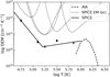 |
Fig. 3. Differential emission measure of the average quiet Sun. The input intensity of the quiet Sun is spatially averaged over the whole SPICE (and the corresponding AIA) field of view. The solid line depicts the DEM profile derived from the SPICE data. Each emission line (see Table 1) is represented with a diamond at its effective line formation temperature, as derived with the DEM procedure. The offset of each diamond to the DEM curve indicates the ratio of the observed line intensity to the one derived from the DEM. The bars represent the errors of the observed line intensities. The dotted lines display the emission measure loci for the SPICE emission lines. The dashed line depicts the DEM profile as determined using the AIA data. See Sect. 3.1. |
 |
Fig. 4. Overview of the bright point 01 observations. We show spectral and imaging diagnostics, along with the surface magnetic fields, for bright point 01, as labeled in each panel. Both the SPICE and the SDO data are shown in their original view plane and plate scale, and images are scaled linearly between minimum and maximum values. The SPICE panels have a size of about 24 × 24 Mm. In the top right of each panel, we indicate the temperature (in log T [K]) of the plasma for which the emission line or channel has the highest sensitivity (Table 1). The SDO data are averaged over about 5 minutes, during which time the SPICE slit crossed the bright point. The dark blue contours and the light-blue boxes highlight the pixels selected for the analysis of the bright point, as discussed in Sect. 2.3. |
Using the UV spectroscopic data from SPICE and the EUV images from AIA, we calculated the DEM of the average quiet Sun and of the bright points we selected. The DEM inversions were performed separately for the transition region observations with SPICE and for the coronal observations with AIA data. The input intensities for the bright points, necessary for the DEM inversions, were obtained as described in Sect. 2.3. The input intensities of the quiet Sun were obtained by spatially averaging the intensity over the whole SPICE raster map and the corresponding AIA field of view in respective emission lines and channels. The details of the DEM inversions are described in Appendix A. Finally, with the HMI magnetograms, we followed the evolution of the surface magnetic fields underlying the bright points.
3.1. Quiet-Sun DEM with SPICE and AIA
We calculated the DEM of the quiet Sun for the full field of view of SPICE, using both the SPICE and the AIA data (Appendix A). We show the resulting DEM in Fig. 3. There, the two power laws show the result based on the SPICE data. This reflects the well-studied variation of the DEM as a function of temperature. Qualitatively and quantitatively, this is similar to previous quiet-Sun studies (e.g., Parenti & Vial 2007, their Fig. 2).
To double-check the piecewise power-law DEM inversion, we calculated EM loci for the emission lines covered by SPICE. Essentially, the EM locus is the total line intensity divided by the line contribution function. We calculated the appropriate contribution function for each transition, under the assumption of an isobaric atmosphere, by using the ch_lookup_gofnt routine available in CHIANTI software and data package (version 10.1; Dere et al. 1997; Del Zanna et al. 2021). The EM loci are shown as dotted curves in Fig. 3. For a single spectral line, the EM locus curve shows, at each temperature, the amount of plasma needed to emit the observed line intensity, should all the available plasma be at only that one temperature. For that reason, the lower envelope of the EM loci curves represents an upper boundary of the true emission measure, and the variation of this envelope should follow a trend similar to the DEM curve. This is what we see in our quiet Sun data in Fig. 3. Hence, we conclude that the DEM inversion based on the SPICE data is reliable.
The output DEM from the AIA data, shown with a dashed curve in Fig. 3, peaks at a temperature near 1 MK. Toward higher temperatures, the AIA DEM drops significantly. This trend reflects that, on average, there is little plasma hotter than 2–3 MK in the quiet corona, which is consistent with earlier studies (e.g., Morgan & Taroyan 2017). The cutoff of the AIA DEM below 1 MK is due to the AIA filter responses not constraining well the plasma emission at lower temperatures (see Appendix A.2). There, the SPICE measurements provide better coverage. Essentially, the AIA quiet-Sun DEM level just below 1 MK transitions nicely into the level determined by SPICE observations. This smooth connection between the two temperature domains is reassuring.
Overall, by combining the data from SPICE and AIA, we were able to calculate the DEM of the quiet Sun between log T [K] = 4.6 and 6.5. Our result in Fig. 3 is in qualitative and quantitative agreement with many earlier studies, such as Raymond & Doyle (1981) and Parenti & Vial (2007). This gives us a good foundation to study the DEM of other features, namely the bright points.
3.2. Properties of the bright points
We analyzed 14 bright points that range in size between about 6 Mm and 10 Mm, based on the C III image. This size is within the expected range for coronal bright points (Madjarska 2019). Our data provided a broad thermal coverage of these features, as we illustrate in Fig. 4. There we show the bright point 01 in all the different spectral ranges and emission lines available in our data. In the following, we summarize the main morphological, thermal, and magnetic properties of the features we analyzed.
3.2.1. Bright points in the coronal images
The majority of the analyzed bright points, represented by short loops, are persistent in the coronal images for several hours. To illustrate this, we supplement a movie to Fig. 1. These loops are clearly visible in the average images from AIA we made for the three example bright points 01, 02, and 03 (see AIA panels in Figs. 4, 6, and 7), which are among the brightest in our sample. The longest loops we identified are about 12 Mm (e.g., bright point 01). The smallest ones are down to about 2–4 Mm (e.g., bright point 03).
A few of the bright points, however, remain mostly quiet during the time series we studied, with faint EUV emission in the coronal images (e.g., bright points 06, 09, and 11). They stand out more prominently above the background only during short periods of time, when they exhibit bursts of EUV intensity enhancements that last between roughly 5 and 20 minutes. Some of these bursts were caught by the SPICE slit and correspond to the bright points we selected in the C III raster image, while overall they are not prominent in the coronal emission.
The nature of the SPICE data, in the form of a large raster, prevents us from checking if these features show similar transient behavior also at transition region temperatures. Furthermore, the low spatial and spectral resolution of our SPICE data are not adequate to investigate the presence of transient features such as explosive events (e.g., Dere 1994) or network jets (e.g., Tian et al. 2014) in the bright points, in particular the presence of double- or multipeaked spectral profiles. Some insight into this could be gained from the AIA 304 Å channel, which at moments shows loop-like features but generally has a patchier appearance and evolves more rapidly than the coronal channels. The formation of the He II line that dominates the 304 Å band is, however, more complicated than the optically thin transition region lines predominantly excited by electron collisions. Therefore, any quantitative conclusion about the variability of the transition region plasma based on the 304 Å channel is difficult (e.g., Andretta & Jones 1997). In particular, we cannot use the 304 Å channel for the following DEM analysis using AIA data.
3.2.2. DEM of the bright points
We calculated the DEM of the bright points, as discussed in Appendix A. As above, we show the same three example bright points 01, 02, and 03. The DEM of the bright point 01 is enhanced at all observed temperatures when compared to the quiet Sun (Fig. 5). Furthermore, the peak of the DEM at the high-temperature end (covered by AIA) shifts to higher temperatures from log T [K] ≈ 6.1 in the quiet Sun to 6.2 in the bright point.
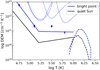 |
Fig. 5. Differential emission measure of bright point 01 compared to the quiet Sun. The quiet-Sun DEM is computed for spatially averaged intensity over the whole SPICE (and the corresponding AIA) field of view. The choice of the different line styles is the same as in Fig. 3. The results are represented with blue lines for the bright point and black lines for the quiet Sun. See Sect. 3.2.2. |
The factor by which the DEM is increased in the bright point (in comparison to the quiet Sun), however, is not the same at all temperatures. At the low-temperature end, in the lower transition region below log T [K] ≈ 5.2, the bright point and the quiet Sun have a similar, negative slope of the DEM (of about −4). In the upper transition region, above temperatures of log T [K] ≈ 5.2 and up to log T [K] ≈ 6.0, the slopes of the two are quite different. Here, the quiet-Sun DEM has a clear positive slope (of about 0.7), while the bright point DEM shows only little change (slope close to 0). Certainly, in the bright point, the increase of the DEM towards the corona (if present at all) is significantly less steep than in the quiet Sun.
Other bright points in our sample share the above characteristics with the example 01. The slope and the values of the DEM in the lower transition region, in particular, are quite similar for all the bright points (see Table 3). Furthermore, they all show a flat or even a negative trend of the DEM in the upper transition region. This is evident when comparing bright point 01 with cases 02 and 03, which are shown in Fig. 6a and Fig. 7a.
Summary of the bright-point properties.
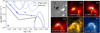 |
Fig. 6. Overview of the results for bright point 02. In panel a we show the differential emission measure of the bright point compared to the quiet Sun (similar to Fig. 5; see Sect. 3.2.2). In panels b–g we show the bright point observations from different instruments and spectral ranges (similar to Fig. 4; see Sect. 2.3). |
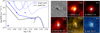 |
Fig. 7. Overview of the results for bright point 03. The layout of the panels is like in Fig. 6. See Sect. 3.2.2. |
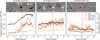 |
Fig. 8. Evolution of bright points 01, 02, and 03 over the course of 8 hours. In the bottom panels, the orange, yellow, and brown curves depict the variation of the EUV intensity in a specific AIA channel that we spatially averaged within the box we used to calculate the DEM (cf. light-blue boxes in Figs. 4g–l) and normalized to the average quiet-Sun value in the total field of view. The SPICE raster takes place between hours 4 and 4.75 and the vertical red line indicates the time when the SPICE slit crossed over a specific bright point. The black curve depicts the variation of the total unsigned magnetic flux, integrated in the field of view shown in the top panels, including only pixels with signal above the noise level of 10 G. The top panels show snapshots of the line-of-sight magnetogram from HMI, saturated at ±100 G. The snapshots correspond to the beginning, mid-time, and the end of the 8-hour time series (Sect. 2), and cover a field of view of about 24 × 24 Mm (like in Fig. 4a). The evolution of these magnetograms is also available online as a movie. |
At and above log T [K] ≈ 6.0, often the peak of the DEM is shifted to higher temperatures, and the peak value is higher than for the quiet Sun (as for BPs 01 and 02). Still, even if the bright point DEM is at a higher level at log T [K] ≈ 6.0 than in the quiet Sun, the gradient of the DEM in the upper transition region is shallower in the bright points. About half of the cases do not show an enhanced DEM at log T [K] ≈ 6.0 at all, and hence often show even a negative slope, that is, a drop, of the DEM in the upper transition region towards higher temperatures. This is illustrated by the example of bright point 03 in Fig. 7a. This bright point, although very prominent in the transition-region emission (Fig. 1c), does not stand out in coronal emission when compared to the background quiet Sun in the large field of view shown in Fig. 1d. Hence, the DEM of this bright point around 1 MK is comparable to the average quiet Sun as seen in Fig. 7a. Still, in the local surroundings of the bright point, where the coronal quiet-Sun emission is particularly low, the coronal loops in the bright point can be identified clearly (Fig. 7f).
There are limitations to our results of the DEM. To select the bright points in the SPICE image, we needed to set intensity thresholds (Sect. 2.3.1), which might have affected our results. We tested different thresholds for the bright point 01, which resulted in selecting a smaller or larger area of the bright point for the analysis in SPICE and consequently in AIA data. While this caused the overall DEM curve to shift up or down (due to the increased or decreased average intensity), it did not affect the general trends we discussed above. Furthermore, our results are limited by the available diagnostics, in particular the five emission lines from SPICE we used to study the DEM in the transition region. Differences in the DEM between the bright points might not have been fully revealed with the data we have. This can be improved by selecting emission lines that more finely and evenly sample the studied range of temperatures in new studies of SPICE. We do not expect major changes in the results, however, because our result for the quiet-Sun DEM is in good agreement with earlier studies.
In summary, we find that all bright points show an increase of the DEM in the lower transition region (log T [K] < 5.2) and keep the same slope of the power law when compared to the average quiet Sun. In contrast, in the upper transition region (5.2 < log T [K] < 6.0) the gradient of the DEM is much shallower in the bright point, with a DEM sometimes even decreasing toward higher temperatures. In only about half of the bright points, the DEM in the coronal part (log T [K] > 6.0) is increasing and peaking at higher temperatures as compared to the quiet Sun. In the other half of the cases, the coronal part of the bright point DEM is very similar to the quiet-Sun one, that is, the bright point is less prominent in the coronal than in the transition-region data.
3.2.3. Relation of the bright points to the photospheric magnetic field
To study the magnetic driving of the bright points in relation to their thermal properties, we followed the evolution of their magnetic flux content, particularly prior to the observation with SPICE. We did this by using the aforementioned time series of the SDO data, which starts four hours before the SPICE raster and runs for 8 hours in total. By (initially) visually inspecting the photospheric magnetograms, we recognized different processes in the magnetic footpoints of the analyzed bright points, namely magnetic flux emergence, flux cancellation, and random motion of the footpoints. For the example bright points 01, 02, and 03, we show three snapshots of their magnetograms in the top panels of Fig. 8.
In the time leading up to the SPICE observations, bright point 01 shows very prominent flux emergence. In fact, the beginning of its emergence is captured in the SDO time series we analyzed. Its unsigned magnetic flux (black curve in Fig. 8a) increases between hours 2 and 6, with a rate of about 0.15 ⋅ 1020 Mx h−1, after which it saturates to a value of about 1.3–1.4 ⋅ 1020 Mx. At the time when the SPICE slit crossed the bright point (vertical red line), the flux emergence was still ongoing. This bright point contains the highest amount of magnetic flux within our sample, with its value being at the higher end of what is considered a coronal bright point, nearing the flux range of small active regions (see, e.g., Mou et al. 2016, their Fig. 2). Its rate of growth of the magnetic flux is also 2–3 times larger than in a typical coronal bright point (1.5 ⋅ 1015 Mx s−1 ≈ 0.05 ⋅ 1020 Mx h−1; Golub et al. 1977; Madjarska 2019), making this case exceptional in that sense.
Several other bright points also show flux emergence prior to the SPICE observation (blue boxes in Figs. 1b–d), including bright point 02. Its magnetic flux grows until some 4.5 hours, with a rate of about 0.03 ⋅ 1020 Mx h−1 (Fig. 8b), which is somewhat lower than the typical value for coronal bright points. This feature was, however, already present at the beginning of the SDO time series. A more dynamic emergence phase happened ≈9 hours before that, after which the magnetic footpoints exhibited mostly random motions.
Some bright points from our sample show flux cancellation before the SPICE raster (violet boxes in Figs. 1b–d). As an example of these, we show bright point 03 in Fig. 8c. Its magnetic flux gradually decreases over time (by about 0.01 ⋅ 1020 Mx h−1), which could be related to the flux cancellation. The absolute value of this rate of change is significantly smaller than for the other two examples we show. The flux is still consistently diminishing over the course of our observation, as is also evident from the snapshots of magnetograms (top panels of Fig. 8c). We note here that the ongoing magnetic processes are often, except in very prominent cases like bright point 01, better visible from the evolution of magnetograms than from the magnetic flux curves. It is, therefore, difficult to objectively grasp the magnetic evolution of bright points and to identify the most relevant processes.
Other bright points in our sample (green boxes in Figs. 1b–d) show predominantly random motion of the magnetic field concentrations. We do not find systematic change of the magnetic flux in these cases, and any processes other than shuffling of the magnetic elements are hard to recognize in the magnetograms. These may still be present at smaller scales, below the resolution power and sensitivity of HMI, similarly as opposite (parasitic) polarities can be found at the footpoints of coronal loops when observing at very high resolution (Chitta et al. 2017).
In all bottom panels in Fig. 8, we overplot the curves of the average EUV intensity in different AIA channels on top of the unsigned magnetic flux. The magnetic flux growth in bright point 01 is clearly followed by the general increase of the coronal emission. In the case of bright point 02, which has already emerged at the beginning of the time series, the EUV emission fluctuates well above the average quiet Sun, with a noticeable positive trend, maybe related to the flux emergence. The coronal emission in bright point 03, with the least magnetic flux of the three examples, fluctuates at a lower rate, with a subtle declining trend that could be related to the diminishing magnetic flux.
In addition to the general trends, there are smaller variations in the magnetic flux and the EUV intensity for which it is harder to find a direct cause. We note here that the expected measurement error for the EUV intensity shown in Fig. 8 is two to three counts per pixel in each channel at most. We estimated this value by using the routines available in the aiapy Python package, equivalent to the aia_bp_estimate_error routine from SolarSoft. It corresponds to ≈0.01 in the normalized intensity scaling we use in the figure, which is significantly smaller than the short-term variability seen in the EUV curves. Hence, the short-term EUV variability in Fig. 8 should be of solar origin.
When focusing on the total unsigned magnetic flux in bright points, as opposed to the flux variation, there are indications that the bright points with greater magnetic flux show flatter DEM slope in the upper transition region (cf. Fig. 8, Table 3). In the current study, however, this relationship is not conclusive. Further insights might be gained by using vector magnetograms and field extrapolations to access the volumetric magnetic energy available to the bright points, which could then be compared to the DEM slopes or the emission measure in general.
In conclusion, the 14 bright points we identified show different magnetic processes at their base. Roughly two thirds show either flux emergence or flux cancellation prior to the SPICE observation, while the rest show only reshuffling of the magnetic elements at their footpoints, without major signatures of either flux emergence or cancellation. While there are limitations present both in the computed DEM and in the accurate identification of the relevant magnetic processes, all analyzed bright points show very similar enhancement and trend of the DEM in the lower and the upper transition region (Sect. 3.2.2), regardless of the ongoing magnetic processes happening in the bright point prior to the DEM evaluation. There are indications of bright points with greater total unsigned magnetic flux having flatter DEM in the upper transition region, which could be addressed in future studies.
4. Discussion
 |
Fig. 9. Loops in bright point 01. We show single snapshots of bright point 01 in different AIA channels, as labeled in each panel. We indicate in the top right the temperature of plasma (in log T [K]) for which the channel has the highest sensitivity (Table 1). The field of view is like in Fig. 4, and the images are scaled linearly between minimum and maximum values. The black and white contours in all panels outline the magnetic field from HMI at values of −50 G and +50 G, respectively. The dashed and dotted blue lines highlight loop-like features from 304 Å and 171 Å channels, respectively, as discussed in Sect. 4.1. |
We find that all bright points show a similar increase of the DEM at all temperatures from below 0.1 MK up to about 1 MK as compared to the quiet Sun. An increase of the DEM in a given temperature bin generally implies higher plasma density at the respective temperature. This is expected for bright points, as they stand out above the background emission in different transition region and coronal images (e.g., Fig. 4). When present, the shift of the coronal DEM peak toward higher temperatures above 1 MK indicates an increase of the coronal temperature in these features. In the following, we will discuss implications of our results for the heating processes acting in the bright points.
4.1. Bright point DEM in the lower transition region
In the lower transition region (below log T [K] ≈ 5.2), the DEM of the bright points is increased when compared to the quiet Sun. The increase is such that the DEM maintains a (negative) slope similar to that found in the quiet Sun. This implies that the plasma at a given temperature has a density in the bright point that is higher than in the quiet Sun. The increased density implied by the DEM could have various sources.
One possible source is heating acting at higher, coronal temperatures, with the transition region being maintained via thermal conduction of energy deposited in the corona. This will shift the transition region downwards towards higher densities (e.g., Hansteen & Leer 1995). However, in a 1D model the energy balance will generally not lead to the observed slope of the DEM in the lower transition region, that is, the steep increase of the DEM towards the chromosphere (e.g., Athay 1982).
Alternatively, plasma can be supplied to the lower transition region by the heating events initiated at still lower temperatures. There, various types of jet-like features, which are commonly associated with the chromospheric network, should have an impact. In particular, (type II) spicules (Pereira et al. 2014); bose2023 and network jets (Gorman et al. 2022) are expected to contribute to the upper atmosphere, although their share remains an open question (Klimchuk 2012). Additionally, Judge et al. (1997) considered upward-propagating acoustic shock waves and concluded that these do not contribute significantly to the heating of the lower transition region.
Finally, the excess emission in the lower transition region could be, at least partially, explained by short, cool (nested) loops. Loops at lower temperatures up to ≈105 K, thermally isolated from the hotter coronal plasma, were suggested to be an additional source of transition-region emission near the footpoints of long, hot loops (Feldman 1983; Antiochos & Noci 1986; Dowdy 1986). The contribution of short loops might be significant in the quiet-Sun network (Judge & Centeno 2008). They are expected and have been found to evolve rapidly because of the efficient radiative cooling (Hansteen et al. 2014). In coronal bright points, however, any present cool loops should be of similar length as the hot loops (like in the model by Nóbrega-Siverio & Moreno-Insertis 2022). While hot loop-like features were observed many times in coronal data, in the transition region, because of the lack of instrumentation to resolve them, similar observations are rare (e.g., Teriaca et al. 2004; Kayshap & Dwivedi 2017; Madjarska et al. 2021). Clear loops are not resolvable in the SPICE data we used. Instead, in Fig. 9 we show loop-like features in bright point 01 in different AIA channels that seem to coexist at potentially different temperatures and not to overlap entirely. These short loops, although probably thermally isolated from one another, should still be related through motions and interactions of their footpoints. While it is reasonable to assume that spicules, jets, and cool loops are all contributing to the emission in compact, network features, such as coronal bright points, disentangling the impact of each component remains a challenging task.
4.2. Bright point DEM in the upper transition region
Also in the upper transition region (5.2 < log T [K] < 6.0), bright points show a higher DEM compared to the average quiet Sun. Unlike in the lower transition region Sect. 3.2.2, in this temperature range the slope of the DEM is shallower in the bright points. This finding suggests that there is a depletion of the DEM in bright points at coronal temperatures in comparison to the lower temperatures.
This could be a selection effect, because we selected the bright points based on the increased emission in the transition region (but not in the corona). It is therefore an interesting question whether this trend of the DEM is only a transient phase, especially since we do not have access to temporal evolution of the transition region emission. We find this unlikely, as the flat DEM in the upper transition region is a common property of all the cases we analyzed, which most likely will be in different phases of their evolution. This is further supported by the fact that the features are well scattered across the field of view that covers several supergranular cells, which makes it unlikely that they are all correlated and in a common or similar phase of evolution.
In our study, the bright points correspond to the brightest locations in the magnetic network lanes, and the average quiet-Sun emission includes both the network lanes and the cell interiors. The trend of the DEM in the upper transition region we found is consistent with an earlier study by Raymond & Doyle (1981), who analyzed the DEM of the bright magnetic network lanes and of the darker cell interiors in the quiet Sun. These authors showed that, when compared to the cell interiors, the network lanes have higher DEM at all temperatures and a flatter trend in the upper transition region (cf. Fig. 1 in Raymond & Doyle 1981). Similar DEM trends in network lanes and cell interiors were also reported in studies by Griffiths et al. (1999) and O’Shea et al. (2000).
Many studies measured the slope of the EM in active-region loops. There, the EM distribution follows a power law EM(T)∝Tα from log T [K] = 6.0 up to the coronal peak at log T [K] ≈ 6.5. Values of α found in different active regions span a broad range between roughly 2 and 5 (e.g., Warren et al. 2012). The power law EM(T)∝Tα could be considered equivalent to DEM(T)∝Tα − 1. Based on this simple conversion, the slopes we found for the bright points roughly span the range of 0 < α < 1. Hence, the slopes in the bright points are significantly flatter than in the active regions, as observed in earlier studies (e.g., Griffiths et al. 2000).
4.3. Implications for the heating frequency
The slope of the EM is often used as a proxy to investigate properties of heating mechanisms acting in active region coronal loops. The power law EM(T)∝Tα in the upper transition region, with α > 0, arises naturally in models where plasma is heated to coronal temperatures of more than 1 MK, with plasma at lower temperatures being supplied during the subsequent cooling phase. There, the positive slope of the EM generally reflects the shape of the radiative losses function, as pointed out in the analytical study of nanoflare heating by Cargill (1994). Since the radiative losses increase toward lower temperatures (due to the increased density in the atmosphere), this results in plasma cooling quicker through the lower temperatures and spending little time in a cooler state.
The amount of time the plasma is found at certain temperatures, and hence the shape of the EM, also depends on how often the plasma is heated. If the heating is episodic (low frequency of variable heating), the waiting time between two heating events is longer than the typical cooling timescales in the corona (a few tens of minutes for plasma at about 1 MK). This allows the hot plasma to cool and hence increase the density at lower temperatures. In case of steady (or high-frequency) heating, it is the opposite, so that the plasma is maintained at higher temperatures without the chance to cool between two heating pulses.
Consequently, the frequency of the heating will affect the steepness of the EM in the upper transition region. The connection between the slope of the EM and the heating frequency was studied, for example, in the scope of the nanoflare heating models. It was demonstrated that trains of low-frequency nanoflares correspond to slopes of α ≈ 2, while the high-frequency ones can account for larger slopes, which are also seen in observations (e.g., Warren et al. 2011). Nevertheless, introducing trains of not equally spaced (and not equally energetic) nanoflares can also reproduce a broad range of slopes (Cargill 2014). This is still an area of active research (Del Zanna & Mason 2018).
The slopes we found for the bright points roughly span the range of 0 < α < 1, while the average quiet Sun shows a slope of α ≈ 1.7. Following the assumption that lower values of the slope correspond to lower frequency of heating, we speculate that the heating in the bright points is of lower frequency than in the quiet Sun. In other words, while on average the quiet solar corona is heated steadily, the bright points undergo episodic and more energetic heating events. However, the models mentioned above, on which our conclusion is based, to our knowledge never produced slopes in the range 0 < α < 1. Furthermore, the quiet-Sun network we observed might require input parameters for the models that are quite different from the ones appropriate for the active regions. Apart from the obviously different loop lengths and their (presumably) different cross-sectional widths, we suppose that also the average coronal energy losses and the energy of the individual nanoflares might be different in the case of the quiet-Sun loops. Chitta et al. (2013) and Mondal et al. (2023) modeled loops in coronal bright points using zero-dimensional hydrodynamic simulations, but none of these studies covered fully the transition region emission. Clearly, more work is needed to interpret the slopes we observe in terms of the heating frequency.
Finally, the nanoflare heating models (implicitly) assume that the amount of plasma existing at coronal temperatures (over 1 MK) and in the upper transition region is a consequence of the same heating events (nanoflares) in the corona and is in that way related to each other. However, in contrast to the nanoflare heating models, we can also imagine that the plasma in the two temperature domains (around log T [K] ≈ 5.0 and at log T [K] ≈ 6.0) evolves separately. Then the slopes that we observe in the DEM cannot be explained through varying frequency of the heating events. This dichotomy was already recognized in the observations of coronal bright points, for example, in the studies by Tian et al. (2008) and Doschek et al. (2010). There could be loops at different temperatures that are thermally independent (in some respects similar to early suggestion by Dowdy 1986,whereas the loops in bright points are all of similar length). Observations that cover the evolution of a bright point over a few hours, both in the transition region and in the corona, would certainly provide more information to address this problem.
5. Conclusions
We analyzed the thermal properties of short loops in the quiet solar corona. Using data from SPICE on board Solar Orbiter, we identified 14 bright points in the magnetic network of the transition region (Fig. 1). These features correspond to loops in the coronal images from AIA and have underlying bipolar fields at their footpoints that are visible in the photospheric magnetograms from HMI.
The combination of the SPICE and the AIA data allowed us to cover the bright points over a broad range of temperatures, from the low transition region to the corona, and to reconstruct their DEM (Figs. 5–7). All analyzed features show consistent trends in the DEM when compared to the average quiet Sun. Namely, the slope of the DEM in the lower transition region (log T [K] < 5.2) is negative and similar to that in the quiet Sun. In the upper transition region (5.2 < log T [K] < 6.0), where the quiet-Sun DEM has a positive slope, the bright points show a horizontal or negative trend. The different features we analyzed, however, show a clearly distinct magnetic evolution for a few hours prior to the DEM analysis and an evolution in the coronal images. The similarities we found in their DEM might then imply that different magnetic processes that act at the footpoints of these loops result in similar properties of the heated plasma.
More details about the heating mechanisms in the bright points can be inferred from the shape of the DEM. One approach we discussed is to interpret the slope of the DEM in the upper transition region in the scope of the nanoflare heating models and the frequency of the heating events. Another possibility is that, unlike in the nanoflare models, the heating mechanisms in the transition region and in the corona act independently.
Our first step of the combined analysis with SPICE and AIA observations revealed interesting thermal properties of short network loops that we plan to explore further. For better insights into the evolution of plasma in the bright points, observations of the transition region and the coronal plasma over a few hours would be ideal. By following the evolution of the coronal part of the bright points in AIA images, we assessed that a shorter temporal cadence of about one minute would be appropriate for SPICE observations. This can be achieved with SPICE if it were to raster over a narrow field of view (≈10 Mm), and the Extreme Ultraviolet Imager (EUI; Rochus et al. 2020) on board the Solar Orbiter mission is certainly capable of achieving this. EUI can provide insights into the fine structure and dynamics of these short loops in the corona.
Data availability
Movies associated to Figs 1 and 8 are available at https://www.aanda.org
Solar Ultraviolet Measurements of Emitted Radiation (SUMER) on board the Solar and Heliospheric Observatory (SOHO).
Extreme-ultraviolet Imaging Spectrometer (EIS) on board Hinode.
These data were obtained during the commissioning phase of the mission, and we used the version V22.
All data from SDO are available at http://jsoc.stanford.edu/
Despite being less prominent in the C III emission, we still added bright point 05 to the sample as it appeared very prominent both in the Ne VIII image from SPICE and in the 171 Å channel from AIA (see Fig. 1d).
Software available at https://github.com/pryoung/ch_dem.
Acknowledgments
This work was supported by the International Max-Planck Research School (IMPRS) on Physical Processes in the Solar System and Beyond. N.M. acknowledges a PhD fellowship of the International Max Planck Research School on Physical Processes in the Solar System and Beyond (IMPRS). L.P.C. gratefully acknowledges funding by the European Union (ERC, ORIGIN, 101039844). Views and opinions expressed are however those of the author(s) only and do not necessarily reflect those of the European Union or the European Research Council. Neither the European Union nor the granting authority can be held responsible for them. P.R.Y. acknowledges support from the GSFC Internal Scientist Funding Model competitive work package program. CHIANTI is a collaborative project involving George Mason University, the University of Michigan (USA), University of Cambridge (UK) and NASA Goddard Space Flight Center (USA).
References
- Andretta, V., & Jones, H. P. 1997, ApJ, 489, 375 [NASA ADS] [CrossRef] [Google Scholar]
- Antiochos, S. K., & Noci, G. 1986, ApJ, 301, 440 [CrossRef] [Google Scholar]
- Athay, R. G. 1982, ApJ, 263, 982 [Google Scholar]
- Barnes, W. T., Cheung, M. C. M., Bobra, M. G., et al. 2020, J. Open Source Softw., 5, 2801 [NASA ADS] [CrossRef] [Google Scholar]
- Bose, S., Nóbrega-Siverio, D., De Pontieu, B., & Rouppe van der Voort, L. 2023, ApJ, 944, 171 [NASA ADS] [CrossRef] [Google Scholar]
- Cargill, P. J. 1994, ApJ, 422, 381 [Google Scholar]
- Cargill, P. J. 2014, ApJ, 784, 49 [NASA ADS] [CrossRef] [Google Scholar]
- Cargill, P. J., & Klimchuk, J. A. 1997, ApJ, 478, 799 [NASA ADS] [CrossRef] [Google Scholar]
- Cargill, P. J., & Klimchuk, J. A. 2004, ApJ, 605, 911 [NASA ADS] [CrossRef] [Google Scholar]
- Cheung, M. C. M., Boerner, P., Schrijver, C. J., et al. 2015, ApJ, 807, 143 [Google Scholar]
- Chitta, L. P., Kariyappa, R., van Ballegooijen, A. A., et al. 2013, ApJ, 768, 32 [Google Scholar]
- Chitta, L. P., Peter, H., Solanki, S. K., et al. 2017, ApJS, 229, 4 [Google Scholar]
- Del Zanna, G., & Mason, H. E. 2018, Liv. Rev. Sol. Phys., 15, 5 [Google Scholar]
- Del Zanna, G., Dere, K. P., Young, P. R., & Landi, E. 2021, ApJ, 909, 38 [NASA ADS] [CrossRef] [Google Scholar]
- Dere, K. P. 1994, Adv. Space Res., 14, 13 [Google Scholar]
- Dere, K. P., Landi, E., Mason, H. E., Monsignori Fossi, B. C., & Young, P. R. 1997, A&AS, 125, 149 [NASA ADS] [CrossRef] [EDP Sciences] [Google Scholar]
- Doschek, G. A., Landi, E., Warren, H. P., & Harra, L. K. 2010, ApJ, 710, 1806 [NASA ADS] [CrossRef] [Google Scholar]
- Dowdy, J. F., & J. Rabin, D., & Moore, R. L. 1986, Sol. Phys., 105, 35 [NASA ADS] [CrossRef] [Google Scholar]
- Feldman, U. 1983, ApJ, 275, 367 [CrossRef] [Google Scholar]
- Fludra, A., Caldwell, M., Giunta, A., et al. 2021, A&A, 656, A38 [NASA ADS] [CrossRef] [EDP Sciences] [Google Scholar]
- Golub, L., Krieger, A. S., Silk, J. K., Timothy, A. F., & Vaiana, G. S. 1974, ApJ, 189, L93 [NASA ADS] [CrossRef] [Google Scholar]
- Golub, L., Krieger, A. S., Harvey, J. W., & Vaiana, G. S. 1977, Sol. Phys., 53, 111 [NASA ADS] [CrossRef] [Google Scholar]
- Gorman, J., Chitta, L. P., & Peter, H. 2022, A&A, 660, A116 [NASA ADS] [CrossRef] [EDP Sciences] [Google Scholar]
- Griffiths, N. W., Fisher, G. H., Woods, D. T., & Siegmund, O. H. W. 1999, ApJ, 512, 992 [Google Scholar]
- Griffiths, N. W., Fisher, G. H., Woods, D. T., Acton, L. W., & Siegmund, O. H. W. 2000, ApJ, 537, 481 [Google Scholar]
- Hansteen, V. H., & Leer, E. 1995, J. Geophys. Res., 100, 21577 [Google Scholar]
- Hansteen, V., De Pontieu, B., Carlsson, M., et al. 2014, Science, 346, 1255757 [Google Scholar]
- Huang, Z., Teriaca, L., Aznar Cuadrado, R., et al. 2023, A&A, 673, A82 [NASA ADS] [CrossRef] [EDP Sciences] [Google Scholar]
- Judge, P., & Centeno, R. 2008, ApJ, 687, 1388 [NASA ADS] [CrossRef] [Google Scholar]
- Judge, P., Carlsson, M., & Wilhelm, K. 1997, ApJ, 490, L195 [NASA ADS] [CrossRef] [Google Scholar]
- Kayshap, P., & Dwivedi, B. N. 2017, Sol. Phys., 292, 108 [Google Scholar]
- Klimchuk, J. A. 2012, J. Geophys. Res.: Space Phys., 117, A12102 [Google Scholar]
- Lemen, J. R., Title, A. M., Akin, D. J., et al. 2012, Sol. Phys., 275, 17 [Google Scholar]
- Madjarska, M. S. 2019, Liv. Rev. Sol. Phys., 16, 2 [Google Scholar]
- Madjarska, M. S., Chae, J., Moreno-Insertis, F., et al. 2021, A&A, 646, A107 [EDP Sciences] [Google Scholar]
- Mariska, J. 1992, The Solar Transition Region (Cambridge University Press), Camb. Astrophys. [Google Scholar]
- Martínez-Sykora, J., De Pontieu, B., Testa, P., & Hansteen, V. 2011, ApJ, 743, 23 [Google Scholar]
- Mondal, B., Klimchuk, J. A., Vadawale, S. V., et al. 2023, ApJ, 945, 37 [NASA ADS] [CrossRef] [Google Scholar]
- Morgan, H., & Taroyan, Y. 2017, Sci. Adv., 3, e1602056 [Google Scholar]
- Mou, C., Huang, Z., Xia, L., et al. 2016, ApJ, 818, 9 [Google Scholar]
- Müller, D., St. Cyr, O. C., Zouganelis, I., et al. 2020, A&A, 642, A1 [Google Scholar]
- Nóbrega-Siverio, D., & Moreno-Insertis, F. 2022, ApJ, 935, L21 [CrossRef] [Google Scholar]
- O’Shea, E., Gallagher, P. T., Mathioudakis, M., et al. 2000, A&A, 358, 741 [Google Scholar]
- Parenti, S., & Vial, J. C. 2007, A&A, 469, 1109 [NASA ADS] [CrossRef] [EDP Sciences] [Google Scholar]
- Pereira, T. M. D., De Pontieu, B., Carlsson, M., et al. 2014, ApJ, 792, L15 [Google Scholar]
- Pesnell, W. D., Thompson, B. J., & Chamberlin, P. C. 2012, Sol. Phys., 275, 3 [Google Scholar]
- Peter, H., Bingert, S., & Kamio, S. 2012, A&A, 537, A152 [NASA ADS] [CrossRef] [EDP Sciences] [Google Scholar]
- Raymond, J. C., & Doyle, J. G. 1981, ApJ, 247, 686 [Google Scholar]
- Reale, F. 2014, Liv. Rev. Sol. Phys., 11, 4 [Google Scholar]
- Rochus, P., Auchère, F., Berghmans, D., et al. 2020, A&A, 642, A8 [NASA ADS] [CrossRef] [EDP Sciences] [Google Scholar]
- Scherrer, P. H., Schou, J., Bush, R. I., et al. 2012, Sol. Phys., 275, 207 [Google Scholar]
- Schou, J., Scherrer, P. H., Bush, R. I., et al. 2012, Sol. Phys., 275, 229 [Google Scholar]
- SPICE Consortium (Anderson, M., et al.) 2020, A&A, 642, A14 [NASA ADS] [CrossRef] [EDP Sciences] [Google Scholar]
- Teriaca, L., Banerjee, D., Falchi, A., Doyle, J. G., & Madjarska, M. S. 2004, A&A, 427, 1065 [NASA ADS] [CrossRef] [EDP Sciences] [Google Scholar]
- The SunPy Community (Barnes, W. T., et al.) 2020, ApJ, 890, 68 [Google Scholar]
- Thompson, W. T. 2006, A&A, 449, 791 [NASA ADS] [CrossRef] [EDP Sciences] [Google Scholar]
- Tian, H., Curdt, W., Marsch, E., & He, J. 2008, ApJ, 681, L121 [NASA ADS] [CrossRef] [Google Scholar]
- Tian, H., DeLuca, E. E., Cranmer, S. R., et al. 2014, Science, 346, 1255711 [Google Scholar]
- Virtanen, P., Gommers, R., Oliphant, T. E., et al. 2020, Nat. Methods, 17, 261 [Google Scholar]
- Warren, H. P., Brooks, D. H., & Winebarger, A. R. 2011, ApJ, 734, 90 [NASA ADS] [CrossRef] [Google Scholar]
- Warren, H. P., Winebarger, A. R., & Brooks, D. H. 2012, ApJ, 759, 141 [NASA ADS] [CrossRef] [Google Scholar]
- Wilhelm, K., Lemaire, P., Feldman, U., et al. 1997, Appl. Opt., 36, 6416 [Google Scholar]
- Young, P. R. 2005, A&A, 439, 361 [NASA ADS] [CrossRef] [EDP Sciences] [Google Scholar]
- Young, P. R. 2018, ApJ, 855, 15 [Google Scholar]
- Young, P. 2024, https://doi.org/10.5281/zenodo.11176466 [Google Scholar]
Appendix A: DEM analysis
We performed a DEM analysis to study the thermal properties of the bright points through the transition region (SPICE) and coronal temperatures (AIA). As we discuss below, we calculated the DEM separately for the SPICE and the AIA data by using different techniques developed by Young (2018) and Cheung et al. (2015), respectively. For the SPICE inversions and further calculations in this study, we used version 10.1 of the CHIANTI software and data package (Dere et al. 1997; Del Zanna et al. 2021). In all calculations, we used the most recent coronal elemental abundances available in CHIANTI (abundance file sun_coronal_2021_chianti.abund).
We checked that these DEM inversion methods yield reasonable and expected results by computing the average quiet-Sun DEM and comparing this to published values. To get the input intensities of the quiet Sun in different emission lines and channels, we spatially averaged the intensity over the whole SPICE and the corresponding AIA field of view. This quiet-Sun DEM was also used to provide context for the DEM of the bright points.
A.1. DEM with SPICE
We used the SPICE data to calculate the DEM in the temperature range between log T [K] = 4.6 and 6.0. One of the main assumptions when calculating the DEM is that the emission lines should form under optically thin conditions (Mariska 1992). The Lyβ line forms under more complex conditions, and does not fulfill the assumption of optically thin plasma, so we excluded this line. For each bright point, we used only the line intensities (as discussed in Sect. 2.3) of the remaining five emission lines from SPICE for the DEM analysis.
To calculate the DEM, we used an IDL-based software.6 From it, we employed the ch_dem_linear_fit routine, which assumes that the DEM is a piecewise power law of the temperature. As discussed in Sect. 1, this choice is justified by the general appearance of the (differential) emission measure as a function of temperature in the quiet Sun (e.g., Raymond & Doyle 1981). In an iterative process, the routine finds the solution for the DEM that gives the closest match to the observed line intensities. For a more detailed explanation of the routine, see Young (2024). Examples of using piecewise power-law DEM functions for the transition region were given by (Young 2005, 2018) in relation to determining relative elemental abundances.
The DEM procedure takes line intensities and uncertainties as input. We estimated these uncertainties to be 20% of the total line intensity for each line. Because the spectra are averaged over the whole bright point, the photon noise and hence the error of the intensity integrated over the line profile should be significantly smaller (below 1%; see also the appendix of Huang et al. (2023) for the measurement errors of SPICE). The systematic uncertainties are, however, expected to be larger and prevail in the total uncertainty of the line intensity. These include the uncertainties in the radiometric calibration, which we expect to be of the order of 15% (based on the estimate for SUMER, whose observations were used as a reference for the radiometric calibration of SPICE; Wilhelm et al. 1997). Furthermore, the continuum radiation contaminates this when wide spectral lines cover most of the available spectral pixels and leave few measurement points in the continuum. We estimated this contamination to be up to 15%. Finally, to cover different sources of uncertainties mentioned, we used this higher value of 20%.
With the lines that are available in our dataset, we selected the temperature range of calculation from log T [K] = 4.6 to 6.0, covered by two power laws, matching at a minimum at log T [K] = 5.2. For the initial values of the DEM in the three temperature nodes [4.6, 5.2, 6.0], we set [1.0, 0.5, 1.0]⋅1022 cm−5 K−1. We performed the calculation for an isobaric atmosphere by setting the pressure to a constant value through neT = 1015 K cm−3. In this way, we obtained the DEM distribution using the SPICE data, separately for each bright point and for the average quiet Sun.
A.2. DEM with AIA
We used the data from the EUV channels of AIA (listed in Table 1), excluding the 304 Å channel, to calculate the DEM in the temperature range between log T [K] = 5.9 and 6.5. For this, we employed the IDL-based software developed by Cheung et al. (2015). By this, we first calculated the emission measure (EM) distribution over log T [K], from which we then calculated the DEM distribution.
To calculate the EM, we employed the aia_sparse_em_solve routine. This routine uses the observed intensities in the six EUV channels from AIA, together with the temperature response function of each channel, to solve for the EM distribution. The EM is represented in terms of a basis function and a set of coefficients that, when multiplied with the basis function, give the EM value in each temperature bin. We supplied the routine with the average intensity value in each AIA channel (for one bright point or the average quiet Sun). We specified the temperature axis to span between log T [K] = 5.5 and 6.5 with increments of 0.1. By using the keyword bases_sigmas = [0, 0.125], we selected the basis functions used to represent the EM distribution over log T [K]. In our case, for each temperature bin, the basis function was a combination of one Dirac delta function and a truncated Gaussian of the width of 0.125 in log T [K].
The routine also requires an estimate for the intensity uncertainties, which are calculated by another routine, aia_bp_estimate_error. When calculating the uncertainties, we have taken into account the total number of pixels that were averaged for the intensity measurement (n_sample keyword). Since we averaged many pixels when calculating the input intensity, both during spatial and temporal averaging, this caused the calculated uncertainties to be almost negligible. These values were underestimated, however, because the systematic errors, for instance, due to uncertainties in the calibration, were not accounted for. Therefore, and in order to ensure that the fitting routine will converge, we specified in the aia_sparse_em_solve routine that the estimated uncertainties should be taken with a tolerance factor of 10 (tolfac keyword).
With the input AIA data and the parameters specified as above, we obtained the EM distribution. After that, we calculated the DEM distribution by dividing the EM distribution by a factor of T ⋅ ln10 ⋅ Δlog T. Values of T and Δlog T = 0.1 correspond to the central value and the width of the temperature bin, respectively.
We tested how robust the resulting DEM is when varying the tolerance factor for the uncertainties. Using values between 1 and 50, we found that the resulting DEM varies significantly at temperatures below log T [K] ≈ 5.9. At higher temperatures, the results were consistent regardless of the tolerance factor. Based on this, we decided to consider the DEM calculated from the AIA data only at temperatures higher than log T [K] = 5.9.
All Tables
All Figures
|
Fig. 1. Overview of our observations. Panel a shows a context image from AIA 171 Å, where the red box outlines the SPICE field of view, which is displayed in panel c (C III 977 Å intensity map). The corresponding SDO field of view is outlined with the yellow box and is shown in panels b (HMI line-of-sight magnetogram) and d (AIA 171 Å). The boxes in panels b–d (side length of ≈24 Mm) highlight the 14 bright points we analyzed, which exhibited predominantly flux emergence (blue), flux cancellation (violet), or random motion of the footpoints (green; Sect. 3.2.3). The images in panels a, c, and d are in logarithmic scaling. Those in panels b and d are averaged during the SPICE raster, and their evolution is available in an online movie that spans eight hours centered around the SPICE raster (Sect. 2). |
| In the text | |
|
Fig. 2. Bright point 01 throughout the solar atmosphere. We show bright point 01 as recorded with different instruments and in different spectral ranges, as annotated. The green dots in panel a mark the pixels we used to estimate the average background spectrum. The dark blue contour in panels b and d outlines the bright-point pixels selected in the SPICE data. The orange contour in panel c outlines the brightening in Lyβ, which we used to align the SPICE data to HMI. In panels e and f, we overplot the contours from panels c and d, respectively, after reprojecting them onto the AIA coordinate grid. The dotted white square represents the field of view of panels a–d (roughly 24 × 24 Mm) after the reprojection. The light blue box in panel f outlines the bright-point pixels selected in the AIA data. In panel g we show the overlap between the various analyzed brightenings in Lyβ and the magnetic field concentrations across the whole field of view (see Sect. 2.3). All panels from SPICE and AIA are scaled linearly between minimum and maximum values. |
| In the text | |
|
Fig. 3. Differential emission measure of the average quiet Sun. The input intensity of the quiet Sun is spatially averaged over the whole SPICE (and the corresponding AIA) field of view. The solid line depicts the DEM profile derived from the SPICE data. Each emission line (see Table 1) is represented with a diamond at its effective line formation temperature, as derived with the DEM procedure. The offset of each diamond to the DEM curve indicates the ratio of the observed line intensity to the one derived from the DEM. The bars represent the errors of the observed line intensities. The dotted lines display the emission measure loci for the SPICE emission lines. The dashed line depicts the DEM profile as determined using the AIA data. See Sect. 3.1. |
| In the text | |
|
Fig. 4. Overview of the bright point 01 observations. We show spectral and imaging diagnostics, along with the surface magnetic fields, for bright point 01, as labeled in each panel. Both the SPICE and the SDO data are shown in their original view plane and plate scale, and images are scaled linearly between minimum and maximum values. The SPICE panels have a size of about 24 × 24 Mm. In the top right of each panel, we indicate the temperature (in log T [K]) of the plasma for which the emission line or channel has the highest sensitivity (Table 1). The SDO data are averaged over about 5 minutes, during which time the SPICE slit crossed the bright point. The dark blue contours and the light-blue boxes highlight the pixels selected for the analysis of the bright point, as discussed in Sect. 2.3. |
| In the text | |
|
Fig. 5. Differential emission measure of bright point 01 compared to the quiet Sun. The quiet-Sun DEM is computed for spatially averaged intensity over the whole SPICE (and the corresponding AIA) field of view. The choice of the different line styles is the same as in Fig. 3. The results are represented with blue lines for the bright point and black lines for the quiet Sun. See Sect. 3.2.2. |
| In the text | |
|
Fig. 6. Overview of the results for bright point 02. In panel a we show the differential emission measure of the bright point compared to the quiet Sun (similar to Fig. 5; see Sect. 3.2.2). In panels b–g we show the bright point observations from different instruments and spectral ranges (similar to Fig. 4; see Sect. 2.3). |
| In the text | |
|
Fig. 7. Overview of the results for bright point 03. The layout of the panels is like in Fig. 6. See Sect. 3.2.2. |
| In the text | |
|
Fig. 8. Evolution of bright points 01, 02, and 03 over the course of 8 hours. In the bottom panels, the orange, yellow, and brown curves depict the variation of the EUV intensity in a specific AIA channel that we spatially averaged within the box we used to calculate the DEM (cf. light-blue boxes in Figs. 4g–l) and normalized to the average quiet-Sun value in the total field of view. The SPICE raster takes place between hours 4 and 4.75 and the vertical red line indicates the time when the SPICE slit crossed over a specific bright point. The black curve depicts the variation of the total unsigned magnetic flux, integrated in the field of view shown in the top panels, including only pixels with signal above the noise level of 10 G. The top panels show snapshots of the line-of-sight magnetogram from HMI, saturated at ±100 G. The snapshots correspond to the beginning, mid-time, and the end of the 8-hour time series (Sect. 2), and cover a field of view of about 24 × 24 Mm (like in Fig. 4a). The evolution of these magnetograms is also available online as a movie. |
| In the text | |
|
Fig. 9. Loops in bright point 01. We show single snapshots of bright point 01 in different AIA channels, as labeled in each panel. We indicate in the top right the temperature of plasma (in log T [K]) for which the channel has the highest sensitivity (Table 1). The field of view is like in Fig. 4, and the images are scaled linearly between minimum and maximum values. The black and white contours in all panels outline the magnetic field from HMI at values of −50 G and +50 G, respectively. The dashed and dotted blue lines highlight loop-like features from 304 Å and 171 Å channels, respectively, as discussed in Sect. 4.1. |
| In the text | |
Current usage metrics show cumulative count of Article Views (full-text article views including HTML views, PDF and ePub downloads, according to the available data) and Abstracts Views on Vision4Press platform.
Data correspond to usage on the plateform after 2015. The current usage metrics is available 48-96 hours after online publication and is updated daily on week days.
Initial download of the metrics may take a while.